If you have never written a landing page before, or if you’ve tried writing one and failed miserably, let’s take a look at what makes a great landing page. We can begin by understanding that “writing” is only part of a landing page. In fact, there are many elements, and they work together to help your visitor understand that he or she needs to click or call or whatever it is you want people to do.
A landing page, for those scratching their heads, is a page on your website that people land on from somewhere else. It is not the home page, but rather a targeted alternative where you might want to send them. For instance, if people are searching for solutions to a specific problem, you might publish an article about that problem somewhere or place an ad about the problem somewhere and link to a page on your website offering a solution to that specific problem. That’s your landing page.
Let’s look at the anatomy of the perfect landing page.
The first element of any landing page is The Big Idea. In this respect, writing a landing page is no different than writing anything, from fiction to tutorials, from academic articles to speeches. You cannot communicate with anybody, anywhere, through any medium without understanding what key message you want to get across.
When I wrote the landing page for a local Montessori school, the message was that parents can give their children an advantage or a head start in life. I even used the word “advantage” three times on what is a fairly short pitch to pick up the phone and call. Can you count the number of times I used the words “early” and “advanced”, as well?
The Big Idea is usually based on a primal emotion or instinct, such as fear or greed or hunger. If you cannot articulate The Big Idea, you will have a very hard time creating an effective landing page.
The headline(s) are important. Why the (s) after headline? Because you most likely will have several subheadings, and those share the burden of the headline – to pull the reader in by appealing to self-interest. Do not try to be clever or cute. The goal of the headline is to get people to see their own problem or desire in the headline, and the hope for a solution. This compels them to learn more about how to solve the problem or get what they desire by reading more.
The text itself is the third element of the landing page. The text has to lead the reader through The Big Idea to conversion, which might be to fill in a form, make a donation, pick up the phone or even make a purchase.
By definition, the text should be persuasive, but that does not mean it has to be a “sales” pitch. In some sectors, the hard sell works better than in others. Few people would buy a time share if there was no hard sell. On the other hand, a school such as the one I wrote for, would never impress anybody with a hard sell.
Do I have to remind you of the importance of correct grammar and proper spelling?
The fourth element is the images. Visuals break up the text, make the page more appealing and make it easier to read – less work for the reader.
The right image, can lead prospects directly to buy. Generally that means an attractive, smiling female looking and/or pointing toward the call to action. We humans instinctively follow where we are directed, especially by someone we believe to be attractive. Interestingly enough, a test was conducted a few years ago revealing that an excited face can increase conversions even more, whether the person is pointing or facing forward.
What about links? It is generally considered a bad idea to include links on a landing page. The fewer distractions or paths out of the “funnel,” the more people you can convert.
How about chat? You’ll have to test this. If people have a lot of questions and doubts, they might just leave without Buying. Adding a live chat can give you a chance to respond to some of those questions and doubts. People who otherwise might leave will stay longer, engage with you and perhaps buy. Even better is if your chat team is empowered to close sales once answering questions and dispelling doubts.
Critical to any landing page is credibility. No sales person is there to impress people, there is no “office” or “store” people can visit to feel like your business is for real (and not just another Internet scam). You need to give them a means to feel comfortable trusting you. Testimonials are great, even better with pictures, and still better in video form, where they are most tangible and believable.
An image, or better yet a video, of the company owner or spokesperson also makes the process more personal, almost as if the person just walked into a real store without leaving the Internet. A real person is always more credible than an automated system. That’s why we placed a picture of the owners on this landing page I wrote.
Awards and accreditations are also great ways to reassure buyers of your credibility, which is the reason we placed the “Better Business Bureau A+ Rating” logo on that same landing page. Any image that shows the site is “verified” or “accredited” or has five stars or is “approved” will boost conversions.
How about an incentive to convert? This could be a discount or it could be a bonus . Both saving money and getting something for free can increase conversions. Or the incentive could be just the ability to buy before they all run out. Scarcity by limiting the number available or the timeframe in which to order, creates a sense of urgency on the part of the consumer. You’ll see in my examples that we used “For a limited time only” and “Space is limited, so call today!” to encourage people to take action.
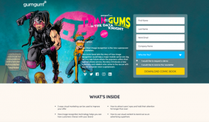
Finally, we have the call to action. This can be a form to fill or an email address or a button to click or a phone number to call. On the renovations landing page, you will see a great big form, with an incentive to save money if they fill it in quickly. Above that is also a phone number, making it easy for people to convert, whether they prefer phone or email.
You will notice that on the school landing page I showed you, we added the phone number in two places. The first is for impatient people who won’t read to the end; the call to action is where they need it to be. The second is at the end, where most people probably will end up (since it’s not all that long a page).
On my own website, you will see that my call to action is to fill in a query form, and I have it programmed to show up near the top of the page, and then to “float” with the page as people scroll. The rationale is that a possible client should never have to scroll up or down to take action. You can see how this works on my ghostwriter landing page.
If a user has to search for the call to action, you’ve already lost some sales. Make sure they don’t have to scroll.
So the elements of the perfect landing page include:
- The Big Idea
- Headlines
- The text
- The images
- NOT links
- Possibly chat
- Credibility
- Incentives
- Call to action
Now you have the elements of an effective landing page, and you will almost always want all of these. You might still need a writer to help craft just the right words, or you might be ready to do it yourself. Just make sure that you begin with The Big Idea and end with the call to action – and that everything you do in between moves people from The Big Idea to the call to action
(251)


