Those of us who can pass hours filtering through keyword referrals and bounce rates know that nothing replaces the thrill of raw data results on website growth tactics. When a blog post ranks for a new popular key phrase or when new website copy increases conversions, we can see our work affecting the bottom line.
But numbers can get in the way. When we have so many “trees” to study, the forest can be overlooked. Maybe our latest blog post is garnering great responses, but no one’s interested in our video tutorial. Maybe an unlinked image or an ad is getting more clicks than a call to action aimed toward conversions.
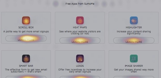
Heat maps give us the big picture in one gulp. We see where users click most, where they click less, and where they’re not interested at all. SumoMe added a free heat map to our arsenal of tools because we know how useful they can be in addition to traditional website analytics.
Recently, when we featured a complete guide about what we’ve learned about website heatmaps (over 1 million clicks combined), we came across some surprising click patterns, some of which came from heat mapping our own homepage. You can read about those learnings here, and below I’ll outline some of the questions any site owner can use to make their best pages better using a heat map tool.
I. Are Most Users Looking Where We Want Them To Look?
One of the best insights a heat map provides is a clear, big picture understanding of user behavior on a given page. Heat maps show exactly what portion of visitors are entering a sales funnel or subscribing to a newsletter, etc., versus those who are getting distracted by other links.
What are those “other” links? Basically, they’re anything that takes visitors away from becoming a customer, however “customer” is defined for you. Of course, social media pages and blogs can play the long game in brand awareness, but they’re doing the company a disservice if they pull people away from the product.
And sometimes, we get so caught up in providing a sleek, classy design to impress users that we put the site’s objectives aside to make room for the “pretty.” But even experienced website designers know that fulfilling business objectives should trump user experience.
Before running a heat map test, identify the #1 objective for users landing on your front page. If users aren’t pulled to that area of the page, something needs to change.
For the SumoMe homepage, the primary objective is to get users to install an app. So when we ran the heat map, we were surprised to see so many clicks on the “About” section and so few clicks on the apps “below the fold.”

But a distracting link does not necessarily need to be axed. Once we visualize our users’ big picture, we can turn our learnings back around to work for the site’s objectives.
II. What Areas Are Users Checking Out, And How Can We Use Them To Our Advantage?
Since heat maps show us where users are clicking, even if they’re clicking on unlinked objects, they give us the unique ability to see the site through a visitor’s eyes. From there, it’s up to us to modify our site back toward the primary objective.
Take SumoMe learning that our “About” page was garnering as much attention as the apps. If our objective is to lead users to the funnel, we could take the “About” button to the bottom of the page. Or, we could alter the “About” page copy and links to lead visitors back toward our apps.
An argument can be made for a scorched earth policy against non-funnel links – that any area distracting visitors from a funnel should disappear. I’m of the school that likes to pick and choose our homepage distractions and see if we can’t turn them around to help us. Companies with a compelling backstory, a celebrity founder, or a great press mention to flaunt may be hesitant to strip the homepage down to “click on our objective or leave.” But using heat maps to see what buttons or photos are drawing unexpected attention helps us adjust those sections to lead users back to that primary objective.
For example, one of our heat map users saw that his site visitors were clicking on an image of a video he’d placed at the bottom of his site. So he changed his homepage and gave the video a lightbox popup when clicked.

Or, if a blog or testimonials page is taking clicks away from the site’s objective, that page should probably be the next to heat map and test. If we decide to keep our distractions, let’s make sure they’re optimized to take our visitors home.
III. What New Heat Maps Can We A/B Test?
Heat maps get ideas churning when it comes to refreshing, or even retouching, a site’s design. Links placed on the homepage months or years ago will suddenly come to the forefront. (You may even find an outdated link or misleading button in the mix.)
But heat maps are also great A/B test brainstormers. Heat maps and A/B tests are the soulmates of website optimization; they complete each other. Heat maps provide inspiration that A/B tests experiment with, giving way to more heat maps that can inspire further tests (and so on, and so forth, and they lived happily ever after!).
Beyond eliminating distracting links, we can test adding buttons and copy (specifically to the heat map proven “F” shaped area of our pages), test new colors, and play around with adding the word “free” or removing form fields. These results can again be contextualized via heat maps.
In a case study by the app Pair, heat maps inspired the team’s growth hacker to run a series of homepage tes
 Source: vwo.com
They tried hiding the top navigation and increasing the size of the conversion button, both of which led to increases in signups. He also tried hiding social sharing buttons, which decreased the number of conversions. Pair’s case demonstrates a great point – without A/B testing, it’s impossible to know which heat map proven distractions are actually helping the cause; which is another reason why a “scorched earth policy” against distractions isn’t the best idea.
Ready to Get Toasty?
Our best pages deserve every opportunity to improve, and heat maps help us get there.
Keep in mind
- Where you want users to click,
- Where users are getting distracted,
- What to test, and
- How much of a difference is made,
and you’ll be heading in the right direction when it comes to heat mapping. It doesn’t replace Google Analytics or the back-end of your favorite social media platform, but checking heat maps can soon become a daily addiction for a data nerd (And they’re much more fun than bounce rates!).
Digital & Social Articles on Business 2 Community
(454)