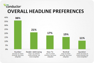

Up until three or four years ago, landing pages were generally crammed with information. Marketers and designers believed that more content elements made for a more compelling argument that visitors should opt in. How can we resist filling out the form when we see so many convincing lists of product benefits, famous customer logos, glowing testimonials, explainer video embeds and demo screenshots? In many cases this approach did drive the most results, but eventually, the world’s internet users came down with a collective headache, overwhelmed by the barrage of visual clutter.
Over the past three or so years, a minimalist aesthetic has taken hold as the new standard for landing page interface design. This trend makes good sense. With less on the page, it’s easier to make the most important elements stand out. As opposed to internal content pages, landing pages should avoid distractions and keep the visitor focused on the desired next step – clicking on that big call-to-action (CTA) button, thereby opting in to whatever offer is on the table.
Minimalist landing page design has been shown to be so powerful that many companies are now using them as their homepages and relegating longer content to other sections of their websites. This Groupon homepage/landing page hybrid is a prime example – it’s clean, the form and its CTA stand out nicely, and there’s an enticing value proposition.
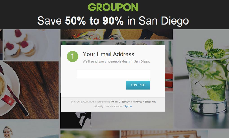
(Source: Groupon)
How to Strive for Landing Page Minimalism
At their core, landing pages are all about making it super clear to the visitor what actions are meant to happen next, so logically, if a piece of information detracts from that clarity ideal, then it probably belongs somewhere other than a landing page. And besides, contemporary digital marketing hinges on positioning products as helping people to live better and easier lives, so crafting a branded atmosphere of blissful serenity is a big part of that positioning.
If you want to create your own minimalist landing page but want to make sure you’re doing it in such a way that doesn’t compromise effectiveness, follow these three tips.
1. Don’t Over-Reduce
In order to give your new landing page a minimalistic look, you’re going to have to make some major sacrifices, killing off nearly all of the elements that appeared in your older, less sparse designs. You’re going to have to get into this mode of thinking if your new design is going to work. On the other hand, don’t take it too far – just because you’re scaling back on bathwater doesn’t mean the baby has to go too.
Make sure you keep the conversion-driving elements that absolutely need to appear, even on the most minimalist of landing pages. You still need a brief explanation of what you are offering; otherwise visitors will have no motivation to opt in. Make sure this line of micro copy emphasizes the benefits of your offer, rather than its features and details.
Your CTA button should be easy to read and worded extremely literally. For example, “sign up for our newsletter,” “get started now,” “download the whitepaper now,” or “request that we contact you.” Include a secondary CTA as well, so that customers who are not as advanced in their decision-making processes can still reach out to your business.
2. Draw Eyes to One Button
Hierarchical graphic design is key when creating minimalist landing pages. It needs to be extremely clear to the page visitors what you’re trying to convey in terms of message priorities. Moreover, the whole point of landing page minimalism is to clear away the noise, allowing visitors to focus on the primary CTA, the element that tells them what they’re meant to do next.
Therefore, your CTA button should stand out, with plenty of contrast against its background, and it should be attractive, so customers will be drawn towards it. Make your CTA large, so it stands out, and position it towards the top of the page and on the left side for maximum impact. Use vivid button colors, too, so that the CTA really pops. Visual complexity and white space around the button graphic can give it more prominence. Your secondary CTA should be much less obvious and not as pretty, to make it clear what visitors are meant to do as soon as they’re ready.
3. Enable Clutterless Drill-Downs
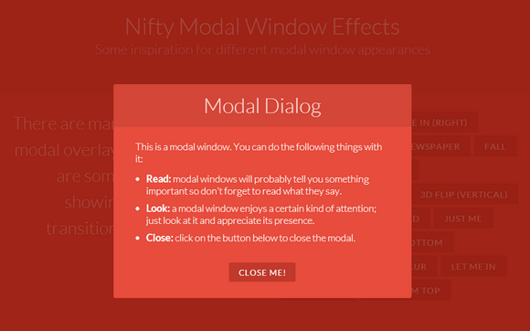
Some products are more complex than others, deserving more explanatory information. Also, if you’re using your landing page as an entry point for customer on-boarding, then you’re likely to need a form with more than one or two fields to display. “Lightbox”-style modal boxes – those on-page popups that have become ubiquitous in contemporary interface design – allow you to include more text, forms and videos without taking up too much space on the layout people see upon loading the page.
Video is extremely powerful for explaining the benefits of your offer, as people love watching pictures that move and tell stories. On the other hand, a big “play” button inside a frame takes up a lot of real estate and can steal thunder from your CTA, effectively negating the minimalism you’re striving for. A well-placed video link that opens in a modal box is the way to go.
But however you integrate video into your page, in order not to distract or annoy the user, don’t set the video to start playing as soon as the page opens. Leave it up to the user to decide whether to play it or ignore it. Make sure that the video is easy to close and brings the visitor back to the landing page so he or she can opt in to your offer.
Finding Performance Maximization in Minimalism
Enable your landing page’s visitors to follow the journey you have in mind for them by designing a page that has as few distractions as possible. Give them the basic information they need to motivate them, and don’t over-embellish with anything more. Don’t confuse them with too many choices or over-chaotic graphic design.
Instead, aim for landing page minimalism which lets customers “get it” extremely quickly and choose between a primary CTA and a secondary one. Once you have made the initial contact with the customer, more extensive explanations about your product can be offered via emails, internal content pages, social media and more.
(373)