You’ve designed a spectacular user interface, one you’re particularly proud of. You’re faced with just one problem, though: it isn’t accessible to all users.
Maybe that fact came up in testing: as part of the QA process, you should be ensuring that your site is accessible for everyone. Aside from just being a facet of being a good designer, ensuring your site is fully accessible has a world of benefits.
Your site is more likely to be robust and rank well on search engines. It’s also more likely to generate business, as customers hate having to clear hurdles before they complete purchases. While you certainly want your brand’s digital experience to remain engaging, there are several ways to improve your page’s accessibility without sacrificing design.
Font Size, Readability, and Legibility
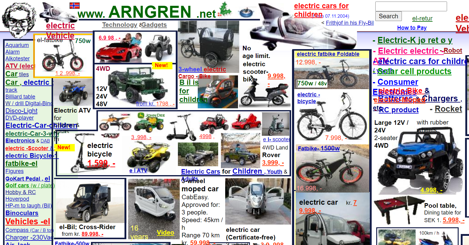
According to a 2019 survey, pages crowded with too much content topped the list of problems for respondents with disabilities.
Not over-filling your page is just good design sense, too. The more things vying for your consumers’ attention, the more likely it is that they’ll be overwhelmed and just bounce off your site entirely.

Source: arngren.net
Essentially, you need to systemise your business, one step of which is making your pages clear and easy to read.
You can do this by utilizing built-in formatting features. Any page with long blocks of tests should be split into subheadings, with a clear and obvious title heading – an <h1> tag.
Simply breaking up the text will allow people to scan your page more easily. However, proper use of formatting means that those who are visually impaired and using screen readers can skip to the section they need.
Make sure that your subheadings are properly labeled as such, and not just in a bigger font size. If you’re using a list, mark it as such in HTML with <ul> or <li> tags, which will ensure that it renders in the correct format.
An even simpler trick is to make sure that whichever font you choose is big enough, and offers enough contrast with the background, to make it easily readable. The Web Content Accessibility Guidelines suggest a contrast ratio of at least 4.5:1, though there are exemptions for splash text.
It has also been suggested that sans serif fonts – and yes, that includes (but doesn’t limit you to) Comic Sans – might be easier for people with dyslexia to read.
Consider the Color Blind and Your Colors
Here’s something you probably didn’t consider when building your site: the fact that color blind people may have trouble distinguishing between the hues you’ve used. With color blind people making up 5-10% of the population of America, it’s a big chunk of users you could be alienating.
Here, crowdsourced testing may be a useful tool: you’ll get several different perspectives on how easy it is to differentiate, especially if you test using black and white.
In fact, testing in black and white is a good way to see for yourself how well features stand out without their bright shades. Red-green color blindness is the most common type, in which people cannot distinguish between the two.
Think about how many error messages are highlighted in red. When you look at your page in grayscale, it will be obvious that adding color just isn’t enough to draw attention. Consider labeling any charts clearly and adding extra prompts – such as an exclamation point to emphasize your goal. Or running your site thru color blind tests

Separation of HTML and CSS
The bane of screen reader users everywhere, HTML and CSS being intertwined means that the machine gets in quite the jumble. Plus, the poor listener will be bombarded with information they just don’t need.
Luckily, we’re now able to separate HTML and CSS. You can build your page with CSS elements where you need them, like site menus at the top of the page, while the HTML code that holds them in place functions just as well at the bottom of the page.
This might take some functional testing, especially if you’re not used to it. Play around with placement to ensure that tools like screen readers can cope just as well as people with full visibility.
Link and Form Box Descriptions
Generic CTAs
How many pages have you viewed where the call to action (CTA) is a generic ‘click here’ or ‘read more’? And how easy do you think it is to distinguish those buttons from one another if they’re all being read out in sequence by a screen reader?
Well, you guessed it: not easy at all.
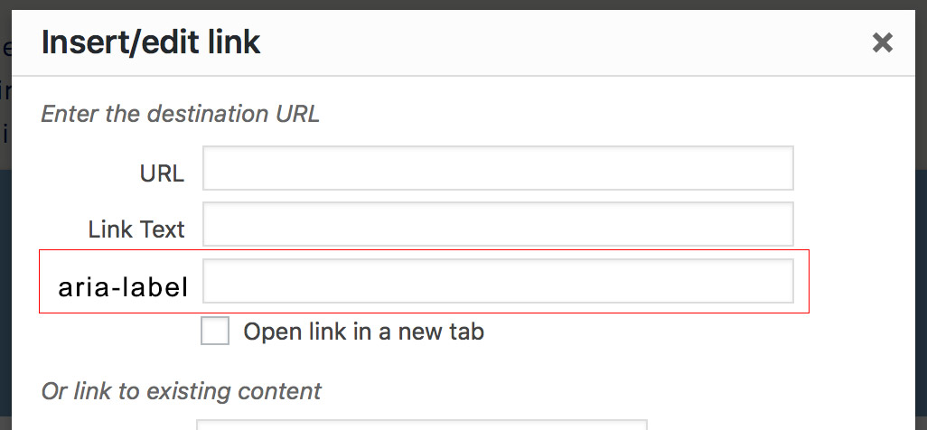
Handily, there is a quick fix for this: you can either name your links something more specific, which people without visual impairments will be able to see as well, or you can use aria-label attributes.
This means that the visible elements of your site stay the same, but the screen reader will announce the alternative label. Your ‘read more’ label can then become ‘read more about website accessibility’ when read aloud.

Forms
Having forms to fill in is a crucial part of most businesses’ lead gathering strategy – and is particularly important if you’re running surveys. Still, a huge number of sites still push forms that are hard to fill in at best, and completely inaccessible at worst.
A super simple way to make forms easier to fill in? Allow auto-fill to work its magic. You’ll most likely gain more leads from non-disabled people as well as those who are disabled, just because you’ve removed an obstacle in the path of signing up.
In fact, according to The Manifest, a huge 81% of those surveyed have abandoned a form after they’ve begun to fill it in. So, enabling auto-fill will make your site more accessible and boost your overall sign-ups, which sounds like a win to us.
This can be particularly helpful to your targeting and retargeting strategy: who doesn’t want more subscribers?
Downloads
Another easy tweak is to label any download links as such. This is pretty useful for sighted users too, making sense to code it in CSS. You can even note how big the file is, in case people are viewing on their mobiles and don’t fancy downloading massive files ver data, or a weak Wi-Fi signal.
Images and Videos
Another element that is often overlooked in terms of accessibility is alternate text and audio with visual elements. All your essential images should be labeled with alt text, briefly describing what’s in the picture. Ideally, all videos should come with transcripts and/or subtitles for those who are hard of hearing. You could even add an audio description to any videos if it seems appropriate.
It’s always a good idea to keep up on software testing news, as programs shift and new research emerges about what constitutes a good design. It is especially important in terms of accessibility. People with disabilities are so often overlooked that it’s only recently designers have begun to consider site accessibility at all.
Try out your site using only keyboard navigation, or even use a blindfold to see if you can navigate easily. Or, ideally, you could enlist some QA testers who have disabilities to bring their unique insight to the table.
Final Thoughts
Who knows, you might even hit upon a solution that becomes the standard practice, paving the way for greater accessibility and usability. Sure, it may take a little back-office tinkering, but the benefits – and not just from a financial perspective – are endless. Optimize your site experience for everyone with pro-style accessibility and your site’s potential will be limitless.
Digital & Social Articles on Business 2 Community
(69)


