Survey and poll data are one of the most common types of content you see in infographics. That’s because poll and survey data typically translates beautifully into charts and graphs. When done right, visualization brings data to life. An infographic can make information more easy to interpret and easier to connect with. It can become a highly compelling visual that will get people’s attention, regardless of whether or not they actually read the entire accompanying article or report. Infographics also have the potential to go viral, when longer, text-based forms of content are much less likely to.
Let’s say you’re a nonprofit organization working on a campaign for more better school library funding in lower income neighbourhoods. Part of your data collection would involve collecting data from surveys asking for information like the number of books per school library, the literacy scores of students in those schools, how often students borrow books from the library, etc. You’ll need a survey creation tool to collect your data, like Pollfish or SurveyMonkey.
Once you’ve collected your data you will, of course, write up the results in a report. But you shouldn’t stop there–you’ve also created a perfect opportunity to make an infographic summarizing your findings, which you can use for your campaign. That’s where an infographic tool or chart maker come in.
This article will walk you through the steps for turning your poll and survey data into a beautiful, educational and shareable infographic.

1. Collect Your Data
When it comes to creating a survey, you’ll want to have a clear idea of what specific sorts of information you hope to collect. Pollfish outlines the four key tips to keep in mind when creating a survey:
1. Know the point you are trying to prove.
What central question are you trying to answer or what central point are you trying to make with your survey data? Tailor your questions towards answering that question.
2. Design your questionnaire having in mind the point you are trying to prove.
Make sure all your questions correlate with the central point or question behind your survey. Don’t overburden your survey with extraneous questions–if your survey runs too long, you run the risk of fatiguing respondents, which can lead to lower quality responses. Be sure to include a variety of different question types to prevent respondents from falling into a response pattern.
3. Distribute your survey to a statistically significant audience.
Make sure that each sub-segment of respondents you reach out to is a significant number so that your results will be statistically sound. You can re-open your survey to receive more responses from sub-segments if you don’t receive enough responses in the first round.
4. Analyze results.
You’re going to need to be able to explain why each data point is important, so take the time to analyze your data in-depth. It’s at this stage that you’ll be able to identify and pull your data story.
2. Find Your Data’s Story
In every set of data there’s a story. Once you have collected your data, your next step is to find that story and bring it to the forefront. The story should be something that connects the data to human experiences–basically, something that will connect emotionally/intellectually with audiences and hopefully resonate with them.
This will be easy if your survey deals with a topic that is already emotional for audiences. For example, my team did a study investigating whether or not people could form romantic connections in a controlled setting through text message. Our study involved an exit survey after the conversation period, collecting both quantitative and qualitative data. Because the study dealt with the topic of love, it was easy to spin a love story from the results.
But for topics that are more dry or technical, it may be harder to find the compelling story within the results.
The trick is to pull the relevant points that will bring your story to the forefront, without skewing the information. For example, if you are a business that wants to show your steady growth in the third and fourth quarter, you can highlight the last two quarters to show your success. That being said, you should also show the first two quarters, even if your business dipped during that period. Choosing the right graphs and charts will allow you to highlight the data you want to highlight while also being transparent in your data reporting.
3. Choose the Right Charts and Graphs
Once you have collected your survey results, it’s time to decide how you are going to present the data. It’s important to keep in mind that visualizing data comes with a risk: there is the potential for data to become skewed in the process, either through poor design, unclear labeling or mismanagement of the data. Nothing frustrates people faster than confusing and poorly presented data (except information that is flat-out wrong).
When creating your infographic, you can use any combination of these charts:
– Data map
– Pictogram
– Pie chart
– Bar graph
– Line chart
– Stacked line graph
Binary Question Responses
A question that only has two answer options, like “Yes” and “No,” has binary responses that, when combined, total 100%. Two option questions are polarising but yields less insight than questions with more options. For straightforward percentages like this, the most common visual used is a simple pie chart.

You could also use an icon/pictogram chart. You will lose some of the visual accuracy of a pie graph, but it’s a fun and thematic way of presenting information. To make an icon chart, select the icon chart widget in Venngage and drag it onto your infographic. Choose which icon you want to use from the icon library and adjust the fill percentage.

Consider which type of chart would better fit your infographic’s story.
Large Samples of Data
Data maps are ideal for visualizing very large samples of data from across a far-reaching area. They also allow readers to analyze the data in many different ways–in terms of overall patterns and region by region.

Showing A Trend Over Time
Say you’re a company and you want to show how your user engagement has increased over time. You can send them out a survey asking them qualitative questions like “Would you be disappointed if you no longer had our service?” and “How likely are you to recommend our company to a friend?” These results can grow and change over time (and if you have a good marketing strategy, they will hopefully grow).
A line graph (or a multi-line graph) is one of the most straight-forward ways of visualizing trends over time. You could also use a combination bar graph and line chart.

Keep in mind that your audience will likely only give you graph a quick, two second glance before they read on. They might not necessarily interpret the trend based on the chart alone, which is why it’s important to clearly label your chart.
Rating Scale Question Responses
The most commonly used rating scales are the standard Scale (1-100), the STAR rating scale (1-5), and a matrix (“Strongly Disagree,” “Disagree,” Neutral, “Agree” and “Strongly Agree”).
The average score of a set of rating scale answers can be presented in a standard pie chart or a donut chart.

Open-Ended Question Responses
Typically, a survey will have a couple of open-ended questions where respondents can offer qualitative answers, such as “Do you have any suggestions for how we can improve our site?” These questions are especially useful for identifying unknown issues and assessing the feelings of respondents.
Open-ended questions are a fantastic way to add depth and human feeling to a report by including direct quotes from people’s answers to backup the point you are making.
If you want to translate open-ended responses into a graph, however, you will need to organize your answers into categories. The best way to do this is to manually go through the open-ended responses and to create categories (given your sample isn’t too big).

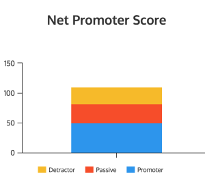
Differences Between Proportions
Say you’re calculating your business’s Net Promoter Score. You NPS is calculated by subtracting the number of Detractors from the number of Promoters. The number of Detractors, Passives, and Promoters you get will be part of the total number of respondents.
For this kind of data, you can use a stacked bar graph to display the parts of a whole.

4. Use a Design That is Data Rich & Has High Visual Impact
Now it’s time to put everything together into one beautiful infographic.
Survey result infographics will typically have several different kinds of charts and graphs in order to offer visual variety. The thing to remember, of course, is that your chart and graph styles should be uniform (same title fonts, same color scheme, same line widths). You can design your infographic using a number of different layouts:
Pose a Question That Your Data Answers
Return to the story you uncovered from your data. What is the central question? Make that the title of your infographic and use that to break down your data into charts that answer the question from different angles.You could also ask a question for each point and then answer it with a graph.
Our infographic about falling in love through text message (featured above) is an example of this kind of infographic.
Show the Before and After of Your Data
If you want your infographic to compare, say, the results of a survey for this year in comparison to last year (like in the case of an Annual Report), you can split your infographic down the middle to compare data points.

Break Your Data It Into Sections
Sectional infographics walk the reader through the different elements. This layout if good for connecting points if there isn’t a clear narrative storyline to follow. Annual report infographics and educational infographics often use this layout.
Take this infographic, for example, which is divided into different sections all centering teens and their social media habits.

BONUS: Some Do’s and Don’ts
DO clearly label your charts so that readers can understand them in only a few seconds’ glance.
DON’T round off percentages until the end of the creation process. You don’t wan the numbers to become skewed.
DO point readers to where they can get further information by including an url to the source and any other vital resources at the bottom of the infographic.
DON’T overstuff your infographic with extraneous information. Your copy should be focused and relevant. Save extra or outlying information and create another infographic.
DO follow infographic design best practices. These posts can walk you through some of the basics of infographic design.
DON’T overburden your infographic with too many icons, crazy fonts, or glaring colors, and chartjunk. Those will only distract from the information you want to communicate. The focus of your infographic should be A) the charts and B) their titles.
I hope this guide serves you well! If you have any questions, please leave a comment.
This post was originally published on the Venngage blog. A few minor contextual edits were made for the purpose of this syndication.
Digital & Social Articles on Business 2 Community(254)