MINI have been going through a rebranding process for a while now and it seems to be a phased approach happening gradually. It’s no surprise their emails have gone through some changes as well to mirror this transition, so I’m going to be focusing on one of their emails and the transition it has gone through in design over the last six months.
The Rebrand
The overarching change has been the rebrand, which seems to have moved on from the previous, bold, in-your-face, young and fun vibe to something a little more grown-up.
I also know that, where all of the previous emails tended to fit the same format and layout, the new ones vary in style. They have developed a modular based suite of assets and design options to allow flexibility moving forward and this approach (despite potentially seeming restrictive) can have countless other benefits in terms of time, consistency and creativity.
Modular design is the method of creating a system of self-contained components that can be stacked, rearranged and used or not used, case by case.
I have broken the designs up in to three key sections (choosing to ignore the pre-header and the terms stuff). The images you see will show the three emails in desktop and mobile view.
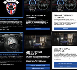
The Top section


The changes in this section have been fairly straight forward and are a positive step towards better practice for their mobile subscriber base. The change has been mainly focused around an increase in the amount of live-text and clear stacking CSS buttons which dominate the top area. The second and Third versions also have their own header image on mobile which helps maintain the balance.
By the third version the copy has been removed from the header image and is now live text making the overall design more concise. Personally I’d like to see what happens without the navigation/buttons there or move it to bottom in some way.
The Content


In the images above, the noticeable difference is the removal of the hierarchy in this email. The two column (alternating side) approach in the first emails with the little chevron style CTA has been changed to a simpler single column card style layout, with larger text and another another large thumb-sized button (on some emails a two column option is still used – but within the new style to include a larger font with nice button, created as part of the modular build).
Mobile First
Visually I really like the changes made here, but there are some obvious drawbacks to it. The weight of images being a main one (but there are ways around that), the lack of hierarchy and the size of it all at 600px wide (you may have noticed I only put one article in the image for desktop because it was so much longer).
However the new versions work much better on mobile, especially by the time it balances out a little more in the newer branding, which is where their core audience views emails. I do think it has given the designers the creativity and space to work with better imagery too.
The Footer

Looking at the images above you will see in the first version the large boxed CTA and the range of cars. On mobile this doesn’t change apart from the range becoming a bit smaller and the space becomes more difficult. The newer versions have kept a similar approach for desktop apart from the car names being live text. However on mobile these now all completely stack individually to the width of the screen and, to save the email becoming needlessly long, the range is hidden within a hide and show accordion which can be controlled by a button.

The accordion section works well for what it is (essentially a seven-item navigation) and provides email interactivity as well. All seven cars can become full width without the email becoming too long, and I like that it’s been used at the foot of the email rather than at the top.
Overall
Overall I think the changes have been positive. There is a clear switch to a more mobile-focused approach with the modular design giving license to be braver, more creative and more flexible while staying within their brand guidelines. So get rid of that nav for a few emails and see what difference it makes, although a hybrid build of this should also be possible and worth experimenting with.
Digital & Social Articles on Business 2 Community(66)