
A web site with great user experience is like a brick and mortar store with excellent customer service.
A store has salespeople who try to identify what’s important to the customers, so they can offer the right product at the right time.
The same idea applies to your web site. At its core, web site conversion rate optimization (CRO) is making sure your site or page has the right things at the right time for the visitor.
It’s about making people feel good about the overall experience.
In a webinar with Bounce Exchange, Brian Lewis, Director of Optimization at SiteTuners, identifies things you can do to make visitors feel comfortable, so much so that they move along the customer path.
I. Understand that Not Everyone is Ready to Buy
There are visitors who know exactly what they need. Likewise, there are those with a pain point who don’t know if a solution even exists.
The problem is most sites suffer from the “Greedy Marketer Syndrome.”
They’re designed to cater only to those who are ready to act, disregarding top-of-the-funnel visitors in the process. Regardless of how big your “Buy Now” button or your form is, if people are not ready, then they’re not going to convert.
Think about what’s important to your visitors as they move through your funnel:

Understanding your visitors is key. And there are different ways you can learn about your visitors:
Quantitative – your ability to see and understand what visitors are doing
- Analytics
o Keywords – the keywords people are using to get to your site can tell you where they are in the funnel. Early stage visitors, for instance, will tend to use general keywords.
o Page popularity – you can review pages that visitors engage with most, and pages where you lose them – where they’re exiting the site from.
o Incoming referral URLs – you can also look at what visitors experience before they get to your site. For instance, if they’re coming in from a review site, you can make assumptions about their mindset, or what’s important to them.
Qualitative – your ability to determine why visitors are doing what they’re doing
- Staff interviews – getting information from your frontliners about the typical people they speak with and the kind of conversations they have with them allows you to understand your audience better.
- Visitor surveys -by putting these at key trigger points on the site, you get rich data. Keep in mind that people will have different frame of thinking depending on where they are on the site. So you’ll want to ask a certain type of question on your home page versus on your product detail page (PDP), for example.
- Social media – you need to pay attention to what’s being said about you and your competitors’ products or services on social media, so you can get guidance about what’s important to people.
Consider these two versions of E-Trade’s home page, for instance. The first one does a good job at working with visitor intent; the second one, not so much:

1. Has clear entry points for different visitors based on their level of knowledge and where they are in the AIDA funnel:
- Left box says “New to Investing?” and call-to-action (CTA) is “Learn More”
- Middle box says “Experienced Investor” with “Get Started” as CTA
- Right box says “Active Trader” with “Upgrade Your Trading” as CTA
2. CTA is “Open an Account.” The problem is the user might not even know what kind of accounts they can open at E-Trade. Unless the user is at the bottom of the funnel, the home page will fail, as it does not address early and even mid-stage visitors.
II. Have Visitor Intent-Driven Navigation Design
People come to your site to look for a solution to a problem or for a specific product.
Here are some navigation mistakes that get in the way of users finding what they need:
1. Featured Products on the Home Page
If you’re an e-commerce site, you’re not doing anyone any good by putting Featured Products front and center on your home page.
For instance, if you’re looking for headphones on Crutchfield.com, you’re forced to either use the top bar navigation or do a search because the body of the page is dominated by the promotion on outdoor speakers.

That’s not good UX.
Your home page is supposed to show visitors a map of the world (i.e. what’s possible to do or buy on the site).
It should show top-level categories that visitors can drill down on to zero in on what they’re looking for.
Featured Products may work if …
- The visitor regularly buys a variety of your products, so they have a good working knowledge of your products
- It’s the holiday season when people might be buying gifts for someone else
- You present them at the category level. Once the customers has shown interest in a particular category and has gotten down to the category page, showing them featured products makes more sense
- You’re Apple. When Apple launches a new product, that launch is worth a billion dollars, so it’s okay for the new product to take over the home page
2. Invisible and Unclear Navigation
Consider Gorilla Movers’ home page.

- It’s almost impossible to identify what the visitor is supposed to do here because the slider takes up most of the prime real estate above the fold
- The navigation bar can barely be seen because of lack of contrast
- The order of navigation and labeling don’t make sense. They’re being greedy by starting with “Get Quote,” it’s unclear what the user is supposed to “Buy,” and is it “Apply with Us” to get a quote or get a job?
3. Horizontal Sub-Navigation
Look at how this sub-navigation is set up:

If the user places their mouse over “At Home” and wants to go all the way to the right to click on “Stores,” the mouse will go through the other top nav entries to the right. To use the sub-nav properly, the mouse pointer will need to make this motion:

That requires a ton of dexterity.
Asking users to be very deliberate about where and how they hover their mouse, lest random things start popping up, is unreasonable. Adding an unnecessary motor load on your visitors is a good way to annoy web site users.
Ryan Urban, CEO of Bounce Exchange, notes that sub-navs, in general, are a bad idea.
When users make a click, you should bring them to another page that has everything else. When they hover over and click on the sub-nav, all the other distractions of the page are still there.
If you must have a sub-nav, make it a list and put that opacity layer on the rest of the site when the user clicks to a sub-nav, so they’re not distracted by other elements on the page.
III. Make Site Search Helpful
A significant portion of your visitors will use site search.
The good news is those who do search are typically late stage visitors and are more likely to make a purchase.
So make sure that when people search, you’re serving them relevant results. Review your search results and do regular audits:
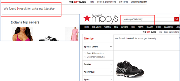
1. Account for misspellings by giving suggestions
Users are bound to mistype things, so make sure your search engine has some level of fault tolerance.
For instance, Macy’s has results for “asics gel intensity,” but hasn’t prepared for misspellings:

Users should be able to recover from minor errors, so on-site search engines can either serve up featured results for common misspellings, or offer “Did you mean” verbiage in an attempt to clear up what the visitor is actually searching for.
2. Don’t dump users on a page that has a lot of results
Asking visitors to scroll and wade through hundreds of results is a big ask.
- First the results need to be weighted – you can’t display ALL things that match the criteria without some sort of way to map relevance to the sort order.
- Second, you need to give users a way to filter down to what they need. You need to serve up a wizard-like experience that helps visitors get closer to what they are looking for.
IV. Avoid Being Clever and Vague Instead of Being Clear
Unless you’re Amazon and people know exactly what you do, you can’t do mind-bending and cute tag lines on your home page.
Your home page should very quickly communicate what you do and your value proposition.
Check out the difference between OpenText Core’s old and new home page:

- Does not communicate what they do; background image is irrelevant
- Text lets visitors know what the site is about, and the image supports that
V. Format Copy Into Something that’s Easy to Digest
People generally don’t read on the web. They scan.

So, you have to present your copy in way that supports this scanning behavior:
- Don’t put all your copy on the home page; you don’t know what the visitor is interested in yet. Instead, have links that users can click on if they want in-depth information.
- Write in fragments or short sentences.
- Avoid capitalizing all letters. Letters lining up at the top and bottom makes it harder to read.
- Have a clear hierarchy of larger sizes for subheadings and headings.
- Use bullet lists instead of paragraphs.
- Avoid industry jargon and acronyms. Look at visitor intent – it’s okay to use jargon and acronyms if you know that your audience is familiar with them. However, you may have early stage visitors who won’t understand them.
Putting It All Together
Technology changes quickly, but the brain does not.
If you meet the psychological needs of potential customers, you’ll close better. That’s true whether you’re operating a brick and mortar store or a business that’s purely online.
If you …
- cater to all visitors instead of just the bottom-of-the-funnel ones,
- make sure your navigation matches user intent,
- make on-site search as helpful as possible,
- and format your content for clarity and easy reading
… then you’re well on the path to humanizing the online experience, and converting better in the process.
Digital & Social Articles on Business 2 Community(108)