
It’s a regular problem for designers:
Choosing appropriate the fonts you want to use for your website—we call this practice, “font pairing.”
By font pairings, I’m referring to how to choose a “set” of fonts (two or more) that will be used for specific types of written content on your website.
For example, you pair fonts when you decide you want to use Open Sans for your headings (one type of content) and Gentium Basic for your paragraphs (another type of content).
Ideally, you want to find fonts that complement one another and are not fighting for the viewer’s attention.
While you’re probably familiar with the idea that many different fonts exist, you’ve probably never thought much about what separates one font from another—we’ll talk about different characteristics of fonts below.
Designing typeface families or fonts is actually really complicated and involved (if you have the chance, watch the movie Helvetica sometime to see just how involved it gets.)
Here are a few DOs and DON’Ts that designer’s swear by for coming up with a beautiful font pairing:
Do
Use Contrast
Contrast, which basically means using two fonts that are distinctly different from each other, helps create visual interest—for example, a very thick font compared to a very thin one. Contrast is king when it comes to font pairing.
You can create contrast by using:
- Weight (Light, Medium, Bold, Extra Bold)
- Size (Example: 30 pt. Heading and 16 pt. Body Paragraph)
- Style (Italic, Oblique, Small Caps, Strikethrough, Underline)
- Color (Using Blue for Headlines, and a Dark Gray for Body Content)
- All Caps vs. No Caps
Pair Different Classifications
Fonts are like dogs—there are some major “Groups”, such as the toy group (what we call classifications), and within those, you’ll find more specific “Breeds” (when it comes to fonts, these are categories).
Here are some of the major classifications of fonts
- Serif
- Sans serif
- Script
- Decorative
These can all be broken down further into categories.
For instance, sans serif can be divided into geometric, humanistic, or square.
Contrast is key, so pairing two different type classifications is a method designers often use when pairing fonts for a website.
A good rule of thumb is to pair a serif font with a sans serif font, like so:

Use Font Families
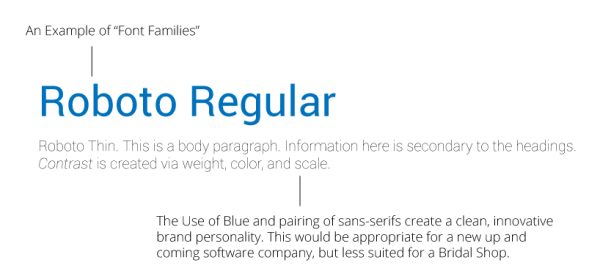
Fonts have families—you don’t just have Calibri, you have Calibri Light, Calibri Regular, Calibri Bold, and Calibri Bold Italic.
Choosing multiple members of a font family can add visual interest to your website without have to choose vastly different fonts—the difference can be subtle and elegant.
This route is often a go-to for designers—by using varying weights or styles within a font family, you are able to create a more cohesive site.
An example would be Futura Bold paired with Futura Light—they both look very similar, but one is much lighter than the other. The contrast creates for a beautiful font pairing, as you can see here:

Select Fonts to Reflect your Industry/Brand Personality
Think about your brand when selecting fonts for your website—what kind of fonts reflect the spirit of your brand?
If you are a professional, contemporary law firm, you wouldn’t use a Script font because that doesn’t accurately reflect your brand personality (Script fonts generally are used by more feminine brands, for example).
By the same token, a fun, carefree brand likely wouldn’t use a stately slab serif font.
Don’t
Use Too Many
If you use too many font classifications throughout your website, it can be visually jarring for the viewer. Keep it simple and limit yourself to 2 fonts (or maybe 3), so that your website is more cohesive.
Use Script or Hard to Read Fonts for Your Website Paragraphs
Script fonts are designed to be used as headings, not paragraphs. When you use a fanciful font, such as Oleo Script, it can be very difficult to read at smaller sizes.
Use Two Different Fonts from the same Classification
Try staying away from Fonts that are too similar. Without unique characteristics between them, there is no clear distinction between the two.
If you choose two fonts that are too much alike, they will be competing for the viewer’s attention.
An example would be pairing Source Sans Pro and Work Sans—they are just too similar to one another to create enough visual contrast.
Resources for Pairing Fonts
Here are a few of the websites I use when selecting font pairings for websites.
This might give you a better visual representation of successful font pairings for the web.
You can also go to Google Fonts for a vast selection of free web fonts you can use for your website. Google Fonts also has a feature that shows suggestions for possible font pairings with your searched font.
And who doesn’t like free?
Digital & Social Articles on Business 2 Community
(92)