 Jon-Mikel Bailey
There is only one constant in the world of web design and development and that is change. We’ve been doing this for 12+ years and have seen all sorts of design trends – good and bad.
While we welcome the chance to redesign our client’s websites, we always stress that a redesign needs to be based on more than just personal taste.
While looking around the interwebs you will likely come across a site you really love. That’s great. It’s important to be open to new ideas and different ways of presenting your brand. But, do this cautiously.
You always want to ask yourself how this new design technique helps:
- “Does it help to support our brand that makes communication with our audience work seamlessly?”
- “Does it provide a better way to deliver our message in a way that resonates with our audience?”
- “Is it a better way to organize our information visually that our audience would appreciate?”
- “Does it improve on the site’s user experience?”
- “Would it help to set you apart from your competition, making you a more favorable option for your audience?”
Here are some questions that should never be on this list:
- Is it cool?
- Is it popular?
- Do you think it’s neat?
- Does the CEO think it’s neat?
Of course the look of your website matters. But, who it matters to is most important. With that in mind, take a look at some of the trends below with an eye towards your audience.
Here are some design trends we’ve been focusing on lately:
- Long Scrolling sites
- Mobile first approach (Responsive Design)
- Large visual headers
- Parallax
- Flat design
Long Scrolling Sites
This is a website where all content resides on one long page. You can include navigation that jumps you ahead to a certain section of that page.
A great example of this is a site we built for Planet Technologies to promote a service for their US Public Sector audience. The message was simple and did not necessitate an involved website. A simple scroll through will get the user all the information they need.
Check it out – http://youalreadyownit.com/
If you have a simple message that can easily work in this format, consider a long scrolling website.
Here is another example of a long scrolling site we’re working on. As you can see, it’s a simple message and the design uses visual cues to guide you along…

Mobile First Approach (Responsive Design)
Mobile first design means the focus starts with the mobile audience first. You plan your design around their needs first.

A good example of a site with a strong mobile audience is one we did for Visit Montgomery. A good deal of their content is catered to folks looking for things to do in Montgomery County, MD. The majority of these searches are coming from mobile devices.
This site uses responsive design meaning it will render properly for desktop, tablet and smartphones. And the information placed up front is definitely geared toward a mobile user.
Check it out – http://visitmontgomery.com/
Take a look at your analytics and talk to your audience. Are they looking for your information primarily on their mobile devices? You might want to consider a mobile first approach.
Large Visual Headers
Sometimes you don’t want to overwhelm your audience with too many choices. Sometimes it’s better to keep things simple and rely more on design to drive conversion.
This is where large visual headers are effective. For example, we built a website for USAN, an IT Firm based in Atlanta, with a large visual header geared towards a simple promotion.

The only ask “above the fold” is to learn more about a product. Keeping things simple can often help to drive your point and improve conversions.
Also, remember that a picture paints a thousand words. Using large visual headers can help support your message without having to use a bunch of boring text.
Parallax
Parallax is a design and coding trend that is very popular right now. This is one you want to be careful with. Sometimes the effect can be a little overwhelming.
That said, it is visually compelling and can add motion to a site without using Flash or video. Parallax will give the appearance that the background is moving at a different rate than the foreground of a page.
Here is a great example showing how parallax works. Look at each layer below – the yellow things (whatever they are), the bushes, and the sky. Each layer moves at a different speed giving the illusion of perspective…
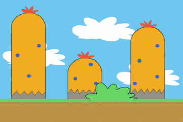
“Parallax scrolling example scene” by OhSqueezy – Own work.
Licensed under CC BY-SA 3.0 via Wikimedia Commons.
To see an example of a parallax website, take a look at the parallax homepage we designed for CTAC – http://www.ctacorp.com/.
If you are trying to add motion to help guide the user through your content, parallax might be a good idea. If you are trying to add motion because it’s cool, be careful.
Flat Design
Flat design is one of my personal favorites. It is how it sounds, design using objects that are flat in color or appearance. It’s a minimalist approach to design.
A few years back, textures were very popular. Now, with mobile devices and responsive design, it’s harder to make these textures work well across multiple devices.
Flat design gives the feel of layers and depth, but with flatter colors, and minimalist design techniques. This way it’s much easier to make the design work on multiple devices.
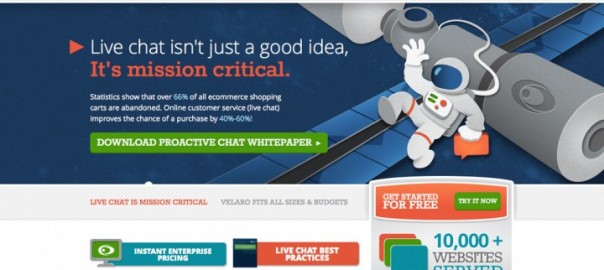
Plus, flat design can be very fun. Take, for example, the design with did for online chat software provider Velaro. The colors are flat and textures are very minimal. But the site still has depth and a playfulness to it…

If you want to look modern with a consistent design across multiple devices, I would recommend trying out some flat design.
Remember to Design for Your Audience
Website design shouldn’t be a matter of what one individual thinks is cool. Your design serves a purpose. Your design supports your message, your goals, and ultimately helps your audience get what they need from you.
So, think about what they need. How could you use one of these techniques above? Would it support the needs of your audience? Design can be fun. Design can be interesting or even ground breaking. But, always make sure it supports your goals.
What are some of your favorites designs or design techniques? Let us know in the comments section below.
(161)