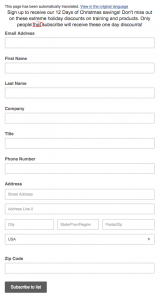
A landing page is a webpage that encourages visitors to your site to download a digital offer (an eBook, tip sheet or white paper) or sign up for a free trial, a webinar or an e-newsletter—all in exchange for leaving their contact information.
While it sounds simple, high converting landing page design is definitely not as straightforward as it seems.
The ultimate goal of a landing page is to generate qualified leads that eventually turn into customers. The first challenge is attracting a potential customer to your landing page. And the second, even bigger, challenge is convincing your visitor to share their email address and other personal information.
There’s definitely a science (and a bit of an art) to designing high converting landing pages.
10 Best Practices For Landing Page Design

Image source: FreeDigitalPhotos.net
#1: Think Before You Start
Before you get started on designing a landing page, there are four important questions to keep in mind:
What is the offer? Describe your offer in a way that tells your visitor why they should give you their information.
What are its benefits? Outline the benefits to your visitor…and why they must have your offer NOW.
Why does your audience need it? Create a sense of urgency for the offer.
How does the visitor get the offer? Explain how to download (or register) for the offer.
It doesn’t matter if you’re building a landing page to convert a new visitor, or to move an existing lead further down the sales funnel, keep these 4 important questions in mind and you’ll be off to a good start.
#2: Explain The Offer
Your landing page copy must clearly explain your offer. As you write, spend some time thinking about and answering the question: what’s in it for them? All of your copy should explain how the visitor will benefit once they’ve downloaded your offer or registered for your webinar.
Format the copy so it’s easy for readers to scan and digest the important points.
Write short sentences and paragraphs (but not necessarily a short landing page) to summarize the value of your offer.
Use bullet points and lists to make the copy easier to read (especially for people who skim, instead of reading, online pages). Increase the font size. Capitalize words you want to emphasize, but avoid all caps.
#3: Write A Compelling Headline
When writing your headline, use action verbs that demonstrate your offer’s benefits. It’s not enough to simply say, “Download the eBook.”
Instead, use phrases such as:
Build your business with blogging fundamentals.
Stay up-to-date on the latest marketing news.
Create more effective marketing programs.
Remember, you need to convince your landing page visitors to leave their contact information in return for getting your offer. To achieve that goal, you need to be as persuasive as possible.
#4: Keep The Form Short
If there are too few fields on your form, you won’t be able to evaluate whether a lead is qualified or not. On the other hand, if you have too many fields, conversion will suffer.
The number of form fields should match the perceived value of your offer. If someone is signing up for your newsletter, stick with two fields: first name and email address. Similarly, a 2-page tip sheet likely warrants no more than three fields.
If your offer is more extensive, such as a 40-page eBook, include more fields to try to get as much information about your lead as possible.
#5: Use Design Cues
While clever copy will catch your visitors’ attention, you can also use simple design cues to direct them to your conversion goal. Effective use of white space, colour, and contrast—even directional cues such as arrows—can all be used to lead your visitor to your form and call-to-action.
#6: Avoid Distractions
The purpose of a landing page is to capture as many leads as possible. As a result, many best practices suggest removing distractions—anything that might encourage a visitor to click away before they’ve completed the form and downloaded your offer—such as navigation and social share buttons.
Use a simple A/B test to see if you convert more leads with or without these diversions. You won’t find navigation and social share buttons on my landing pages, however this approach may not be effective for your website.
#7: Try The Blink Test
I first heard about the Blink Test from Chris LoDolce who suggested I print a copy of my landing page, then show it to a colleague. “Count to 5,” he told me, “then pull the paper away and ask them what they saw.”
A visitor will judge the value of your landing page in mere seconds. They evaluate all your hard work in that one, short glance when they decide if they will fill out your form…or click away to something they find more interesting.
Your landing page is more likely to survive the Blink Test if you place the most important information “above the fold.” “Above the fold” comes from the newspaper business and refers to the top half of a broadsheet newspaper—basically the most important news of the day.
In web lingo, “above the fold” is everything a visitor sees in their browser when they first come to your landing page without the need to scroll down.
#8: Redirect To A Thank You Page
When someone completes the form on your landing page, redirect him or her to a thank you page to download the offer. Alternatively, you can also use an inline thank you message, but I prefer to use a page where I can suggest a free consultation or other offer.
Use the thank you page to encourage your recently converted lead to follow you on social media, subscribe to your blog, provide a discount code, or register for a webinar.
As Oli Gardner at Unbounce says, use a thank-you page to “take advantage of that magic moment directly after the customer says ‘Yes, I like you’ and you’ll keep your new leads in your sphere of influence while they’re in the mood.”
#9: Create A Follow-Up Email
In addition to a thank-you page, I also suggest sending each newly converted lead an email with a link to download your offer. Your lead may lose track of the offer they downloaded from your thank you page so it’s always wise to provide an alternative. Keep the email short, but include another opportunity to convert, just as you did with your thank-you page.
#10: Always Be Testing
The most important rule of thumb for landing pages isn’t a design or copy suggestion: it’s to test and refine every element of your page.
Even though I recommend removing navigation, you may find your pages convert better with navigation. The headline your boss loves may not convert as well as the one the copywriter suggested.
Test your assumptions to see what works for your product or service.
Get More Inspiration
If you enjoyed this information about landing page design, you might find these additional posts helpful:
Landing Page Best Practices You Should Still Test for Yourself
How to Design Above the Fold Landing Page Experiences
How to Design a Landing Page that Converts
8 Visual Design Techniques to Focus Attention on Your Landing Pages
15 Great Examples of Landing Page Design Examples You Need to See
What other approaches have helped you create high converting landing pages? Let us know in the comments.
(237)


