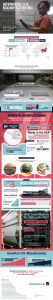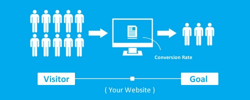

Driving traffic to your site isn’t the final goal but part of the overall process of converting site visitors into customers. You can have tens of thousands of unique site visitors per day and still not convert those customers into sales. In this post, I’m going to share some tips to help you turn that website traffic into a powerful marketing success story.
Testimonials
Collect testimonials from your satisfied customers and share them on your website. But don’t just stop there. A/B test your use of those testimonials for maximum impact. This can include where you place them on the page, what color the text is or even which testimonials you use.
For example, Wikijob (case study) increased their sales by 34 percent simply by adding optimized customer testimonials. Put your testimonials to work for you. The goal was to increase sales, but your conversion goals can be anything from social media shares to having visitors sign up for your newsletter.
Comscore (case study) was looking to increase visitor to lead conversion rates after finding low rates on lead capture pages – even those pages that included testimonials (a notoriously well-performing page tactic). To test the hypothesis that social proof could help to improve the conversions, Comscore tested three page versions including different design variations with the featured testimonial organization’s logo. Using a layout that prominently featured the logo increased conversion rates by 69% over the original version.
Read case study: Wiki Job & ComScore
Call To Actions
We all know having a call-to-action on your landing page is important. But there’s more – you need a well-optimized CTA. The best ways to learn about which CTA works from a marketing perspective is to partake in A/B testing and try out various versions of CTA – text colors, hover effects, CTA locations, and so on.
In one case study, Sarah Genner found that adding a stronger ‘NO’ below the CTA gives a better conversion.
My hypothesis was to make the YES picture almost irresistible painting the positive image of life with the product and the NO should be much stronger and give the prospect a negative aspect of life without the product. We launched a test for both male and females to test out the hypothesis. The results were surprising because when we first set out with this test we believed we would see significant changes in conversions on both male and female platforms. However, it seemed that we got an overall 12 percent on the muscle offer and only half at six percent on the diet offer.

On the other hand, Highrise found that there’s more than just having that call present; the wording counts. By testing variations of the typical “free trial” call to action verbiage, the organization found that by simply altering the language to “See Plans and Pricing,” they were able to grow sign-ups by 200 percent.
Crossfit gym had interest from visitors, but a lack of actual conversions. It modified its site to offer a call to action both above the fold and consistently on pages throughout the site. It modified its language to further define the benefits and what it offered specifically. This clarity resonated well, apparently, with consumers because the gym saw memberships rise at an average rate of 10 per month.
Read case study: Crossfit – Highrise
Industry Trends
Stay up to date on the latest industry trends. When you spot a trend, execute your idea quickly to catch the opportunity before it passes. If there is one thing that is constant about trends it is that they change often.
One example of a website grabbing onto a trend and doing well with it is when Amazon completely revamped their MP3 homepage within two hours of pop idol Michael Jackson’s death. Amazon is savvy about what makes customers tick, so it’s smart to watch what they do and learn from it. According to ARHG, Amazon may be running as many as 200 conversion tests at any given time on their site.
Trust Signals
Another thing you can do is to add trust signals. Quite simply, these are things that will make someone who doesn’t know you feel they can trust you. You can offer things like a free return policy, a 30-day full refund without questions, free shipping, or even a better logo designs.
There are also certain companies that you can get a good rating with that consumers naturally trust, such as the BBB and Consumer Reports. Moz offers a complete chart listing company symbols and the level of trust consumers have for those symbols.
According to study, Norton secured gives the best sense of trust when payi.ng online. Chart credit and study details – Baymard.
Simple / Closed Checkouts
Amazon offers an excellent example of the closed checkout model. A closed checkout is simply a place where all distractions are removed and the focus is on checking out and buying what is in your cart.
Is your checkout too busy? Will your visitor get distracted and click somewhere else before completing the sale?
PyramydAir conducted A/B testing on its checkout page to test ways to increase sale completions. In testing, it found that by simply eliminating a step of the checkout process, they were able to increase completion rates by 25 percent. It goes to show, simplicity still reigns.
Read case study: PyramydAir
Responsive Designs
We hear a lot about the importance of responsive these days. Walmart and TruckersReport are the proofs to the point.
Walmart turned its website responsive in 2013 and reaped the rewards to the tune of a 20 percent increase in conversions to sales. Of course they didn’t decide to redo their website without research – A/B testing played a heavy hand in the final design.
By analyzing the existing site in full, TruckersReport found numerous changes that would increase conversion rates. Beyond updating the headline and images, it found a greater need for responsive design (50 percent of its visitors came from mobile devices), credibility, and more. It redesigned its site and page accordingly and found a 79.3 percent rise in conversions – hardly chump change.

The new, fully responsive, TruckersReport site design created. by Conversion XL team.
Read case study: Walmart & TruckersReport
Special Web Functions And Effects
While you shouldn’t go crazy with special effects as they can bog your site’s load times down, a few here and there can grab visitor attention and help convert visitors to customers.
For example, a Hello Bar is very simple to add to your site. It will help you collect email addressed, point visitors to your social media channels or even drive traffic on to a specific page on your site.
As part of a site redesign, Blue Acorn completed A/B testing to optimize its pages. It learned many things, including a need to minimize manual data entry, a need to redesign and simplify its category page, and more. By implementing changes per the testing results, the organization increased the average visitor revenue by 17.1 percent, among other positive benefits.
Page Format
Have you ever visited a website that is so busy or disorganized that it is hard to read? You probably didn’t stay there very long, much less long enough to buy something. It’s important that you choose a visually pleasing and easy to navigate page layout and design that is easy to read online.
Utilize headers, sub-headers and bullet points. Make sure there is white space as well as text throughout. You will help reduce your bounce rate if your pages are easy to read.
Sometimes, even a bare bones version can go far, as SuperOffice discovered. In testing three different pages, it found its best performing version to be the super stripped-down version with the least content – a version that the company personally thought was too sparse. Had it not been for testing, they wouldn’t have likely used that version and wouldn’t have seen the 197 percent lead generation increase that it saw.
Separate Landing Pages
Don’t just have a single landing page. Offer different landing pages for different audiences you are targeting.
Voices.com improved their conversion rate by more than 400 percent simply by creating two separate funnels. Imagine how much more you could improve your conversions by adding multiple landing pages targeted at different user personas.
Tools And Suggestions To Help
Now that you have some ideas for things you can do to improve your conversion rate, here are some tools that will help you get there more quickly and make your work easier and more accurate:
Think Eye Tracking
![]()
Have you ever wondered just how effective your advertising efforts are? This can be hard to track, but ThirdEye can help by providing both expert designer consultations and user testing. The company has worked in marketing for many years and has statistics that will help you come up with a more successful campaign.
Google Analytics
There is a reason why most website owners utilize Google Analytics at least part of the time. It is an essential tool in understanding your visitors. You’ll find out what pages they are entering on, how long they are staying, what they click on while on that page and when they leave. You can even track conversions and do some basic A/B testing via this tool. Most of what they offer is free as well.
Web Engage
WebEngage is a tool that allows you to collect feedback directly from your customers. They utilize “hyper targeted surveys” and push notifications to gather the info you need to increase sales. It will help you improve in-site usability and engagement rate.
Click Heat
ClickHeat offers heat maps of a specific URL. This means that you can take a look at your landing page more closely and figure out what is attracting the eye of your site visitor. If it isn’t where you want them to click, you can easily make adjustments based on this information. This is free software and a good tool to see how visitors are interacting with your web page.
Concept Feedbacks
Not sure if you’re on the right track? You can get free advice and feedback from development professionals on this site.
Bottom line
Even if you only implement a few of these ideas, you’ll see a difference in your overall conversion rate. A/B testing is a must to see what is successful for your particular site and what is not, so that is one of the best places to start. Everything else just allows you to tweak your conversions a bit more and build on that success.
(280)