Believe it or not, your mobile website is the only version of your site some of your customers and prospects will ever see. In the United States this year, nearly one in 10 internet users will only go online with a mobile device. Fifty-one percent of consumers’ internet time is now spent on mobile, and 42 percent of B2B purchasers do product research on their phones.
It’s no longer OK to offer a “full” website for desktop visitors and a lesser site for mobile users. More designers today are emphasizing a mobile-first design process that starts with a core site infrastructure, then applies progressive enhancement to augment desktop experiences with more complex features.
Some of the key tenets of effective mobile web design in 2016 are:
- Cleaner, simpler page layouts
- Easy-to-use navigation menus
- Concise, compelling copywriting
- Lightweight images and media for fast-loading pages
- Task-oriented interfaces
- Touch- and tap-friendly buttons, links and forms
It turns out, these mobile design standards are great for larger screens, too. After all, no matter what device we’re using, everyone wants intuitive navigation, fast load times and content that answers their questions quickly and succinctly.
Let’s look at some business websites that have adopted progressive enhancement and mobile-first website design to provide customers an effective web experience whether they visit on desktop, tablet or smartphone.
1. SolarCity
Solar provider SolarCity serves up a consistent experience across all devices. On any screen, the prominent call-to-action urges visitors to see if they qualify for rebates in the area SolarCity services. The first three pieces of content address top user questions:
- How much do solar panels cost?
- What are the benefits of solar energy?
- Why switch to solar?

Image source: SolarCity mobile website
SolarCity’s site demonstrates progressive enhancement in action with its use of video backgrounds in the home page banner on desktop view (in browsers that support this feature) and static banner images on tablet and smartphone. This keeps mobile page load times snappy while adding a cool visual enhancement for more robust desktop browsing experiences.
In what’s become a widely adopted mobile standard, the small-screen versions of the site hide the navigation menu items behind the hamburger menu—that’s the icon with three horizontal lines stacked atop one another. Fonts are large enough to read on small screens; CTA buttons and form fields are large enough for real human fingers to tap and type into.
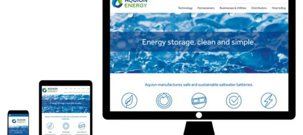
2. Aquion Energy

Aquion Energy develops saltwater batteries for storing energy on the grid. The company’s website reinforces its technology with a clean, modern look and feel. As an alternative energy startup, it’s important for Aquion to make it crystal clear to site visitors what exactly it does.
It describes its technology simply and concisely: “Aquion manufactures safe and sustainable saltwater batteries.” It offers clear paths forward for its primary customer types: homeowners and businesses. To help people learn more about its battery technology, it provides relevant case studies and diagrams, and links to buying instructions right from the home page.
The site has a satisfying simplicity with plenty of white space, and mobile users appear to have every bit of functionality desktop users have.

Image source: Aquion Energy
3. Acieta
Acieta provides industrial automation services, designing and building robots for use in industrial settings. Its site features flat design, tap-friendly CTAs and strong imagery throughout.
Since Acieta’s services are somewhat technical, the company wisely includes its phone number in the top right section on desktop displays and a prominent “Call” button on smartphones, helping site visitors easily talk to someone to get their questions answered. It also made the internal search feature larger on smartphones for quick access.

Image source: Acieta mobile website
In line with industry standard, the company logo in the top left serves as an easy navigational tool to let mobile users tap back to the home page at any time. The smartphone site uses a short, simple list of navigation menu items, while additional submenu items are included on larger desktop screens. All of these design choices are recommended in Google’s Principles of Mobile Site Design, a great resource for mobile best practices.
4. Kaber Technologies
Kaber is a consultancy offering engineering, design and prototyping services to industrial companies. Its one-page website demonstrates that sometimes less is more, especially for small businesses.
Like SolarCity, Kaber’s home page hero section features static images on mobile devices, with cool background videos swapped in on some desktop browsers for a more dynamic experience. The rest of the single-page site uses bold imagery from the firm’s key projects, brief copy explaining its services, and a simple and mobile-friendly contact form.

Image source: Kaber Technologies
5. Evernote
Evernote, a popular note-taking app, syncs your notes across all devices, so it’s no surprise its website looks great on any screen. It has focused on a lightweight feel with big, inviting CTA buttons and short, to-the-point copywriting.
The signup form on the home page couldn’t be simpler, with just two fields—email and password—for optimal conversions. Evernote has wisely kept its home page neat and uncluttered, free of pricing or promotional information.
When you dig into its Plans page for pricing details, the mobile site features a smart accordion layout above the scroll, which lets you quickly see that there are three plans to choose from. You can then click to expand and compare the features of each.

Image source: Evernote mobile website
6. Typeform
Typeform is a web-based app that helps you create great-looking, engaging forms, and it has carried its aesthetic across the website, which emphasizes beautiful, flat design and iconography, along with playful, succinct copywriting.
Typeform also showcases its platform’s capabilities across the site. The Meet the Team page is built with Typeform, and the Examples page (shown below) lets you explore more than 20 sample forms, with the added benefit of testing the tool’s functionality and UX on whatever device you happen to be using: desktop, tablet or smartphone.

Image source: Typeform mobile website
7. United Healthcare

Health insurance provider United Healthcare has a robust and information-rich website, but the company has managed to create a core site structure that doesn’t overwhelm on mobile devices and instead homes in on the most common user paths.
On all devices, it makes it easy to take key actions right from the home page, like shop for a plan, look for care, log into your account or search internally for the answer to your question. A shortened menu on mobile keeps choices limited to what’s most important.
As an insurance provider, form functionality is key, and they’ve taken care to ensure forms are easy to tap, type into and submit on mobile screens. There’s also a phone icon that follows you on mobile form pages so that you can easily call a representative for help.

Image source: United Healthcare mobile website
8. Scripps
Scripps Health is a private, nonprofit health system in San Diego, Calif. Like United Healthcare, Scripps provides a seamless cross-device web experience that focuses on key user activities and simple navigation.
There’s a wealth of health information on this site, but it’s tucked away with a straightforward site architecture, leaving the home page free to help solve people’s most common problems: finding a doctor, learning about a condition, paying their bill and finding a location.

Image source: Scripps mobile website
To learn more about how mobile-first design strategies can make your website work better for your business, check out our new eBook, High Performing Websites That Last: Going Beyond Growth-Driven Design.
Digital & Social Articles on Business 2 Community(70)