
15 seconds…that’s the amount of time you’ve got to captivate your visitors. We’re hoping that the average visit duration on your site is higher than that, and even if it is, what are people doing on your site? Are visitors taking a look at several of your pages? Are they adding products to their cart?
This post was written because we understand that without the proper homepage, your eCommerce business does not stand a chance to create long-term growth. It’s time to fix your homepage woes, and to do so we’ve evaluated the homepage of 27 different eCommerce businesses! Here’s what you can learn from these high-earning businesses on how to optimize your eCommerce homepage.
Optimized eCommerce Homepage Design
To minimize bouncing traffic, ensure higher conversion rates, and to generate more return visitors we analyzed the homepages of 27 highly successful eCommerce businesses. Some of them are billion dollar businesses traded on the stock market, while others are booming businesses that have built something (all make six-figure sales) out of nothing.
We’ll start from the top of the page and work our way to the bottom. Finally, we’ll note what the most common elements were – the things you must add to your homepage.
Slider or Single Feature Image?
The debate as to whether homepage sliders are helpful or damaging to your SEO and overall site experience is one we won’t decide today. However, they do seem to be out of date and out of place, at least based on expert opinion and case studies, like this study: 1% clicked a feature of the slider. Of those, 89% were the first position (source).
Eight of the eCommerce websites used sliders at the top of their homepage, with two sites adding sliders to the middle of the page to display sales. If you are going to use a slider, this is what these top sites are doing.
Sliders
Of the eight eCommerce websites using sliders on the top of the website, seven of them use arrows to point the visitor in either direction, while the one of them has no navigation option for the slider. Of the two sites with sliders situated in the middle of their web store, one uses arrows while the other uses small circles to guide navigation between the slides.

Example from Bonobos (side to side and down arrow)
What can be taken away? If you are going to use a slider, it should change slides automatically and also have arrows to enable the visitor to navigate at his/her pace.
Call to Actions
We are not involved in these business’ web design and testing decisions, however if we were running an eCommerce website that implements a slider, we would definitely test different CTA’s for the different slides. Of the total 10 sites implementing sliders, only one site decided not to use any call to actions whatsoever in its design. Odd.
The other 9 sites using sliders either employed different versions of call to actions on the various slides, with a couple sites opting not to use a call to action in one or two of the images. Only one site used the same exact call to action across all the slides in the slider.
Static Feature Image
If you don’t want to use a slider, then this is what the rest of the gang are doing with their static feature images. The large majority are using one main feature image with either one or two call to actions (some have two for two different types of customers (men/women), although there are two very successful retail businesses that have gone ahead and places two static images at the top of their web store.
For those using sliders, placing two static images side by side might be one of the a/b tests that you want to run on your homepage.

Awesome use of two different images side to side
Depending on the usage habits of your shoppers and who your target customer is, you may want to test the use of one or more static images placed above the fold against the use of a slider. You’ll probably see the later one generate a higher CTR.
“Sliders please the owner of the site, but they deliver little to no value to the customers. The reason is that we are not going to sit there and wait for your ‘movie’ to play out. I’m also not a fan of sliders because for most businesses they provide an excuse not to think about personalization and being good at giving the customer the right answer, right away.” – Avinash Kaushik, Digital Marketing Evangelist for Google, Author of Web Analytics 2.0
Social Proof: Reviews, Social Media Feeds, and User Generated Content
Here’s something that works without a doubt: social proof. 21 of the 27 sites used either one or more of the following on their homepages: Instagram feed with user generated content, reviews, product ratings, product stock status, press mentions, and recent purchases, and of those that did not implement any UCG, four are either backed by venture capitalists or already traded on the stock market (they don’t need as much social proof).

Fit Girls using UGC to optimize CTR
Why is social proof so popular? Social proof works!
User generated social proof, which includes user images on social media and reviews – is interpreted by the visitor as more honest and trustworthy (there is no motive behind it). The visitor that see or reads the user generated content tends to see themselves in the other person’s shoes. Shopping for product ‘A’, I can relate (or want to relate) to someone else that has bought the product.

Gap, a billion-dollar business, has added UGC to their homepage
Another type of social proof found on these business’ websites is “crowdsourced” user generated content, or as you are probably familiar with it, ratings. Ratings reflect the aggregate feelings of a large portion of your customers, again creating a semi-personal connection between your visitor and the product that they’ve yet to purchase (but will shortly).

Birchbox displays product ratings and shows how many customers ranked the product
It’s all about creating trust at first sight (just like love).
Promote Products or Categories
On your homepage should you be promoting your product categories or several (or all) of your products? We won’t decide for you, because there is no one definitive answer (just like slider vs. static image).
Of the 27 eCommerce homepages we examined, 11 promoted specific products on the homepage, 9 promoted a collection, while three homepages had no other product/collection CTA, other than their menu and slider/feature image. Finally, four of the businesses promoted shopping the entire site. You need to run split tests on a homepage with product categories vs one with product listings and see which converts to more sales.
What we will take a look at is how to develop a homepage that promotes categories and how to promote one with product listings.
How to Promote Products on Your Homepage
How do these successful brands promote products on their homepage? First and foremost, they all have the product images placed on whitespace. With the high quality images, these business’ place product prices below the image (two business did not add prices to product listings on the homepage).

Simple can do more for you than you think
Aside from placing the price below the image, all but two of the homepages decided not to add a call to action to the product image – not below it and not when you scroll over the image. Of those promoting products on the homepage, more than half of them added social proof to the product listing itself.

Fit Affinity keeps it simple: ratings (w/amount of reviewers) and price mark down (and CTA)
There is nothing that makes us confirm our want to purchase something than social proof. When booking my next vacation I read countless hotel reviews, and even went ahead with a more expensive plan. Why? I don’t want to take the chance that I’ll receive something less than stellar. The same thought process runs through your customers’ minds; they don’t want to risk buying something that does not meet expectations.
How to Promote Collections on Your Homepage
All of the businesses that chose to promote a certain collection or numerous ones did so by adding an image and a call to action. Using visuals to enhance branding and increase conversion rates is nothing new, and always something worth testing on your homepage.

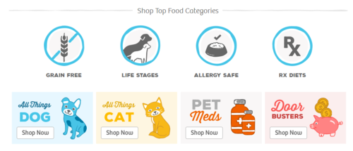
PetFlow promotes their product categories on their homepage
Common Elements
White Space
This should not come as a surprise, but just so you know: all of the websites that we analyzed use a white background and white areas at some point or another on their eCommerce business’ homepage.
Why do these websites do it? If you are not incorporating white space on your site, now is the time to add it. White space works because it allows you to direct attention to your call to action by giving your prospect’s eye only one thing to focus on.
They Promote sales (don’t hide them)
In business, profit margins are important, so naturally you’ve probably set your prices high enough so that when you offer sales and discounts you are still making a profit. Naturally, sometimes you might worry about offering a sale both because it can decrease overall profits and because it can dilute your brand’s value.
These successful businesses don’t shy away from offering or promoting some type of discount on their homepage. Of the 27 sites we took a look at, 16 of them promote sales on their homepage, either by using a coupon popup, by marking down prices on the product listing, or by adding static images for the entire shop or a collection promoting the sale.

Both Brayola and Gap promote deals on their homepage without shying away
The bottom line is that unless you are Versace, Bebe, Louis Vuitton, or some other high end brand, there is no reason not to begin testing the effect of homepage-promoted sales on your eCommerce website.
Call to Actions
How do these successful businesses use call to actions on their homepage? Aside from placing them on the slider or static feature image, what else can be learned? Other than three sites, all of them used rectangular buttons for their CTA. Nothing surprising here.
Dollar Shave Club and Dollar Beard Club each used a version of a rectangular shape, but edited to be more arrow-like.

Call to Actions on Dollar Beard Club & Dollar Shave Club
Call to action takeaways: frame it, rectangles seem to lead the way, use either transparency, white space, or your brand colors inside of the call to action, make it an action, and don’t shy away from creating a ‘creative’ call to action.

Try using a different, more creative call to action (not just ‘Buy Now’, ‘Shop’, etc.) – Bonobos
No Text, More Images
Notice very little text on the page. The most you’ll find is toward the bottom when promoting the story behind their business. Visuals get the job done! Harry’s, Dollar Beard Club, MVMT Watches, Raw Generation, Bolder Band, Ugmonk, Inu Inu, and Greats all understand this concept; all eight of those businesses go ‘diet on the text’ and have hugely profitable businesses on their hands.
Optimized Homepages Promote Content
One of the most important things a business can do is to create content that connects customers to the brand. Interestingly enough 20 out of the 27 sites promoted some type of content – blog, look books, success stories, video tutorials – on their homepage, and I know for a fact that a few of the others create awesome YouTube videos (but they are not pushing that on their homepage).
I don’t know for a fact whether the content came before these businesses started making boatloads of cash, or if it was after (kind of like the chicken and the egg question: which came first?). Regardless, there is no doubt that creating content – the right way – can help deliver sales.

Onzie using content to promote their products
Go Optimize Your Homepage
Do you want people to just ‘window’ shop or do you want people to actually take a few steps into your store? You want them to step in – scan over your products or collections – enjoy what you have to offer and make a purchase before leaving.
To get more purchases, the first step is to optimize your homepage. Remember, we as humans have a tendency to judge things based on how they look from the outside (“don’t judge a book by its cover”) so don’t harm your business by creating a homepage that get laughed at and never looked at again.
Digital & Social Articles on Business 2 Community(103)