A well-designed form is an important interaction between your business and a potential lead. If your form causes friction with users, you could be turning away potential business. It could be as simple as too many fields, or worse, a poor mobile experience. Whether it’s a simple newsletter sign-up or a complex product purchase, a form should be easy to understand and easy to complete.
Want to squeeze more conversions out of your form? Make sure you aren’t making any of these design mistakes:

Labels
Avoid placeholder labels
Placeholder labels might look sleek and minimal, but they can hurt the user experience by making things a bit confusing. Say you get interrupted filling out the form — placeholder labels make it tough to remember what was supposed to go in the active field. Was it first name or full name? Was it phone number? Did it have dashes? Periods? Screw it! I didn’t want to sign up anyways.

Top-align labels
Your form labels are easier to read when aligned to the top of fields. Top-aligned labels require a single eye fixation to take in both input label and field, making it faster to complete. Top-aligned labels also provide more horizontal real estate which works better responsively for mobile devices.

Avoid all caps
Did you know lower case letters are easier to read than capitals? It’s true. That’s why you should steer clear of using call caps on your form. While labels are generally just one or two words, the easier they are to read, the easier it is for users to complete the form.

Cut down on mandatory fields
Give users the option of what information they want to provide by cutting back on the number of mandatory fields. Not only will this will reduce clutter in your spreadsheets, but it also comes off as less forceful.
In today’s privacy-sensitive landscape, asking for a birthday or phone number can feel invasive and turn potential customers away. In fact, Clicktale discovered simply having a Phone Number field can reduce conversions by as much as 39% — even when the field is optional. So, save your mandatory fields for the information you can’t live without. Everything else should be optional or removed altogether.

Fields
Use a single column
Single column forms are much easier to read and have a smoother flow than two-column forms. A study by CXL Institute found participants completed single-column forms on average 15.4 seconds faster than multi-column forms. This might not seem like a lot of time, but as you’re starting to see, these fine details add up and can make all the difference.

Group common fields
If your form is on the longer side, try grouping fields together that are related. This will help organize the form into more digestible sections, making it less daunting to the user.

Use intuitive field lengths
Tailor field lengths to the information you’re looking for or expecting. For example, if something only requires 6 or 7 characters like postal code, don’t use a field length that fits 30 characters. This limits the guesswork by showing users relatively how much information they should be giving. Furthermore, it should lead to shorter fields and a less crowded form.

Provide input examples
Depending on the question, providing an input example will show users what they should submit and how they should submit it. For example, an email field with the placeholder “name@company.com” shows you’re looking for a work email rather than a personal one. A name field with the placeholder “John Smith” shows you’re looking for users’ first and last names.

Provide positive feedback
There’s nothing more frustrating than a form that doesn’t go through and then fails to specify why. Let users know if they’ve missed a step or submitted incorrect information by using inline form field validation.
Consider your messaging. Something like “Please use DD/MM/YY” addresses the issue in a polite and constructive manner, whereas “This information is incorrect” is not only vague but implies your user doesn’t know their own birthday.
Apart from this, be sure to show a confirmation message when a form is submitted successfully. Otherwise, you can expect to receive multiple submissions from the same person as they try to figure out if the damn thing worked or not.

Content and layout
Break up long forms
Beyond grouping similar information, consider breaking even longer forms into steps. We’ve talked about the benefits of two-page forms before, highlighting how they’re less intimidating, take up less space, and more. Including a progress bar or state of completion is a nice touch that lets users know where they are in the process. Just don’t forget to add navigation buttons!

Use descriptive titles and buttons
Sure, forms aren’t the most exciting part of a website, but that doesn’t mean you can phone it in when it comes to copy. Use attractive value propositions to push users to complete your forms. Titles that inspire or provide incentives will go a lot further in pushing users to convert.
CTA buttons with strong command verbs are more definitive and tell users exactly what they’re doing. According to Hubspot, buttons labeled with “submit” tended to have lower conversion rates than those with different wording. When you stop and think about the implications of the word, it makes sense why something like “Sign me up!” performs better.

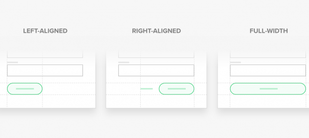
Consider button alignment
We naturally read left to right so left-alignment is best for quick readability. Right-alignment, however, is best used when your form has multiple stages, as it will communicate moving forward. For mobile, I recommend using full-width buttons to make them easier to reach and click regardless of the device.

Make it mobile-friendly
Having a great mobile experience should be an absolute no-brainer by now. If you want to maximize form submissions, make sure your forms are legible and present well on mobile so you don’t lose potential leads. This could be anything from reducing the number of fields to enabling auto-correct and autocomplete.

Always test
Best practices and trends are constantly changing. What might work today may not work in the future. As we’ve seen, even a small design change can dramatically improve results. Try these tips and test at each step to see what works best with your audience.
Business & Finance Articles on Business 2 Community
(117)