In the blog I posted yesterday, I described the different functions of CTAs and where they might be placed on the web. To quickly recap, CTA stands for Call-to-Action, and it is a way for you, or your business, to generate leads by directing your website visitors to take a specific action. CTAs have many different purposes, and, similarly, they can come in many different shapes and sizes.
Today, I want to go further in depth on CTA design, some essential parts of a CTA, and general best practices to keep in mind when creating CTAs. To do this, I’m going to use one of Quintain’s CTAs as an example.
Personal disclaimer: Some elements – like the description and offer – may not be as necessary as others, but I find them helpful in making sure your audience knows what you are offering.
1. Title
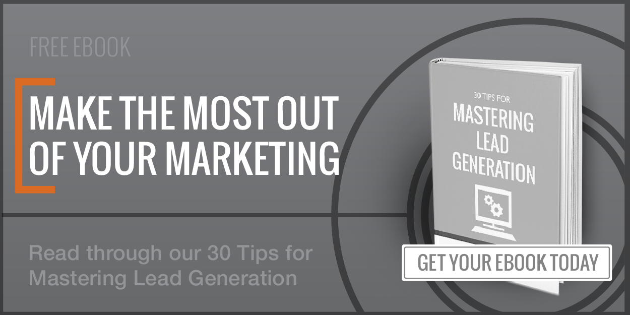
The title of your CTA is one of the most importent elements and is designed to immediately grab the viewer’s attention. It can be the actual title of the piece of content you are trying to promote (if that is the purpose of your CTA), a 5 word statement of what the offer is, or a question to get your visitor thinking or pique their interest. I personally like to change this up a bit depending upon the content and the purpose of the CTA.
Normally, the title space will simple reflect the title of your content. For example, instead of “Make the Most of Your Marketing” I could have written “30 Tips for Mastering Lead Generation.”
Sometimes it makes more sense to have a brief declaration of what this content will do. When creating CTAs, I like to imagine that there is no explanation of the content beneath, and that there is just this title. What should it say? How can I best capture the interest of my audience in as few words as possible? When doing this, it is helpful to have audience personas that you can draw upon.
My solution is to create a title that gets to the heart of the content I am promoting, and to tell everyone why they need this – how it will benefit them.
2. Description

Unless your CTA is a tiny button, you should have room for a short description. Unlike the title, you have a bit more wiggle-room with the description. If you didn’t use the title section to share the actual title of your content, you can use the description to do so instead.
When writing your description, be straightforward. No gimmicks, just a clear statement that follows up and further explains the offer. Make sure your audience has a good idea of what they will get if they download your content.
As a helpful rule, I like to limit CTA text much like I would a tweet (its amazing how that 140 character limit forces you to be concise!). In the case of CTAs, a general rule of thumb is to keep things simple by having a total character limit under 100, including the title, description, and offer.
3. Offer
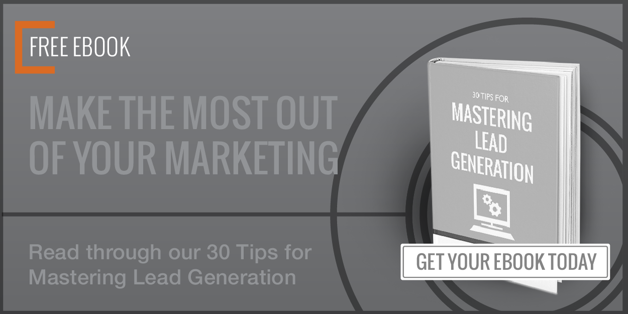
Visitors are more likely to convert on your CTA if they know exactly what it is they will get. What are you offering? Write it out in the most simple of terms.
In our example here, it’s just “Free EBook” – simple as that! And again, you may not find this to be such a necessary detail in your CTA, but it drives home the point that you have great content and you are giving it out for free (everyone likes free things!).
4. Button
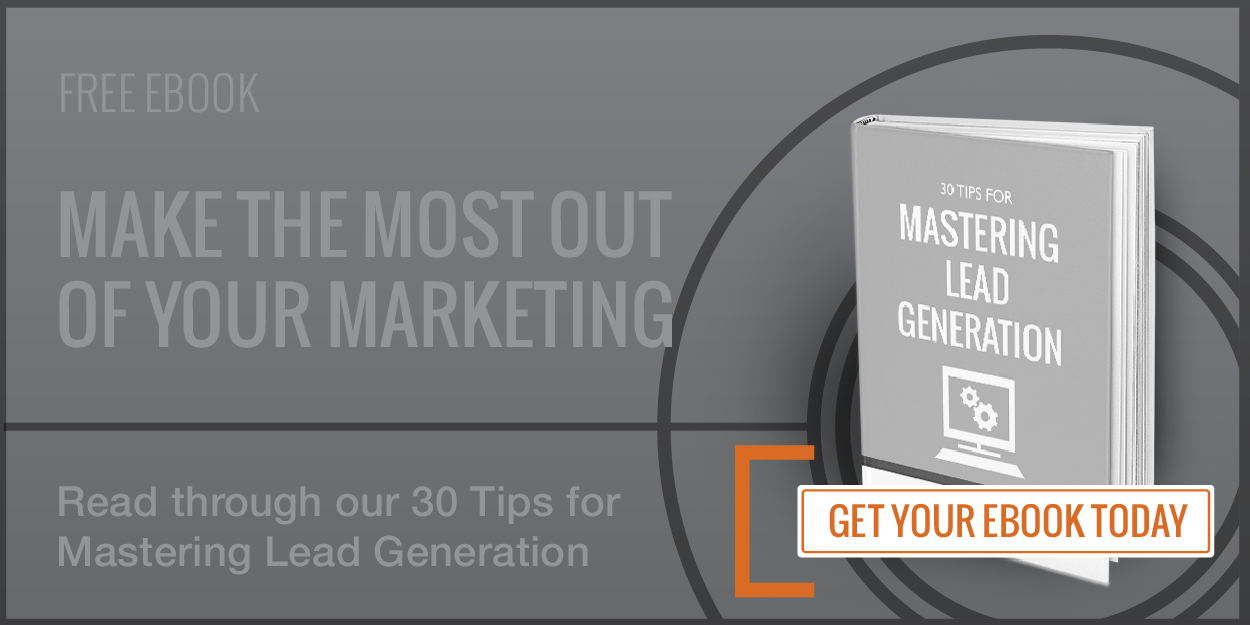
Now, pay close attention! Even if you have nothing else for your CTA, you must have a button no matter what!
Why? Because the button IS the CTA. It is the actionable item that gives your audience a direct order to follow. It is the next step they need to take.
A simple “Download Today” button creates an urgency about your offer – whether or not it is a limited deal. Your CTA button demands to be clicked, and to be clicked NOW. It’s bossy like that.
5. Key Visual
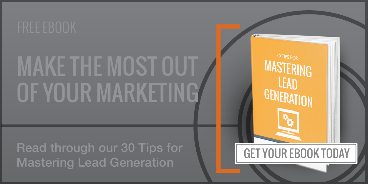
“Visual” is a bit of a broad term, because this can cover photography, icons, or thumbnails of content. Think about how blogs tend to have a key image that can be used all over the web – on all sorts of social media sites – as a representation of that blog post.
CTAs aren’t very different. It’s great to have one singular image or icon that gives your visitors a visual clue as to what they are looking at or what your content entails.
For something like an ebook or checklist, I like to create thumbnail images to represent that content. It gives visitors a better idea what the offer is, and helps them relate your free digital content to something that is tangible and valuable, like a hardcover book.
There are many great book templates available online that you can easily edit – usually in Photoshop. Some mock ups are free to download, but if you are looking for something more specific, sites like Graphic River have many great resources for sale.
6. Color
One of the quickest ways to pull in possible leads is to highlight important information with colors that stand out. Most websites have white backgrounds, or something close to white, and a bright splash of color is an easy way to draw attention.
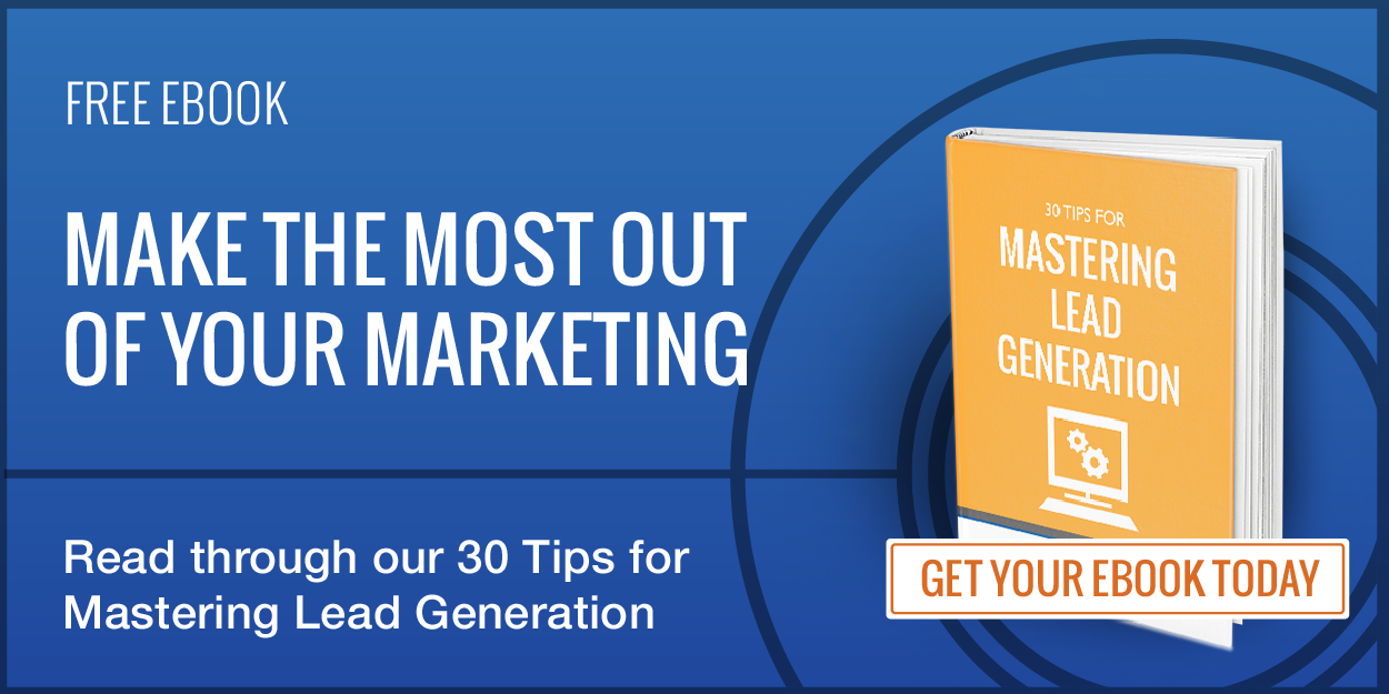
More importantly, you need to be sure that the elements in your CTAs have good color contrast. In the example CTA we’ve been using, the orange of the thumbnail sticks out from the blue background. The white text is clearly visible against the blue, and the button also utilizes the orange so that it doesn’t blend in too much.
7. Typography
Like color, good typography can mean the difference between being inviting, being an eye-sore, or yelling at your audience. Your most important, actionable items – like your buttons – may be great in all caps. But setting every single line in all caps might not be as great an idea.
I MEAN, REALLY, DOESN’T A WHOLE ALL CAPS SENTENCE JUST LOOK LIKE I’M SCREAMING AT YOU?
Not only that, but too much text can hinder legibility. Any textual emphasis – bolded, italic, all caps, etc. – should be used in moderation. Make sure there is a hierarchy to your design. The largest text will usually draw the most attention – after any images, of course.
Conclusion
Like I’ve mentioned before, CTAs have a range of purposes and styles. While you will be tailoring your CTA to fit your brand and your needs, it’s important to remember that practice makes perfect.
In the case of CTAs, at least, this means testing out new designs, new placements, new colors even. Do a few A/B tests to see what your audience responds better to. Perhaps, after all, testing (and not practice!) makes perfect.
(293)


