
The ecommerce design and layout of your site can have a major impact on sales. Usability is extremely important. If customers can’t easily find the products they’re looking for, there’s little chance they’ll dig through your site for hours when they can find them somewhere else with an easy Google search.
But, it’s not just about getting your customers to click that “Add to Cart” button. Your ecommerce site needs to provide the right information at each stage in a customer’s buyer journey, helping them to make informed decisions in their research, interest and validation phases.
The following seven tips will guide you to creating a useful, engaging and beautiful ecommerce website that does just that.
1. Clear Calls to Action
The most coveted space on an ecommerce homepage is the top featured banner space. More often than not, a slider occupies this space. However, do you really need a slider on your homepage? Don’t just include three to five slider images on your homepage because everyone else is. Make sure the action is clear and that these images are highlighting a hot product or category, promoting a sale or highlighting some unique aspect of your products or brand. Give people a sincere reason to click that will increase customer trust and loyalty, rather than filling that space with clickbait or irrelevant content that wastes a user’s time.
If you have a relatively new or unknown brand, you might consider ditching the slider and going with a static image with text that lets visitors quickly know who you are and why your business exists. This is a great moment to drive home your business purpose and earn customers based on mission statement alone. You could also highlight one category or action with this single image approach.
Whichever approach you take, it should be informed by user testing beforehand and/or heatmap tracking post-launch to ensure that you are truly helping the user complete their task(s).
Now, let’s look at a couple examples of brands utilizing a clear call to action
Patagonia makes good use of their slider by showcasing new products, promoting seasonal and popular items and announcing a charitable project they are working on. All images in the slider are big, bold and eye-catching, helping to pique the customer’s interest and create an emotional connection.

REI on the other hand uses their featured slider area to highlight one category and user action. If you have two or more pieces of potential slider content, you might consider placing them as banners throughout the site, instead of in a single slider. Many studies show that users often do not hang around to click through a slider –– so your second, third or more promotions may not receive high impressions or subsequent clickthroughs.

2. Include Several Large, High-Quality Images on Product Pages
Allow your customers to get intimate with product details and design. Show your product from several different angles, and highlight any important or unique features.
Incase does this well on their product pages. They include images of the front, back, sides and inside of their bags and cases. They even include images from customers, which can highlight different angles or show products in real-word situations, like the bicyclist wearing the Incase bag in the image below.

3. Test Lifestyle Versus Product Imagery
Some brands (e.g., furniture, clothing, outdoor gear) may have more success showing off products in real-world settings. This can provide suggestions for customers as to the product’s design or use, and allows for a more emotional connection.
Other products, those that are more technical or mechanical (think computers or gaming consoles), may be better showcased on a white background so that product features and details are easier to discern. To truly know which type of imagery is best for your brand, you can use A/B or multivariate tests to see which performs better.
Betabrands shows each of their products in various real and sometimes silly settings so that customers can not only see the fit but also connect with the experiences in the image.

4. Show Related Products
Merchandise products by showing similar products, products viewed by other customers or related parts and accessories.
Fly fishing company Redington showcases related and popular products in a simple, elegant format at the bottom of each product page.

5. Show Customer Ratings for Various Product Features
In addition to having reviews on product pages, a unique and useful way to provide customer feedback is to show additional product information. For example, include a scale for “runs true to size,” “actual colors match online swatches,” etc. This lets customers know exactly what they are getting at-a-glance, and may reduce negative reviews in the future.
ModCloth does this with all products, as seen with the “Fit,” “Width” and “Quality” scale in the image below.

6. Create Intuitive and Useful Site Navigation
Organize products into categories and subcategories that make sense. Allow users to easily find what they are looking for and drill down for more products. On average, you should have no more than five to six parent-level categories.
If you have more than five or six, consider consolidating into broader categories. Remember, a user will not always be viewing your ecommerce store on a large screen. It’s more likely that they are using their mobile device and less navigation will make that experience more friendly overall. As with most of the other recommendations here, this is a great area to conduct some user testing and/or keyword optimization.
Nixon’s navigation is separated into new products, men’s, women’s, watches and collections, and subcategories are organized into featured items, watches, accessories and clothing.

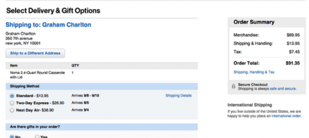
7. Checkout
This is obviously an important element of an ecommerce site. If poorly implemented, none of the previous elements will be of any use. There are many factors that contribute to a great checkout experience. The most important ones are speed, guest checkout option, easy form filling, progress indicators and persistent cart summary.
Crate & Barrel has a nice checkout process that gets out of the user’s way by splitting the forms into clear steps and proving a persistent summary of the order. The user interface is also clear of distractions that could pull the user away from checking out.

With all of these elements, you should test and iterate –– don’t just take our word for it. Test various different ecommerce design elements to ensure you’re getting the most from your ecommerce site. Every business is different and it’s possible you will stumble upon new best practices during your A/B testing.
A/B or multivariate testing is a cost-efficient and effective way to truly know what works for your site, and what your customers want to see. An ecommerce site is never truly complete. The goal should be to always be refining the path for the user to get the information they need and complete their task efficiently.
Digital & Social Articles on Business 2 Community(106)