Generating a large number of conversions from a PPC landing page doesn’t happen overnight and all ppc experts agree. There are specific elements that turn curious visitors into loyal customers and many mistakes that turn them away just as quickly. A landing page that converts and reduces your cost-per-click, requires a clean, balanced design that makes people want to take advantage of your offer.
Don’t give up on users who left
Make sure you follow up with users who left with emails or with targeted ads. To follow your users across the web with targeted ads (otherwise know as retargeting) – you would need to sign up with a retargeting company and setup a few codes on your site. Its fast and simple and should provide you with more conversions over time.
Be Consistent with Offers
When people click through to your landing page, they product or service they see has to be the same one promised in the original ad. Whatever keywords they used in their search should appear in context on the page to create consistency throughout your campaign. Any other steps necessary to complete the conversion process must also be relevant.
Use Copy that Shows Benefits
Landing page headlines and copy should show visitors how following through on your offer will help them. Use the headline to state the benefits and the copy to answer the questions that prompted them to search for your product or service in the first place. Include testimonials from satisfied consumers or the logos of businesses that are loyal customers as “social proof” that what you’re selling delivers on these promises.
Have One Clear Call-to-Action
Although visitors get to your landing page via a specific search and a keyword-rich ad, design your call-to-action as though they have no idea what to do when they get there. Whether you’re selling a service or offering a free incentive, make the next step as easy to understand as possible. If you want them to fill out a form, make sure that the cursor is ready and waiting in the first box. Use button text that tells visitors what they’ll get once they click through and conveys a sense of urgency about the offer.
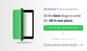
Direct the Eye
Also called “directional cues,” elements on a landing page that draw a visitor’s attention to the next step are critical if you want to increase conversions. Your CTA or “buy now” button should be the first thing that people look at when they arrive. One of the best ways to ensure that this happens is to use images of people making “eye contact” with your CTA. Using a single arrow is also an effective technique.
Stick with Simplicity
Keep the design of your landing page simple so that key elements stand out. Avoid excessive text, unnecessary images and links to other pages. A landing page should focus only on the fulfillment of the offer that visitors clicked on your ad to claim. Social media icons, menus and other fundamentals that are important on regular site pages and blog posts will clutter the design and detract from your CTA. Everything on your landing page should relate directly to the conversions you’re trying to create.
Incorporate these elements into at least two variations of you landing page. Run tests to see which design generates the most conversions, and continue making tweaks until you get the performance you want.
Digital & Social Articles on Business 2 Community(83)