
Marketing is at its best when campaigns, tactics and strategies are built on research.
Of course, in our industry, the word “research” covers a lot of ground. It could mean searching for gold standard campaigns and modeling your plan on a best-in-class brand’s success story. It could mean shaping your approach based on evidence-based reports or statistics. Or, it could be informing your campaign through your own primary research, via A/B testing.
For our purposes, A/B testing compares two versions of a Web page to see which one performs better. Basically, the process allows us to figure out which version brings in the most conversions.
Small changes can make a big difference in marketing. A few minor modifications to design, messaging or timing can lead to major gains in conversions. By using a measured and strategic approach to deploying these changes (and keeping track of what works) you won’t just make an impact on your current campaign – you’ll create a roadmap for success in future projects.
To help, here are the top four pieces of website real estate primed for A/B testing:
#1. The headline
Your headline is the first thing visitors see when they land on your page. When a visitor reads your landing page headline, it’s important they know what to do next. Don’t be afraid to spell it out for your users – they’ll appreciate your clarity and will pay you back with dividends.
Let us be more specific, readers require content that is clear and helps them acquire information quickly. If the content on the page provides the reader with the information they’re seeking, the reader is likely to follow the flow of the page – which is usually to your CTA – “download the whitepaper”, “try a free trial” or “speak to customer support.”
When Mozilla Firefox changed its call to action from “Try Firefox 3” to “Download Now – Free,” it outperformed the original by 3.6%, and had a confidence level of over 99%, resulting in 500 more downloads during Mozilla’s testing period.
#2. Your lead capture/generation form
A/B testing can help improve your form’s conversion rate. And, improving your conversion rate means more submissions from your visitors, equating to more leads and more sales.
Try testing one form layout and design against another, and then measure their effectiveness in getting submissions. Or see if a form with added value (like a contest entry form or a survey submission) outperforms your tried-and-true contact form. The 2015 Form Conversion Report found that contest forms convert at a whopping 35%, so odds are good you’ll see an impact.
#3. The call to action button
For most marketers, getting a visitor to click the CTA button is the end goal. With that in mind, spend some time testing which button delivers the most conversions. Change the color to an attention-grabbing hue, or add some minor animation. Or, try variations with specific, motivating text that communicates your unique value proposition and drives people to take action.
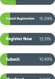
Having a hard time deciding what words to use in your button copy? Keep it short. Formstack’s top 10 converting buttons all contained two words or less. Specific is better, too: Adding just one word after the word “submit” can boost conversion rates by as much as 320%.

#4. Photos or videos
Human beings are hard-wired to be visual: 90% of the information that comes to the brain arrives via our optic nerve, and that visual data is processed 60,000 times faster than information our brain receives in text form. That makes Web images a powerful tool for marketers, when used correctly – and a prime target for A/B testing.
Assess which image performs better or try assessing whether a page brings in more conversions when the image is omitted.
So, why even test an image-free page, if they resonate so strongly with site visitors? Because if images aren’t leveraged properly, they can actually hurt your conversion rate. For example, if an image pushes your form down the page, it can cause frustrations for mobile users and distract visitor attention away from the form.
Each of these elements delivers optimization through A/B testing , but it’s important to test only one variable at a time, or your conclusions could be skewed. Choose the most critical element to test, and then be patient!
As a final note: Don’t dread the process. Testing can be fun, and the experience will provide your marketing team with hard data to inform decisions – not hunches.
(329)