The following article was contributed by Elena Mintzias, Senior Production Designer for Lyons Consulting Group, an e-commerce digital agency. Elena has a background in graphic design as well as search engine optimization. Her wide range of skill-sets comes from involvement in a variety of client-related projects as well as in-house experience. She has a passion for art and design and is a big fan of Michigan football. The original article can be found here.
You’ve spent a lot of time and money optimizing your e-commerce site to attract customers. Now the job of converting a visitor to a buyer comes down to how well your product pages work.
Think of your product page as the online equivalent to a store associate. Its design should perform tasks similar to what a live salesperson would do. As noted in a blog from Econsultancy, an effective product page should address these objectives:
- Reduce distractions/focus a consumer’s attention
- Appeal to various buying stages
- Satisfy various buying motivations
- Answer questions to build confidence
- Make the desired action simple and obvious
Let’s take a look at three best practices for an e-commerce product page that will help move a visitor along the purchase path to check out.
1. Keep Key Information High on the Page
Product pages don’t fully render when they load. So it’s important that a user gets key information fast so they know they’re in the right place (that the page actually is displaying the item that they’re looking for, and that they can take action).
Place product name and information, cost, selection/size and images high on the page. This space, generally about 700 pixels from the top of the site header, ensures that key information appears on the first screen.
Keep the “Add to Cart” button front and center. Call-to-action buttons need to be clear and consistent, and they need to stand out. You want to make it as easy as possible for a shopper to make a purchase.
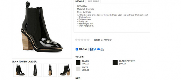
Crafting a balance between imagery and product information is crucial. Avoiding visual clutter (too much information) will help the visitor focus on the product. Another reason to avoid clutter is to make sure your product page loads quickly. Here’s an example of a good, clean layout that’s clear and actionable from men’s shoe designer Allen Edmonds.

Be Responsive
You also need to consider how the information will render on different screen sizes. With mobile usage surging, scrolling requires that information to render in a way that it guides the user down the page. Remember to provide ample space between page elements to allow for easy tapping.
Let’s look at an example of a product page that could use some improvement. This screen shot is from a laptop. Note how the “Add to Cart” button as well as size information are cut off.

When you have a larger view, you can see the call-to-action button is the same size and color as the “Find in a Store” button. This lessens its visual impact.

2. Improve Scan-ability with Negative Space
Visitors scan a product page to determine if it’s of interest to them. A user wants to find key information fast.
The white space around page elements guides a visitor’s eye. It helps them easily find what they’re looking for, and can communicate what content is most important by creating a visual hierarchy. Consider the amount of white space around an action button as a way to make it prominent.
Not only is a cluttered page unattractive, but it’s also hard to read. It also takes longer to load a content-heavy web page. So for the sake of page speed, keep scan-ability in mind.
At the same time, too much white space can make information seem to float on the page with no relation to other elements. This makes it difficult to know what content is important. So, striking a balance between the amount of content and white space is key to a good product page design.
White space doesn’t just refer to the areas around content or images. Margins, line and letter spacing, and the padding around text columns, are also elements of white space.
Here’s a good example.

And here’s an example that could use some work.
In the example below, take a look at the product name; it’s too close to the product information. The spacing is the same between the descriptive information, which makes it hard to determine what information is most important. Note how price, color and size information seem to be less important since they appear so far from the product name. (Bonus points if you noticed you could almost miss the “Add to Bag” button.)

3. Make Maximum Use of Brand Imagery and Video
If you sell products that depend on looks, you understand how a photo communicates more effectively than copy. So grab a shopper’s eyes with great brand images to help increase conversions.
(Editor’s note: An even more powerful idea is to complement your branded images with lifestyle content sourced from your community managers, store associates, influencers and customers. Editorial-style content that depicts your products “out in the wild” frequently increases conversions, shopping cart size, and ultimately, revenue.)
Because an online shopper can’t touch or try on an item, you should supply them with a lot of visual information to convey color, size, style, shape and selection. Striking product imagery and video can reduce purchase anxiety and increase conversion. Make sure to make use of the following:
- Action shots or photos of real customers in a fashion item work particularly well.
- Capture multiple views and angles to simulate viewing the product in person.
- Use a zoom or 360-degree feature to highlight product features.
- Show decorative items in a setting that mimics real life.
- Adding a video that demonstrates the product can increase the conversion rate by 64%.
In this example, the video plays in-line with the other product images and gives the user a good idea how the shoes fit on the model.

Prioritize Quality
The quality of your imagery and display matters. If you’re selling a $ 4,000 sofa or a set of Ping golf clubs, you’ll want to convey why such an expensive purchase is worth the investment. Even regular-priced products benefit from first-rate photography. (Remember you’re competing in every way for a sale.) While good photography requires planning and financial investment, it’s well worth the time and cost.
If the product is available in multiple colors, the main product image should be available in those colors. Make sure the page updates as the user selects the respective color option. Not only does this create a good user experience and keep a visitor on the same page, but it also is an SEO best practice since it avoids duplicate content.
Another benefit of appealing product photography is that it encourages social sharing. This approach helps improve customer engagement, conversion and word-of-mouth branding. (Editor’s note: An excellent way to promote social sharing is to make every image pinnable, not just the default image.)
Lastly, product videos can rank in search engines. If the video is optimized properly, it can drive additional traffic to the site and possibly result in new customers and sales.
Closing Thoughts
Product pages can make or break your e-commerce website. Their design should help convert as many visitors into customers as possible.
Remember, your competition is only a click away. So make sure your product page follows these three best design practices.
- Keep Key Information High on the Page: Let visitors know they’ve come to the right page.
- Improve Scan-ability with Negative Space: Make it easy for them to find the information they need.
- Make Maximum Use of Brand Imagery and Video: Depict the product in the best possible way.
(178)