 There are many different aspects to an eCommerce website – the homepage, the product pages, the header, the imagery.
Each is important in its own right.
At the end of the day, though, the point of an eCommerce site is to get a user to take an action.
Therefore, one of the most important aspects of your site (if not the most important), is an effective, well-placed call to action (CTA).
Call to actions are those buttons, links, and images that you want your users to click on in order to get them to shop, buy, upgrade, sign up, etc.
Without a good CTA, unfortunately, your site will probably not perform very well.
Lucky for you, it’s not too hard to add a CTA…oh yeah, and I’m going to show you some absolutely awesome tips for putting together the best call to action for your site.
The Wording Matters
We’re going to look at the two main aspects of any call to action – the wording and the design. So, let’s gets started with how to make your CTA wording really count.
1. Make it Clear
The first rule of CTAs is to always make it abundantly clear what will happen when the user clicks on the button.
If your button is leading to a payment page, you don’t want the text to say something like “Click Here,” because someone might see that and think, “Click Here, and then what? Where will this link take me?”
Instead, try to have something nice and clear like this:

2. Make it an Action
As per the name, the goal of your CTA is to in fact call your users to do an action – so that means that you should actually be calling to them. Tell them to do an action. Use an action verb.
How does that translate into practice?
Rather than writing something like “Products” as your CTA to take people to your products, consider using something like “Shop Now,” because it actually tells the user to do something, rather than merely stating what will be at the other side of the link.

You can get creative with your “action words” too if it fits your brand voice.

3. Throw in some “I”s and “You”s
Using an action verb becomes even more effective when you add in a “subject” that the verb is addressing. Rather than “Shop Now,” you could write, “Get Your New Clothes.” This makes the call to action more personal.
Another cool thing that a lot of eCommerce shops have started doing is actually using the first person like this – “I Want My New Clothes.”
Projecting feelings onto your customers like that could be a cool way of getting them to take action.
Not to toot our own horn, but take a look at this pop-up we ran on our blog:

4. Try Out the Buzz Words
Obviously this isn’t something that can be done with every CTA, but on occasion, using buzz words like – free, discount, sale (you get the point) can be really effective.
Think about it – which sounds better – “Get Your T-shirt,” or “Get Your T-shirt Half Off”?
I’d click on the second one, so it’s safe to say a bunch of your customers would too.

5. Create a Sense of Urgency
Nothing gets people going more than urgency. Anything that makes your users think that there is a limited amount of time to complete the action will make the CTA more effective.
For example, “Shop Now While Supplies Last,” or “Get 50% off Today!” are both great ways of expressing how urgent it is that the user act.
Just as a point of comparison, think about the text above as compared to “Shop Now,” or “Get 50% off.” I don’t know about you, but to me it seems pretty clear which version is more compelling.

This call to action that Best Buy has on its site is really powerful because of the urgency!
Don’t Forget About Design
Compelling wording is super important, but design is just as important. If you write the most amazing text, but your CTA looks terrible, or is hard to see, then it simply won’t be effective.
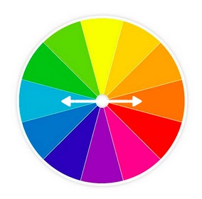
6. Choose the Right Color
Just like you want to use wording that draws the attention of your users, you should use colors that achieve the same thing!
To do that, always be sure to have your CTA color contrast the background color.
Dark background = light CTA
Light background = dark CTA
In general, green, blue, and orange CTAs work well. Make your CTA stand out and you’re in good shape.

Look at how well that CTA stands out from the rest of the page!
7. Always Add a Frame
What do I mean when I say add a frame?
Actually, just what it sounds like – literally, be sure to frame the words of your CTA with something.
It can be a graphic button, or even just a flat design box (to learn more about flat design, check out these design tips for eCommerce).
This frame helps to separate the CTA from its surroundings and makes it clear that it isn’t just another piece of text, but actually a clickable button.

Without the frame around this button, you’d probably know that you could click on it, but with the frame it really sets it apart from the page and clearly portrays it as a CTA.
8. Put it Above the Fold
What is a fold you ask?
It’s quite simple actually – picture your homepage. Now think about what you can see when you actually open the page, versus what you see as you begin to scroll down the page. So, the content that is only visible once you scroll down is considered content that is “below the fold.”
Now, doesn’t it make sense that you’d want your CTA “above the fold” – meaning you want to be sure that the button is visible on the homepage the second your site visitors land there, because if it isn’t then it’s possible that they just won’t see it.
9. Surround it With White Space
One of the best ways to draw attention to your call to action is by surrounding it with a whole lot of nothing.
By creating “white space” around your CTA button, you will inevitably draw your site visitors’ attention to it because there is nothing else around it to catch their attention.

Look at how much this button stands out just because there’s nothing else around it.
10. Keep Your Per-Page CTAs to a Minimum
Something that is very important when building a page for your eCommerce site is to have focus. Each page you make should be defined with a specific purpose.
Whatever that purpose is should be fulfilled through your CTA.
So, if you want your users to shop, your CTA should get people to check out your products, if you want your users to buy something, your CTA should ask people to add items to their cart.
With that in mind, it is important to maintain the focus, so try to keep the number of CTAs pointing to different things to a minimum.
If possible only have one CTA, if not, be sure that your page is structured in such a way that the most important CTA is also the most prominent.

Clearly the idea of this page is to get the user to checkout, but there is another necessary option to give – keep shopping, so the more important CTA is made to stand out more than the other one.
This is what it means to create a hierarchy of CTAs.
11. Point Towards the CTA
Finally, if all of these tips for drawing attention to your CTA weren’t enough we get to the last tip – actually point to the button itself!
There are many ways you can do this. You can have an arrow, you can have the model on your home page pointing towards it, or you can even just have someone looking towards the button.

Bonus Tip: Test EVERYTHING
All changes that you make to your call to actions should be closely observed and tested. You don’t want to just change things and hope for the best. You want to change things and know if the new button is better than the old one or not.
On a basic level, you can use Google Analytics and a spread sheet to keep track of your results. If you want to get a bit more advanced (or learn more ways of doing it) check out our post on A/B Testing to learn all about how to do this well!
Call Your Customers to Action!
Take what you’ve learned in this post and start optimizing your CTA buttons. I guarantee that as you play around with the buttons and test out the best combinations, you will start to make more sales as well!
(173)