 Kasia Perzyńska
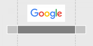
Over 50% of the world’s population uses mobile devices, according to GSMA Intelligence. It’s about time to focus your efforts on mobile search. Therefore, Google’s mobile friendly algorithm update, “Mobilegeddon”, was released two months ago. The update turned out to be a massive breakthrough in the way results are sorted in mobile search.
1. Choose your configuration
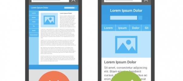
According to Webmaster’s Mobile Guide there are three types of mobile site configurations. The most common is Responsive Web Design. In this setup, the server always adapts the same code on a single URL, regardless of the type of device and adjusts the rendering of the page for each screen size. Responsive Web Design demands adding a meta viewport tag (shown below) to the head of the document.
the meta viewport tag:
The meta viewport tag informs the browser on how to display a page on a particular device. Without this tag, mobile browsers adapt the content automatically to fit the screen’s width.

Page without a meta viewport specified is on the left. On the right is the same page with a viewport specified.
On the other hand, your website can be hosted on two Separate URLs, sending a different code to both desktop and mobile devices. With this technique, all desktop pages have their mobile equivalents. For example, the desktop version is hosted on www.example.com while the mobile version is served on a subdomain m.example.com or on a completely different mobile domain like example.mobi. It is very important to set up the two-way annotation correctly, which helps Google understand the relation between your desktop and mobile website.
There is also another type of configuration- Dynamic Website Design. Sites that use this method render different content to each device, but on a single URL. It may be problematic for a search engine to detect when a website is using its mobile version, because of this, you need to optimize the Vary HTTP for mobile search correctly. This code tells Google when your mobile optimized content should be displayed.
The most common approach, Responsive Web Design, is also the recommended one because it helps Google with indexing your website. There are few advantages that responsive design gives you and your users. First of all, Googlebot needs to crawl your website only once, what significantly improves crawling efficiency. Secondly, there is only one URL, so sharing and linking to your website is easier. Moreover, you don’t need to maintain multiple pages for the same content and no redirections are needed to have a device-optimized view. Go mobile by choosing the configuration that suits your business best.
2. Help your users meet their objectives
First and foremost, you should understand how your mobile customers interact with your website. The fundamental issue is to analyze your traffic in Google Analytics and learn:
- where your users come from
 Percentage of Traffic From Mobile Devices: Audience – Mobile – Overview
- what type of content they are interested in on their device

Top Mobile Landing Pages: Behavior – Landing Pages – “Mobile Traffic” [advanced segment]
This approach will give you a clue as to what smartphone and tablet users are searching for on your website. As a result, you will be able to rearrange and tailor your content for a specific audience. Think about how to simplify and streamline users’ mobile journey and cut unnecessary interactions.
3. Organize your content for mobile search
The Nielsen Norman Group study has shown that it’s much harder to understand information when reading from a mobile screen. Mobile forces us to be super concise. This shows that organizing your content is crucial. Your visitors will only read your content if they find your information useful very quickly.
Less is better appears to be the most important rule for written content in mobile search. Consider what you want your visitors to accomplish on a particular page.
Set a goal for each page and make sure that you provide all the information they need to make a decision and take action. This helps you determine what information should be included and excluded from your mobile website. Limit the amount of text and keep your page structure clear and well-organized.
Remember that users tend to move from one device to another. If you want to improve their experience, make sure that the core content stays unchanged regardless of device type. Choose a simple layout that smoothly integrates tappable elements and call to actions (CTA). Make sure that your users are able to accomplish all actions in both landscape and portrait view. Write short, concise and scannable paragraphs.
Get to the point quickly. Replace plain text with bullets and implement compelling titles and subheadings. Avoid making unnecessary forms for your users to fill out – they don’t have time when they’re on mobile.
4. Adjust font sizes and types
It is advisable to use standard fonts for your copy and check if your font sizes scale properly. Avoid custom fonts and keep sizes consistent because they may not always display correctly on mobile screens and might take more time to load. In most cases, a good default size is 16px (CSS pixels) and a line-height of 1.2em. As well, restrict using different font types, since having too many will make your layout look messy.
5. Pay attention to interactive elements
Touch-screens love interactive elements, so try to create a finger-friendly design and make them easy to tap. It would be tricky to click on a tiny CTA link on your website, so help them by making it larger. Place your CTA icon front and center, it can even take up the entire width of the screen!
The recommended size by Apple’s Human Interface Guidelines is 44 pixels wide 44 pixels tall for calls to action. When users view your page, they want to accomplish a particular task.
However, the study Human Fingertips to investigate the Mechanics of Tactile Sense discovered that the average width of the finger is 1.6 to 2 cm (16 – 20 mm) for adults. This converts to around 45 – 57 pixels and it is a bit wider than the suggested target size. Keep in mind these findings when designing your calls to action.
6. Improve your touchscreen with these hints
Touch-screen interfaces dominate smartphones and has dramatically changed the way designers perceive their target markets. In order to make your design successful:
- Include large icons and touchable areas.
- Incorporate standard gestures, such as swiping or double-tapping.
- Create a scroll website because it shows more information without needing to wait to load another page.
- Avoid flash elements because it cannot be rendered on most mobile devices.
7. Simplify site navigation
Your website’s navigation should be straightforward and intuitive. Remember that people who view your site are probably interested in what you have to offer. However, half of them will bounce unless you make it simple for them to achieve their goals.
All clickable elements should be placed in a clear distance from each other to avoid unwanted actions, known as “fat-finger syndrome”. Improve usability by leaving a blank border between the content and the outer border of the screen. It will also make the layout clear and easy to scan.
Implement the right type of navigation menu. You can choose between a few traditional navigation solutions. The most basic and simple way includes a navigation bar and a regular drop-down menu. A navigation bar is a horizontal or vertical menu used to accommodate its categories, while a regular drop-down menu, when triggered, shows up as a list on top of the content.
 navigation bar

homepage drop-down menu
8. Include visual content
The exception to the rule “less is better” is when it comes to visual content. Videos, infographics, images, and other visuals are becoming increasingly important in mobile search. Replace long blocks of text with appealing visuals, which will communicate much better with users on mobile screens. However, before you do, make sure that your visual content is correctly optimized for mobile, otherwise it may have a negative impact on your site speed.
Make sure you:
- Use high-resolution images to provide your users with an enjoyable experience.
- Don’t have auto-zoom for images, because it may annoy your readers and interrupt their journey.
- Use YouTube videos because their embed code is responsive.
9. Make it easy to find and click your phone number
A click to call is the most used feature in mobile search. Based on Google’s commissioned research by Ipsos, 70% of mobile searchers have used “The Call Button” in order to get in touch directly with companies. The ability to call is an important conversion trigger in each phase of decision-making. In general, customers call more frequently when they are ready to buy your product or service.

10. Work on page speed
Mobile users demand quick and flawless web experiences. There isn’t any tolerance for poor usability, especially when it comes to site speed. Studies conducted by
e-commercefacts.com clearly indicate that having a slow load time negatively affects your abandonment rate (it is the ratio of the number of abandoned shopping carts to the number of completed transactions).
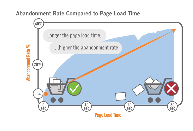
If your mobile website takes longer than 3 seconds to load, 43% of your visitors won’t return and 40% will turn to your competition instead. According to Aberdeen Group,
“A 1-second delay in load time can mean 11% fewer page views, a 16% decrease in customer satisfaction, and 7% loss in conversions”.
In order to improve your mobile experience, Google is currently testing a “slow to load” warning in mobile search. They measure the internet connection on your device and display a little yellow label next to slow loading websites. The Android Soul published this screen. It is apparently a new feature that is slowly rolling out.
Conclusions
Once your mobile website is fully developed, you can start with testing it. Investigate all the possible combinations, pages and buttons across devices and operating systems. The best would be to make it an ongoing process to keep up with any updates. Mobile search is a great way to create a more tailored user experience than on the desktop. Don’t miss this opportunity!
So, have you already created a mobile friendly website?
Feel free to like it, share it and comment on it.
(297)