Modern website design is a relative phrase. Some people might think a website designed in 2010 is modern, while others in the web design field have seen so many new things in the past year, that anything pre-2019 is already outdated.
The thing we notice most is that modern website design doesn’t require or benefit from a ton of bells and whistles. The more simple and clean, the better the user experience is.
How Website Design Affects User Experience
How your visitors perceive and interact with your website really can make or break you.
User experience (UX) is the overall experience a person has using a product (like your website), especially in terms of how easy or pleasing it is to use.
Your website design can affect UX in a few ways:
It Guides the Reader’s Eye Down the Page.
A well-designed website will know how to keep the reader scrolling. Oftentimes, this means breaking up content into smaller chunks, including visual hierarchy with banner images, fonts, and supporting elements, and utilizing white space.
It Captures Their Attention.
What happens above the fold really does affect the entire user experience.
It only takes 0.05 seconds for a visitor to decide whether or not they’ll stick around on your website. Therefore, that first impression counts and you have to grab their attention!
It’s important to include high-quality imagery, good typography, and to be cohesive in your design. Clutter will only detract a visitor and force them to click out of your site.
It Increases Functionality.
How your website functions is also a huge factor in overall user experience. Responsive web design makes sure that your website looks and functions the same no matter what device a website visitor is on.
It Promotes Professionalism and Can Build Trust.
Outdated and tacky websites won’t cut it anymore. And, since 94 percent of people won’t trust an outdated website, consistently updating and refining your design and content is key to pleasing consumers.
A great website design will present your business as professional, clean, and often can help you seem more reliable. It proves that you know what you are doing and you can present your business in a clear, professional manner.
10 Elements of Good Modern Website Design
Here are some of the elements of great website design with examples to help inspire you to create your own beautiful modern website design.
1. A Strong, but Limited, Color Palette
This might sound rudimentary, but color schemes and color usage are very important when it comes to modern web design. A strong color palette will help create cohesiveness between everything your business puts out.
Companies who have both primary and secondary colors have more wiggle room to work with when creating new elements for their website, whether it’s the homepage, landing pages, blogs, or a resource database.
However, the number of colors you incorporate in your design is also a very important aspect. Too many colors become visually distracting, so most modern website designs opt for only two or at the most three in their major design elements.
Check out huge sites like Apple and Amazon. You won’t find a rainbow of colors – just one background color (white or black) and one major accent color (silver, yellow, and blue, respectively).
Simplifying the color scheme of your site makes it easier to focus, and this is why there are only minimal color combinations in modern website designs. For example, check out Snipcart’s website with a simple and attractive dark gray, white, and yellow color scheme.
")
Bonus tip: If you struggle with everything starting to look repetitive on more content-rich pages, you can experiment with different shades and tints of your current colors. This will add a little variety to your designs while keeping consistent with your brand.
2. Plenty of White Space
This goes along with the last modern website design element, but white space is also very attractive. It doesn’t necessarily even have to be white.
White space is a term used for the amount of “empty” space that acts as a buffer between all the elements on your page, including copy, sidebar, margins, etc. Things should have room to breathe; if your website is crowded, it is very hard to direct the attention of your visitor’s eye.
Pocket Penguins uses whitespace that is aesthetically pleasing and provides organization. Further down on the homepage, they introduce the books they sell using quotes from some of their classic books.
")
Purposely designing your website with white space makes for a clean design that is easily digestible and organized. As websites are adapting a more minimalistic style, keeping space open on your page will allow your reader to navigate their way around page with more ease.
3. Responsive Hero Images
As we mentioned before, a good website should be able to attract your attention and guide your eyes down the page.
One way to do this is to incorporate high-quality, vivid hero images.
Take HelloFresh’s homepage for example. The minute you enter their site, you are captivated with a pop of color and several images of delicious fresh food. This hero image makes users want to start cooking fresh meals just like the ones in the picture.
")
This colorful hero image immediately captures your attention. If you incorporate hero images throughout your website, you can ensure that visitors will keep looking around.
4. Valuable Calls to Action
As we hinted earlier, converting visitors into leads and customers is also very important to modern website design.
Here’s why: Websites are meant to connect you with the people who are interested in your content, products, and services. Once this connection is made, you want to retain some sort of relationship with these visitors.
Conversion paths start with enticing gated content, like email newsletter subscriptions, free downloadable ebooks or whitepapers, free product forms, free consultations, or other exclusive invites. These paths are successful when they include great calls to action (CTAs).
These should be strategically incorporated into your website design and are very important for gathering the contact information (at least an email address) of your visitors so that you can continue conversations with them as leads and convert them into customers.
For instance, Epic, the digital reading library for kids, has three unassuming but attractive CTAs on the homepage that are well placed. The CTAs are also catered to Epic’s specific target audience, parents and educators.
")
Include relevant CTAs in optimal places throughout your website – at the end of blog posts, in the sidebars, and in your resources page, to name a few. And don’t forget to place a CTA on your homepage!
5. Cohesive Card Designs
With the more minimalistic website design style starting to take over, the use of cards has grown in popularity.
Cards help visitors consume your content a little easier by grouping together text and imagery to form one eye-catching element.
Help Scout effectively added cards throughout their website to create a simplistic grid design that is organized and user friendly.
")
Bold graphic images are accompanied by simple titles to help inform readers what they can expect to read when clicking on one of their guides.
Utilizing cards in your website design can help you attain a clean, organized look while keeping user experience at top of mind by appropriately sectioning off your content into bit-sized pieces.
6. High-Quality Product Videos
As video marketing continues to grow more and more popular among both B2C and B2B businesses, many companies have started adding product videos and other company feature videos to their website.
Doing this can help highlight your brand’s personality and show off what your business has to offer your customers.
According to research, 92 percent of B2B customers watch online videos, and 43 percent watch online videos when researching services and products for their business. Videos really can impact the decision-making process.
These short videos allow for your prospect to quickly understand value without watching a really long, in-depth experience. Sure, both have value, but the shorter videos allow for quick understanding that is best for top of the funnel.
Fort, the design studio website, has an intuitive video that starts going through various slides with attractive product pictures on it. You can slide your cursor over the “play reel” CTA to stop or play the video.
")
Place videos strategically around your website – maybe on your pricing page to talk about your pricing options, maybe on your product page to demonstrate your products, or on your about us page to introduce your team to everyone.
Wherever you use video, it can be a great tactic to add a little flair and movement to your website.
7. Clean Backend Coding
This modern website design element is one that you might not notice visually, but it is probably the most important when it comes to the functionality of your site.
Behind every website is a great deal of coding in the backend that will dictate how your website performs.
At our Tampa, Florida office, Bluleadz has skilled designers who also know how to code a site to function flawlessly, load quickly, and navigate effectively for converting visitors into leads and customers.
Dedicating the extra time for clean backend coding will make it easier to write, read, and maintain how your site functions.
Have you ever been digging for something out of your closet, but it’s just too damn messy to find? Like a cluttered closet, if you don’t have clean backend coding, it will only be harder to locate and fix any issues that may come up.
8. User-Friendly Design
This element of modern website design is exactly what it sounds like: You should design your site for the user, not just to boost your rankings. Companies, out of a sense of desperation to get better rankings, tend to do things that are “good” for Google but bad for the user.
However, this shouldn’t be the hierarchy of importance for website design. A website should be user friendly before a company should concern itself with ranking higher on a search engine results page.
For instance, Quiver is an incredibly well-designed site that is effortlessly user-friendly and easy to navigate.
")
Google is smart: It can tell when your users are getting good value from your website because they keep coming back and spending more time on it. Place your content above SEO, at least when first starting off, to optimize your site for the user and build a group of loyal, recurring visitors.
9. SEO-Boosting Elements
")
While I just mentioned that a website should be designed for the user first, it doesn’t mean that SEO doesn’t matter.
There are modern website design elements that can greatly improve the search engine optimization (SEO) of your site. A lot of these are invisible to the naked eye and also appear in the backend coding of your pages and posts.
Design tricks like meta tags, title tags, heading tags, and other HTML coding go a long way in helping your site climb the ranks of Google’s search engine.
Make sure you fill out, tweak, and optimize these elements so they are relevant to your site and improve your search ranking.
10. Speed Optimization
Optimizing for speed is an imperative design element that should not be overlooked.
With today’s technology, people expect things to load immediately, or they’ll probably throw in the towel three seconds later and never return.
As a business, you don’t want leads and prospects to think negatively about your brand just because your website is slow.
To make sure your website is fully optimized for speed, here are a few tips:
- Always optimize a photo, no matter how small it is.
- Enable compression so files will be smaller and open quicker.
- Minimize HTTP requests in Google Chrome’s Developer Tools.
- Choose the proper hosting options, whether it’s shared hosting, VPS hosting, or a dedicated server.
Incorporate these 10 elements into your modern website design. Prioritize user experience, and make sure that you optimize your website for not only its physical design but its functionality too.
You also need to consider your mobile site speed. Most people today look at websites on mobile devices, and slow mobile site speed will cause a higher bounce rate and more exits.
10 Examples of Companies With Good Modern Website Design
Here are 10 companies with the best modern website designs that include many of the awesome elements mentioned above.
1. Brit + Co
")
We’ve talked about Brit + Co in the past – and for good reason.
Brit + Co is a “media company that inspires, educates and entertains real women with a creative spirit.” And it seems their website does just that for us!
Their website is full of bold yet muted colors and clean lines. They section off their pages well, which helps bring your eye down the page, and they let their strong imagery speak for itself.
A lot of white space comes flooding in from the sides, so nothing looks cluttered and everything is easy to read.
2. Bose
")
Bose is a well-known audio equipment company, and their website screams sophistication and functionality.
The large hero images are eye catching yet highlight their products perfectly. Bold typography with a lot of visual hierarchy keeps you attentive to the page. The featured products section right under the fold is a great way to bring in some white space after the dark black hero image.
3. Oak Street Bootmakers
")
Simple and refined are the two words that immediately come to mind when looking at the Oak Street Bookmakers website.
The more natural-tone colors are very calming to the eye, and the images of their products are very clean and direct. To keep with the calming look, they opted to place white text over their images rather than making a bolder statement with black.
Since their homepage is pretty short and simple with only three main sections, they chose to get a little more creative with their header and navigation, using a more sectional design rather than just placing a straight navigation on top of the page.
4. Londonist Textile Agency
")
Speaking of feature videos in modern website design, the Londonist Textile Agency nails it.
The second you land on their homepage, you’re drawn into the panning video of an individual looking at a bunch of design sketches. The video is simple yet has a lot of textural and visual elements that keep your eyes looking around.
The rest of their homepage combines white space with angular dusty blue elements and image overlaps. The complete design is bold yet professional and simple.
They utilize super bold headers to point out major elements of their business, and keep the rest pretty standard and refined to contrast nicely.
5. Land Rover
")
Not only does the Land Rover USA website have a beautiful and captivating hero image – it has four (and one of them is a kickass video!).
You can either wait for each hero image to transition naturally, or you can move your mouse left or right to toggle back and forth. Plus, a little arrow follows your mouse around the screen – a simple, yet impactful, animated element.
The colors in their images are what pull you in, and they opt to keep the rest of their site pretty clean and simple. The grid style really works here because it allows for optimal white space to separate their vehicle details and specs.
6. bthere
")
bthere knows how to steal your attention. Their website is full of bright colors and animations that make you want to reach the end to see what else is in store.
While it might be a little busy in terms of color, it actually works here. All the colors are cohesive and mesh well together. Almost all of the visual elements move in some way or another, which is a great tactic to entertain visitors while they’re skimming your site.
7. Muse
")
Muse has awesome product pictures and clean website copy that is easy to understand and contributes meaningfully to their site. They have testimonials right on the homepage, with several CTAs near some of their photos and descriptions of how Muse headbands can help you meditate and sleep better.
They offer inside looks into their app that connects to the headphones to track your brain waves by including screenshots of what the app can do.
The hero image at the top of the woman fastening her headband pulls the user in and makes them want to know more about this new piece of technology.
8. Litter-Robot
")
The Litter-Robot website has plenty of white space and a great color scheme that is easy on the eyes.
The website is selling cat litter pans, but the experience of the website makes it appear more glamorous and exciting than it is. Their pictures and awesome layout help showcase the fact that this particular litter pan for cats is extremely high-tech!
They even feature a short product video to show you how the Litter-Robot works so you’ll never have to scoop again. Their headlines are catchy and engaging, which fits seamlessly into the rest of the branded information and general theme of their website.
9. Tallyfy
")
What’s great about Tallyfy is that it is a simple no clutter website. They have one simple dropdown menu at the top of the webpage and five CTAs that are all presented in different ways.
They have one simple picture that shows various people in little bubbles with arrows pointing to one another to demonstrate a workflow. The site is user-friendly and the information users want can be found easily using the navigation menus.
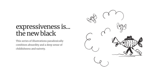
10. Absurd Designs
")
A new modern website design trend involves line-drawings or artistic illustrations drawn out across a website. It is a whimsical and attractive way to include artistic elements on your site in a way that isn’t overbearing.
Absurd Design’s website uses these line-style drawings to tell a story in an imaginative and creative way that still leaves plenty of white space. This modern website shows users that a black and white color scheme on a website is anything but boring.
With these tips and examples, your company can create a kickass website design that will help you attract new visitors, generate leads, and convert prospects into customers.
Digital & Social Articles on Business 2 Community
(67)