— February 7, 2019
As technology arcs toward sophisticated innovation, minimalism is on the rise. Designers are embracing the sleek over the spartan in hopes of developing experiences that offer better usability while maintaining a low profile.
Creating an interface that’s intuitive requires two steps: First, determining the most necessary functionalities for each screen, and then guiding users to these specific functions.
Seamless designs not only make user navigation easier, they also put people at ease — ultimately keeping them active on a website, app, or other digital platform and more likely to become repeat users and visitors.
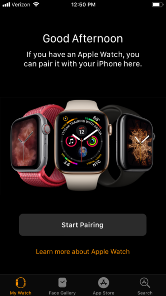
Apple was one of the forebears of minimalism in digital design, and to this day, they remain one of the best practitioners of the art:

There’s an obvious relationship between Apple’s skill in minimalist design, the user experience their customers enjoy, and the runaway success of the company.
In contrast, overly intricate designs tend to mire users in the decision-making process.
If left pondering “what next?” for too long, users will become confused and frustrated. They’ll exit the site or app entirely in search of easier answers.
This concept behind Hicks Law, which states the more choices a person is presented with, the longer it will take them to reach a decision. Too many options require users to invest precious mental energy interpreting how to use an app, bogging them down in work they will often reject.
UX designers would do well to reference Hicks Law in their UX design process and attempt to create digital interfaces that are simple but not empty, stylish but not convoluted.
Reducing how many functions are offered in each part of a website, app, or platform can optimize your users’ approach to decision making. Less stimuli supports a faster decision-making process and creates a focuses, more comfortable user experience.
Applied wisely, a minimalistic design practice helps users see the core elements of the interface. The user’s path then becomes intuitive and powerfully purposeful. What’s more, minimal interfaces tend to be more aesthetically pleasing as sophisticated and uncluttered digital spaces.
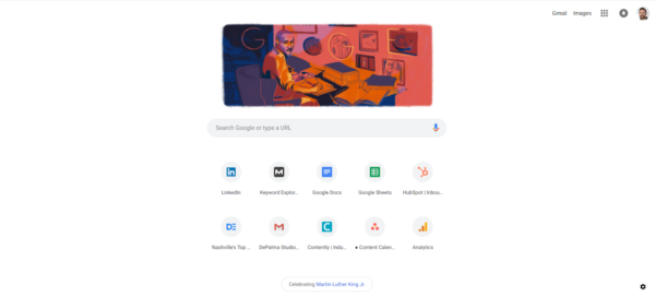
Google’s homescreen in the Chrome browser provides a superb example of minimalist design in service of the user experience:

Still, minimalism in experience design can be tricky to get right, forcing economy into the ethics of even the most technically skilled designers. In other words, designers must say and do more with less.
Designing for minimalism
Minimalism in design means that ideally, every element presented on screen is deliberate and useful. When every button, icon, and image serves a clear purpose, the experience is distilled down to focus on the absolute essentials.
Severity can go one of two ways, however: sleek and streamlined, or primitive and sparse.
Ensuring that the space is free of generic motifs and stock photos — and only including images when they are absolutely necessary for communicating a clear message — is an easily attainable path to a highly usable minimal design.
Likewise, striking excessive text from the page ensures succinct, clear communication. When copy consists of only the most meaningful information in the briefest of terms, you are more likely to thoroughly express your message for an easy, streamlined user experience.
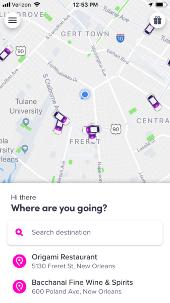
Lyft’s relies on 4 words of copy in the user interface: “Where are you going?”

The more complicated and elaborate the messaging, the more likely you are to create confusion and end up with a flawed user experience.
Minimalist design philosophy hinges on the concept that “content is king, and visual layout bows to the king,” thus compelling designers to create experiences around core content. Messaging can be polished to a higher sheen by sticking to a single focal point per each screen.
By keeping the focus on content and stripping away distractions, communication through design becomes crystal clear. And when less features live on a screen, the remaining elements pack a powerful punch to user experience. In short, a clean, essentialist design highlights content and call-to-action prompts in plain, easy to read language.
Perhaps most powerful of all in a minimalist’s design toolbox is the correct use of negative space. “Whitespace,” the blank, not necessarily white, spaces between content, creates breathing room on a page. It is essential to minimalism, making the style aesthetically comprehensive and easy to read.
Agenda uses negative space to give the user room to breath. Organizing projects and notes can be complex, but the spacing makes this experience feel manageable.

When used generously and purposefully, whitespace helps avoid cluttering for an intentionally soothing user experience. It’s helpful to think of whitespace as cushioning between the page’s content, rather than empty space that lacks substance.
Increasing the negative space around images, calls-to-action, and text in a logical pattern makes these elements noticeably more attractive to the eye.
When everything is minimal
The writing is on the wall: Design uniformity is trending. Just open popular apps like Instagram, Lyft, Dropbox, or Airbnb and you’ll no doubt notice strikingly similar, if stripped-down interfaces.
This movement seems to flow against Silicon Valley’s tendency to prize design differentiation, though it ultimately makes sense. Low-maintenance, homogenous design creates more brainspace for designers to focus on building everyday digital products that genuinely improve the user’s life.
And when a user can rely on standardized design conventions—like a shopping cart icon handily placed at the top right of any ecommerce interface—they become loyal, repeat users.
Besides, branding a product has much more to do with seamless function and creating a positive user experience over a unique look and feel. Style contributes to user experience, but sticking to essentials frees a designer to fine-tune functionality and add real-life value in completing a task.
Reducing “good design” to visually appealing interfaces limits long-term possibilities in a changing tech landscape.
Developments in artificial intelligence and augmented reality means our interactions with computers will eventually become more “human,” providing designers with ample opportunity to stimulate our senses beyond sight while still captivating user perceptions, attention, and emotions.
***
Minimalism ultimately isn’t about stripping away artistic license to embrace a design skeleton; it’s about adjusting your aesthetic and adding only enough to entice users to follow your digital trail.
The Holy Grail is seamless simplicity that creates frictionless design, achieved only by combining refinement with user logic, economy of elements, and plenty of breathing room for the eye and mind.
Digital & Social Articles on Business 2 Community
(142)


