 Brian Shilling — December 15, 2016 Follow @shilling_brian
Effective communication with your website designer can make any web project go smoothly, but most project managers and clients aren’t well versed in technical design language. If you’ve ever been involved in a website project, chances are you’ve caught yourself asking your designer for ambiguous changes like, “move that thing to the right” or “add a link up there.”
With a basic web design lexicon, you will be able to effectively communicate with your design team to ensure the end result is exactly what you want.
Here are some basic web design terms that will help you set the right expectations, reduce confusion, and streamline the revision and review process.
Website Structure
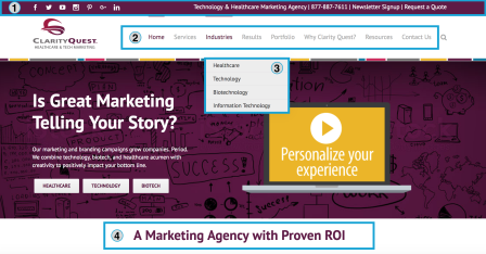
Utility Navigation: This is where you find secondary tools and functions, and usually occupies the top horizontal strip of each website page. You will typically find options like contact, subscribe, log in, shopping cart, or social media icons in the utility navigation. (1 – See image below for examples)
Main Navigation: The main navigation consists of the high-level pages or categories of pages where you want to funnel website visitors. Each main navigation item typically has several subpages in its drop down menu. Main navigation items should be present on each page of the website. (2)
Drop Down Menu: A drop down menu displays when a website visitor hovers over a main navigation item, expanding to show more options. (3)
H1: The most important of the header HTML tags, the H1 is often the first and biggest headline on a page and is an important area to place SEO key phrases. (4)

H2–H6: Following the H1 header, there are also H2, H3, H4, H5 and H6 header tags. These headers should be used to create a hierarchy for your web content to help both human visitors and search engines navigate your content.
Mega Menu: A type of drop down menu that expands to show many more options. Think of a mega menu as another main navigation under a particular category. See an example of a mega menu below.

Sidebar: The sidebar is an optional area for extra content or navigation and can be placed on the left or right side of the page. It’s common to add additional navigation links in the sidebar or a prominent call to action, signup form, social media links, upcoming events, testimonials, downloads, videos—really anything you want!
Footer: The footer is a section that appears at the very bottom of each page of a website. You can keep the footer simple with a business address and contact information, or you can get creative with additional links, social media icons, calls to action, or content downloads.
On-Page Design Elements
Homepage Banner: The homepage banner occupies prominent real estate near the top of a website homepage and can be static (one banner) or sliding (multiple banners). Homepage banners are often large and very visual, featuring either an image, video or animation.
Flip Box: Flip boxes are animated web design elements where one section of content “flips” or turns to display different content in its place.
Ticker: A ticker is any element that scrolls across the screen to showcase multiple images or text blocks in one space. Tickers can be static with manual forwarding or can auto-scroll.
Lightbox: A lightbox is a viewing window that overlays the web page to display videos or images. The web page behind the lightbox is dimmed until the lightbox is closed.
Favicon: A favicon is a small 16×16 pixel image displayed in the tab of the web browser. Here are some popular favicon examples:

Design Styles
Flat Design: A simple, minimal design style common in website design. The flat design style is typically used to convey a modern design, is known for its fast load times, and works well on responsive websites. Microsoft popularized flat design in 2006 and it still looks fresh a decade later.

Realism: The opposite of flat design, realism takes the z-axis into account to create a 3D effect. Realism can help users understand how a product will look and function in real life and can be more visually attractive, but could become dated as design trends change.

Material Design: A newer design style created by Google that blends flat design and realism. Like flat design, material design is simplistic, but with the addition of shadows to show movement or depth.

Responsive Design: Responsive design’s usability and versatility ensure a website loads quickly and renders properly on all device types and screen sizes for optimal user experience. Responsive design has become a best practice in web design and is Google’s recommended format.

Parallax: Parallax is a design style where the background image moves slower than the foreground image or text as the user scrolls down the page, creating a 3D effect.
This post was originally published on the Clarity Quest Marketing blog.
Digital & Social Articles on Business 2 Community(98)