That much dreaded unsubscribe button – your stomach churns just hearing the mention of it. It symbolizes the end of a customer-brand relationship. There’s disappointment and doubt: “did my content fall short?” or “why didn’t they like my email design?”
But, there is a silver lining in the unsubscribe. It’s an opportunity to ask your customer what they need in order to keep finding value in your product. The unsubscribe page, the landing page that the unsubscribe button brings a customer to, is instrumental in collecting feedback and preventing churn.
Hand the mic over
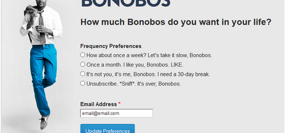
Give your users an in-between option to cutting out your emails, cold turkey. Build a preference center into your unsubscribe landing page allowing your users to choose the content they receive and/or how frequently.
Here’s an example from Bonobos, with a good selection of options and punchy copy. Notice they have an option to mute their email for 30 days. Allowing your users a break from your email can allow them to come back refreshed and ready for new content and improve your sender reputation since users will likely be more engaged.

Jetsetter also has a great email preference center, each type of subscription being clearly labeled with a description of exactly what type of content the user should expect.

How can we improve?
The unsubscribe page is another great feedback loop. Whether or not you are able to successfully win back a customer, there is some gold here on how to improve your content for future subscribers.
After users unsubscribe, serve them a short and simple survey asking why they have chosen to unsubscribe. Commonly used answers include “We are sending too much email”, “Content is no longer relevant”, and “Signed up by accident”. But another interesting point to ask is where your users are consuming content. Just because they are unsubscribing from email doesn’t mean they are unengaged. Perhaps they are choosing to tune into your Twitter or Instagram account instead.
Here’s a well designed example from Barneys New York:

Laughter is the best medicine
As the saying goes, laughter is the best cure. If you’re looking to go a slightly less traditional route, use a funny video or GIF to remind your customer why they were drawn to your business in the first place.
Charity:water took a unique approach with an unsubscribe confirmation email that gives users a choice to either unsubscribe or watch a video of their CEO being ambushed with water balloons. The results were mind-blowing. At over 70,000 emails sent and 740 views, their unsubscribe count remained low at 100.

How do you currently use your unsubscribe page? What are some of your favorite examples? Let us know in the comments below!
(204)