Plus: The year’s top essays and stories on branding
Editor: Suzanne LaBarre
Great branding is more than a logo. It’s more than a list of acceptable fonts, too, or even some 100-page PDF containing everything from measurements on proper margins to deep verb-subject-adjective explorations on writing the proper “voice.” Great branding is really the DNA of product or company, manifested through various media in ways that the public can recognize and understand.
With that in mind, above is a collection of our biggest branding stories of 2014. It’s not just a highlight reel of great branding. You’ll see some of that, of course, but you’ll also see some of the worst branding of 2014, too, along with essays on branding from some of the best names in the business.
BEST: Remaking The MIT Media Lab
From shapeshifting displays to technology that could 3-D print self-lacing McFlys, the MIT Media Lab reinvents the way we think about the future every single day. Now the Media Lab reinvented its visual identity with the help of Pentagram partner Michael Bierut, who created an abstract logo-typeface hybrid in a 49-pixel grid.
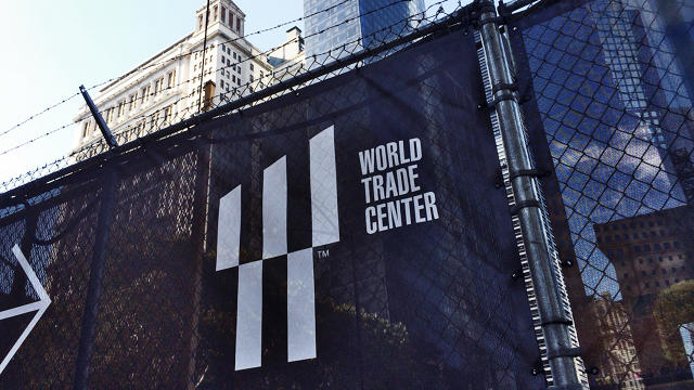
WORST: The World Trade Center’s New, Confusing Logo
The new World Trade Center logo manages to squeeze in so many references, juggling a landmark, a Twin Tower tribute, and an ad in one, that it feels like it’s pandering. But given the wildly competing interests that have informed the redevelopment of the site, this logo just might be the perfect embodiment of a space still in search of its identity.
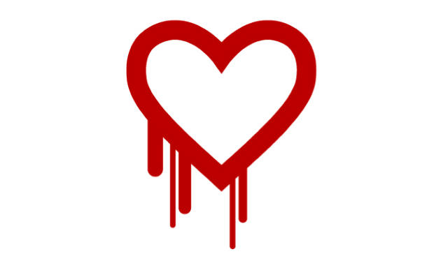
BEST: The Security Bug Heartbleed Has A Catchy Logo
Heartbleed might be the first security bug to get its own name, registered domain (Heartbleed.com), sleekly designed FAQs explaining the bug, and a designer logo. It isn’t the world’s most sophisticated logo—a bleeding heart to convey a bleeding heart—but as a way to communicate the perils of a security hole that reportedly afflicted half a million websites, it got the job done with blunt efficiency.
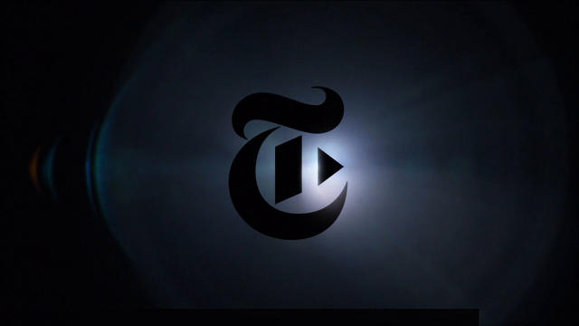
BEST: The New York Times Play Button
To launch the Times’ new video hub, branding consultancy Work-Order slyly toned down the gothic elements, changing the “T” in the Times Old English font to incorporate a digital play button.
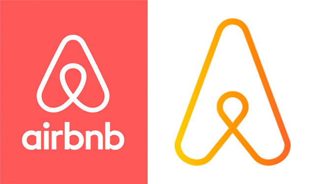
WORST: Airbnb’s New Logo Looks Awfully Familiar
There’s nothing fundamentally wrong with the design of Airbnb’s new branding. The logo, which resembles a paperclip bent into the shape of a heart, actually has a compelling logic. The problem: it looks an awful lot like another logo, that of the IT company Automation Anywhere. Read more.
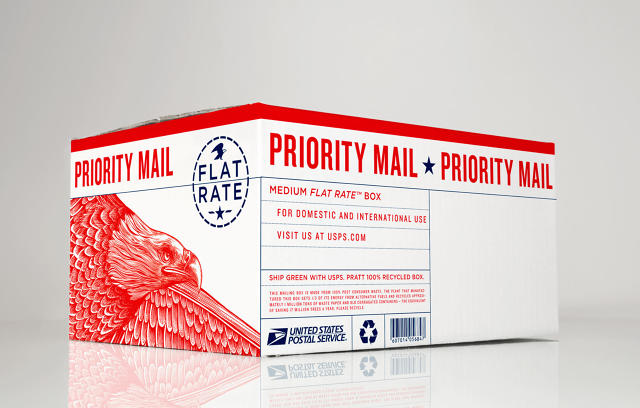
BEST: The Badass Postal Service Branding That Could Have Been
The USPS has been going through some tough times. So imagine if every time you mailed a box, that box was really an eagle swooping down to rip the limbs off of FedEx and UPS? Pretty great, right?
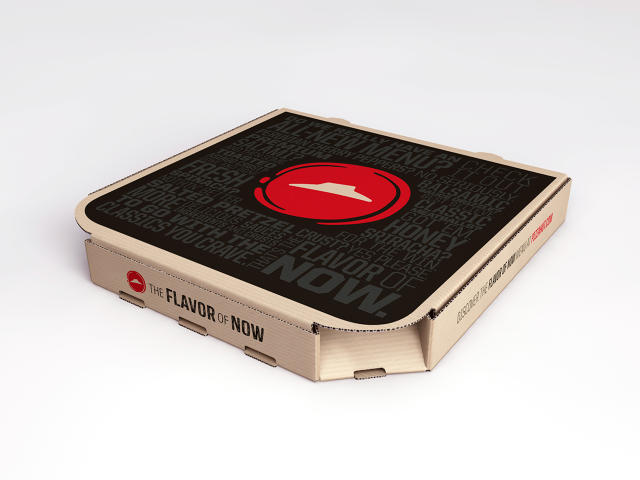
WORST: Pizza Hut’s Saucy Rebranding
You probably don’t think about a Pizza Hut Meat Lover’s pizza and think “fine dining,” but when launching their new menu this year, the company channeled the visual language of haute cuisine to elevate their product. Too bad it’s the equivalent of a middle-aged guy buying a bright red sports car in the quest to rekindle his glory days.
WORST: Netflix’s Boring New Logo
Netflix quietly introduced a new logo that gave up its boldness in the interest of flatness. Here’s why that was a bad move.
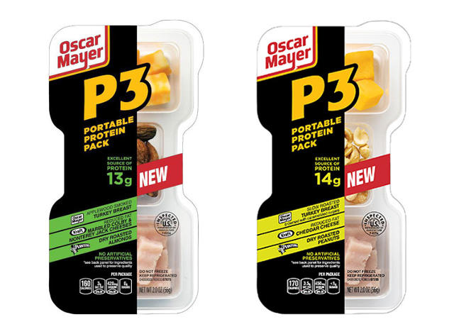
WORST: Oscar Meyer Rebrands Lunchables For Adults
Remember the Lunchables you used to pack as your lunch? They’re now called P3s to woo you as a grownup—that stands for “Portable Protein Pack.” Gag.
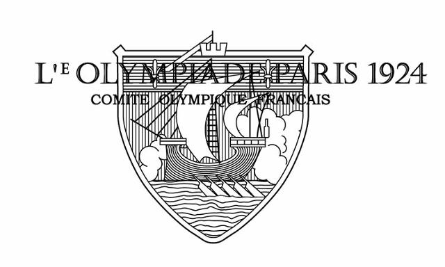
WORST: 100 Years Of Depressing Olympic Logos
Lousy Olympics logos are a tradition almost as long-lived as the Olympics themselves!
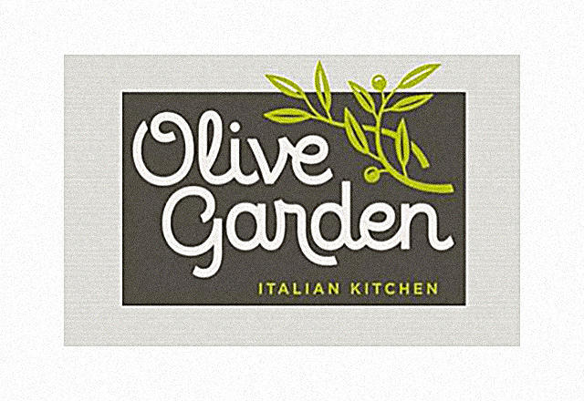
WORST: Olive Garden’s New Logo Is The Pits
“The gray evokes the ashen complexion of someone who has just discovered that he will be having dinner at an Olive Garden, while the green resembles the complexion of that same patron as he nauseously walks out of the restaurant, his meal completed.” But the breadsticks are still alright.
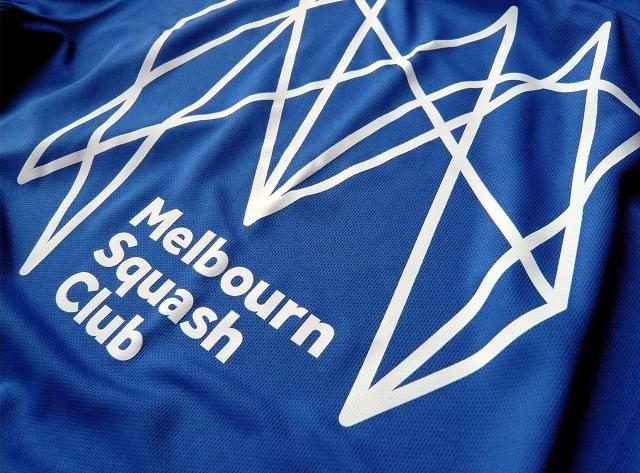
BEST: This Logo Is Just A Bunch Of Squiggly Lines, And It’s Perfect
Designed for the U.K.’s Melbourn Squash Club, the logo was created to show squash’s frantic motion—a welcome departure from traditional athletic clubs logos that uncreatively portray players or sporting equipment.
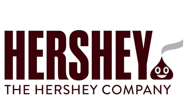
WORST: An Apology To Hershey’s And Emoji Poo
Fun with Photoshop and the new Hershey’s logo , but hey, don’t make a brown Hershey’s Kiss part of your logo in the era of emoji poo.
Branding Has Become Oppressive
Pentagram legend Abbott Miller laments: “I think the phenomenon of branding has become oppressive. As “brand” colonizes more and more experiences and places (and even some people who have achieved brand status) you get a zombie-like effect, a placelessness and
over-determined experiences.”
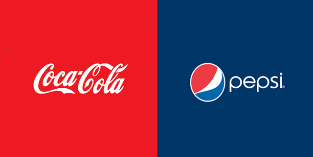
How Much Does Color Define A Logo?
What happens when you swap the colors of Google’s logo and Yahoo’s logo? Or McDonald’s and Subway? Things get really weird.
Great Branding Is Invisible
Look at a knock-off Gucci handbag and consider its original counterpart: The difference, besides the “leather” chosen, is in the stitching, the inside lining, the zippers, and so on. Quality resides in the hidden details that aren’t obvious to most. It’s craftsmanship that gives luxury fashion brands longevity and which lets them weather trends. Brands are no different.
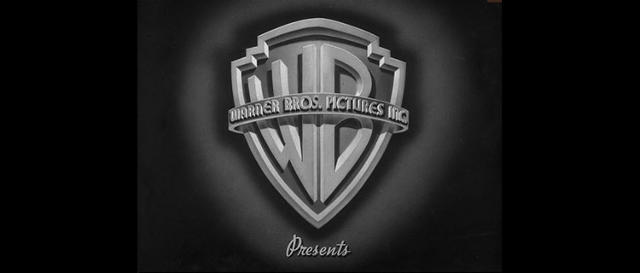
The Surprising History Of The Warner Bros Logo
It’s a shield floating in the clouds. Everyone knows it, and it’s tempting to say the Warner Bros. emblem you see at the beginning of a movie today seems virtually identical to the one you would have seen 60 years ago. In actuality, over the last century, the that has resulted in literally hundreds of different logos. Here’s a fantastically comprehensive gallery that shows what has changed over the years, and what has not.
7 Questions For Logo Design Legend Ivan Chermayeff
If you’ve ever watched Showtime or NBC, visited the Museum of Modern Art or the Smithsonian, read National Geographic or a Harper Collins book, or shopped at Barneys or Armani Exchange, you’ve seen the graphic design of Ivan Chermayeff and his firm. We asked him seven questions.
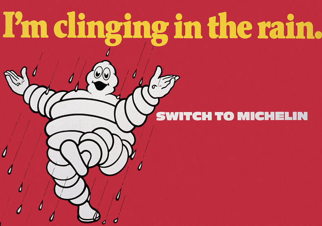
The Secret History Of The Michelin Man
The Michelin Man mascot was a drunkard with a propensity for smoking cigars, first seen in 1889, toasting a giant martini glass full of crashed car debris. Needless to say, his image evolved.
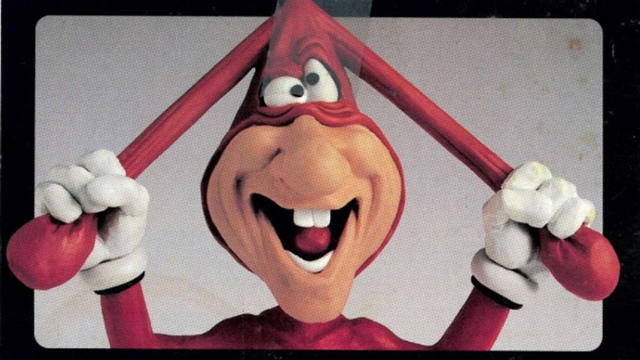
What Happened To The Domino’s Noid?
A gibbering, pot-bellied, buck-toothed pervert squeezed into a skintight rabbit costume, the Noid was a Hamburglar-like character wholly devoted to delaying Domino’s pizza deliveries. But the company had to ditch the mascot when on January 30, 1989, a 22-year-old man named Kenneth Lamar Noid walked into a Domino’s Pizza in Atlanta, Georgia, with a .357 magnum revolver and took two employees hostage.
When A Simple Logo Isn’t The Best Choice
When Betaworks’s CEO first saw their new logo, he was horrified. Then he was intrigued. And then he was sold.
(339)