Navigation gives a user control, which is generally a good thing – but what about on a landing page, where the motto is “one page, one goal?”
While there’s not a one-size-fits-all answer (there never is in optimization), we do have some good data by which we can make a decision.
Landing Page Optimization
It’s a fact that landing pages should be an integral component of your inbound marketing strategy, with companies seeing an average 55% increase in leads when increasing their number of landing pages.
However, surveys say only about 22% of businesses are satisfied with their conversion rates.
This is, of course, for many reasons. But one might be because it’s common to come to a page like this upon clicking a paid search ad, banner ad, or an email link:

See all those links in the page header? They present the visitor with the opportunity to exit the landing page. Landing page navigation links that take visitors off the page go against the very concept of landing pages.
A landing page is a standalone page that a visitor lands on after clicking an ad or a search result. Its purpose is to get that visitor to take action — whatever it may be — like getting a product demo or signing up for a webinar.
Navigation links on landing pages don’t make sense, and yet only 16% of landing pages are free of navigation bars.
Alarming, yes. But, true.
Common practice dictates that using navigation links on landing pages is okay. However, let’s see what A/B testing data has to say on the matter by looking at things from both sides.
The Case for Landing Page Navigation Links
Navigation links allow visitors to move around a webpage and mainly serve two purposes:
- Tell the user which page they’re currently viewing
- Enable the user to go to another page with ease
There are three main types of navigation links:
- Main Navigation
- Local Navigation
- Contextual Navigation
Main Navigation
This type of navigation divides the website’s content into an easily accessible menu. Each menu represents a specific section on the website, allowing the visitor to know which page section they want to go to.
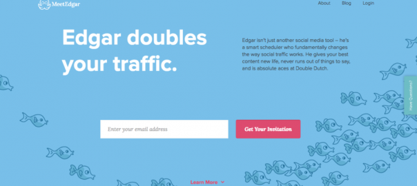
The page header on the Edgar page is an example of main navigation:

Local Navigation
It represents the sub-sections and groups and helps classify the content into their respective sections. These links include the drop down menu links under the main navigation.
The drop down menu on the Zoho landing page featured above is an example of local navigation.
Contextual Navigation
This type of navigation makes it easy for visitors to access other sections of the website that are not part of the website section they’re currently viewing. Examples of contextual navigation include the “back” button, a “read more” link, or a hyperlink on a product page or blog article to another related page on the website.
The ‘NCATE accredited’ link on the Capella University landing page is an example of a contextual navigation link:

All three types of navigation links are vital to the user’s browsing experience and providing website hierarchy. They also make it easy for the visitor to move around a website because they help the visitor go to another page easily and get to know the brand better.
According to WordStream data, an alarming 96% of landing pages feature at least one link that leads prospects off the page.
Here’s the breakdown of the data:
- Only 4% of marketers have link-free landing pages
- 81% of marketers include between 1-9 links on their pages
- 14% use more than 10 navigation links that take visitors away from the landing page
Using navigation links on landing pages helps marketers achieve goals other than the immediate landing page goal. For example, social media links on landing pages give marketers the opportunity to increase the social outreach of their pages.
Take Meltwater’s landing page, for example:

Not only does the landing page allow visitors to demo the product via the primary CTA button, but it gives them access to their entire website with the navigation header and footer (below the fold).
So, visitors who aren’t interested in the primary goal of the page, may be interested in Meltwater’s other goals that are present. Therefore, even though the links are distracting the visitor from converting on the page, they might come back another day and perform another action.
This is why landing pages feature navigation links:
- Take visitors to your main homepage via a hyperlinked logo
- Take visitors to other pages of your website such as the Contact or About page
- Allow visitors to share the landing page via social media channels
- Take visitors to a privacy policy or terms of service page to make your page (and your brand) more trustworthy
These were the most popular navigation links included on landing pages, according to WordStream:

Even though landing page navigation links distract visitors from the page goal, links allow you to promote your page via social media and showcase your brand story through the About page and help visitors get in touch with you via the Contact page.
You can even add a Privacy Policy link to make visitors feel at ease, although WordStream data shows that only 48% of landing pages include privacy links.
The Case Against Using Landing Page Navigation
Navigation links don’t work on landing pages because your landing page is not any other page on your website, and so it shouldn’t look like one. On the homepage, navigation links help visitors move around the website, moving from one page to the other, as they gather more information. On landing pages, however, navigation links just serve as exit links that take the visitor off the page.
For example, the Contact Us link at the bottom of the LabTech ebook landing page, doesn’t increase the chances of more visitors downloading the ebook. What it does do is give a chance for them to exit the page and get distracted:

It won’t matter that the page has an engaging headline, neatly arranged copy, or a big red CTA button. The navigation link would take the visitor away from the conversion goal and you can’t really know whether they’re going to come back to the page or not.
Your visitors have a limited attention span so you need to engage them on your page from the start and make sure that all goes well from there on out.
The same is true for a footer full of navigation links. Imagine a visitor going through your entire landing page convinced on clicking the CTA button and then getting distracted by a link in the page footer. There goes your conversion.
Take Better Homes and Gardens’ sweepstakes landing page. It’s a very real possibility for visitors to get curious about what the “Meredith Corporation” is and click the link to be redirected to another page and lose their button clicking train of thought:

But enough about examples; let’s see what A/B testing evidence has to say about navigation links lowering landing page conversion rates. After all A/B testing is the perfect way to determine which element is working toward your conversion goal and which element is working against it.
To demonstrate how removing navigation links can have a positive effect on conversion rates, let’s look at a case study from AmeriFirst.
AmeriFirst was looking to increase conversions, but were hesitant to do a full page redesign because they were afraid of losing customer trust. Instead they opted to remove the navigation bar, which de-cluttered the page and gave them a 30-40% increase in conversions. Here is the difference in the two-page variations:

Likewise, HubSpot ran A/B tests across five high traffic landing pages Version A included top navigation, footer navigation, and social media share buttons while version B was free of all navigation links:

The data showed that removing navigation links actually increased conversions:

What was increasingly interesting is that removing navigation links from middle of the funnel landing pages had a much bigger impact on conversions, with the pages seeing a 16% and 28% lift in conversions. While the top of the funnel landing pages saw a 0-4% increase in conversion rates.
When Minders tested their landing page and removed the navigation menu, they saw conversions increase from 9.2% to 17.6% over the month-long test.
And, here’s test number four. Yuppiechef is a leading online store specializing in premium kitchen tools based in South Africa. They tested removing the main navigation bar from their landing page, so that visitors wouldn’t be distracted by the links and focus on the conversion goal, which was to get them to sign up for the online wedding registry.
This is what the original page looked like:

Here’s the variation they created:

The variation increased their conversion rate by a surprising 100%.
When there are no other links present on the landing page (other than the CTA button) visitors don’t have a chance to get derailed from the conversion goal. A page that features no navigation links is a page focused on only one goal — which is exactly why visitors focus on that one goal.
Not only do navigation links distract visitors from the conversion goal. They can cost you money.
Using PPC marketing to promote your landing pages means spending money for every visitor that clicks your ad. And when your ad doesn’t take visitors to a dedicated page free of navigation links; there’s a much greater chance of losing money because the visitor isn’t able to complete the conversion goal as easily.
Regardless of the type of page you’re creating, whether you’re using landing page templates or starting from scratch when landing page navigation links are included, you allow visitors to bypass the conversion goal and move onto a secondary goal.
With that said, you should know that it is okay to include navigation links on landing pages when the links keep the visitor on the page and optimizes their experience.
Longer landing pages use a sticky navigation bar to help visitors navigate through the page and move from one section to the other with ease.
The Conversion XL agency page has a sticky navigation page menu that lets you navigate the page without having to scroll:

On information-heavy landing pages, the on-page navigation header helps visitors move to their desired section with a button click. This is much better for user experience than having them scroll the entire page to find the section they were looking for.
The Google App landing page is another example:

Conclusion
Unlike your homepage, landing pages are dedicated pages created to persuade visitors to complete a specific action, and all their attention should be directed at that conversion goal. When you add navigation links, you give visitors the chance to get distracted and leave the page before converting.
Navigation links on homepages are a logical decision, it makes sense to provide your visitors with a roadmap because they have multiple pages to go through and multiple offers to view. Including the links on a landing page, however, makes no sense, because they don’t need a roadmap to go through a single page created to fulfill just one goal.
The data has spoken, your dedicated pages should be dedicated toward one goal. Presenting visitors with an entire menu of reasons to leave the page is not an option you should use.
Digital & Social Articles on Business 2 Community(276)