
Interactive scrolling is one of the most polarizing design styles out there. Some people swear by it and some people hate it.
Should you use it?
Parallax shouldn’t be used just for the heck of it. Although it makes your website stand out, it can get frustrating for users who came to your site for more than just to play around and admire the design. Users want their information right away and don’t want to waste time on scrolling through 20 animations.
However, parallax is particularly helpful when you want to tell a story. An interactive, parallax website can be very engaging because the user controls the pace of the story. You can take users on your journey by making them scroll down your website.
This post will explore seven great examples of interactive scrolling websites and how they use parallax to tell a story.
1. Space Needle
The Space Needle is Seattle’s most famous tourist attraction. You take the elevator to the top where you can see the entire city and the mountains in the distance. The Space Needle’s website is perfect for parallax scrolling.

Source: The Space Needle
When you go to the Space Needle, you’ll have to ride the elevator to the top while learning interesting facts about Seattle. The Space Needle’s website takes you on this same journey. You start at the base of the building, then you scroll up and make your way to the top with the elevator. On your way, you’ll learn facts about Seattle and see more of the city come into view.
A unique feature of this website is that you scroll up instead of down. Although this can be confusing at first, clear instructions tell you to scroll up, and it adds to the story of visiting the Space Needle. It stands out and makes interactive scrolling an essential feature of the website.
2. Arnold Clark Savings Challenge
The Arnold Clark Savings Challenge helps readers find ways to save money. Although there’s also a simple web page that lists the facts, the designer chose to make it more engaging for the user. The result is a scrolling website where the information pops out at you as you scroll.

Source: Arnold Clark
People are more likely to share your website if you create an enjoyable interactive experience for them. You can make a simple post or article where you list facts, and it’s still a good idea to make information available in that format. But a scrolling design with appealing graphics that presents the facts in a unique way is well-suited to sharing, if that is your goal.
3. Kanbanize
Kanbanize sells productivity software. Their website starts with a creative graphic that hooks you in. When you scroll down, the first section that pops up is about who their product targets.

Source: Kanbanize
Subtle animations and scroll effects like these work nicely for creating an atmosphere of productivity or efficiency for their product, and the subtleness of the interactivity makes it appropriate for the homepage of a B2B website.
This website does a great job of telling a story and why you need to use their software. Making the user scroll gets them more engaged, and gives them more of a purpose to invest in your product.
4. For Better Coffee
Freese Coffee Co. has a microsite called For Better Coffee. This website takes you on an interactive journey of a coffee bean. By scrolling down, you’ll be a part of the process of taking a coffee bean and turning it into a hot cup of joe.

Source: For Better Coffee
The purpose of this website is to give the user five essential tips for making a great cup of coffee.
Instead of simply writing an article, Freese uses animations and eye-catching design elements to tell the story of making a cup of coffee. It stops at set points along the way and presents you with one of the tips. Below the text is a link that’ll lead you to more information.
At the bottom of the site, you’ll discover a completed cup of coffee, a satisfying end to the animations (and story). You can then sign up for an email list or learn more tips for making a great cup of coffee. It’s a great idea to reward your users for making it to the bottom of your scrolling website.
5. The Royal British Legion
The Royal British Legion wants to teach users about where their money goes. To do this, they created a cute parallax website where you can follow a poppy, which is a British symbol for remembrance, down the page. Right away users are engaged, as the poppy tells the story of how The Royal British Legion serves veterans.

Source: The Royal British Legion
Above the fold, you’ll find essential instructions like scroll down and click on anything that moves. It’s important to give clear instructions like these to your users.
As you scroll down, you’re taken to different settings. Within these places, you can learn where the money is going. It’s a visually appealing website that clearly articulates information. At the end, you have the option to share the site with a friend. Make sure your scrolling website has this option as well, so you can get more visitors.
6. Flat Design vs. Realism
In 2013, the battle between flat design and skeuomorphic (hyper-realistic) design was fiercely playing across our screens. Here, an award-winning parallax website summarizes how the battle went down, by pitting the king of realism and the rationalist leader “Flat” against one another.

Source: Flat Design vs Realism
This engaging website uses parallax design in new and exciting ways. The design actually plays a pivotal role in the story itself, showing the differences (and similarities) between flat and realistic design by blending them together in layers that move across one another.
After an extended introduction to this universe, viewers can even choose a side and battle for dominance, bringing the interactivity full circle.
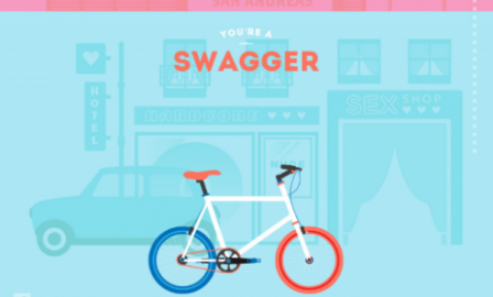
7. Cyclemon
Cyclemon‘s website uses a scrolling design to introduce you to their product catalog. First, you’re met with the company’s logo and a slogan that says, “You are what you ride.”
As you scroll down, you go through characteristics that you might identify with. There’s a bike that matches each description (e.g. hipster), which stays true to the company’s slogan. When you get to the bottom, you can order the design that matches your personality.

Source: Cyclemon
The scrolling website is used to take you through each bike until you find the one that fits you the best. Since you won’t be sure you found your bike until the end, you’re obligated to keep scrolling.
Wrapping Up
Scrolling websites are most effective when they tell a story, guide visitors through a journey, or provide an introduction to a product set. Certain types of websites can benefit greatly from parallax design, such as sites that operate as a product portfolio or guide visitors through a story that requires rich visuals.
And the interactivity – either just the act of scrolling or even more interactive experiences like the game embedded in the Flat Design vs. Realism website – makes these websites far more immersive than your average site. If you decide a parallax design is for you, be sure to incorporate some of these tips.
Digital & Social Articles on Business 2 Community(67)