 Amir Jirbandey
Remember those Cracker Jack boxes you had as a child? Not knowing what toy you’d find at the bottom was a huge incentive to opening and consuming the box all in one sitting. While the element of surprise was exciting back then, it doesn’t translate quite as well to email marketing.
Don’t leave it up to chance whether the GIF in your latest newsletter will render for one customer and not another. Given that each email client has slightly different temperaments, we’ve broken down the most popular email clients and how to ensure responsive design for each.

Major Email Clients
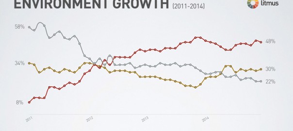
While there are a lot of email clients out there, the top 5 most used clients have a combined market share of 73%. Once you have these few locked down, you’ll be well on your way to more responsive email. This observation is taken from Litmus, when they checked 1 billion emails in March 2015. In this post we’ll concentrate on these five major email clients:
- Apple iPhone – 28%
- Gmail – 17%
- Apple iPad – 12%
- Outlook – 8%
- Apple Mail – 8%
Why is responsive email important?
As mentioned earlier, mobile email clients are the main tool we use for opening our emails. To make sure that our emails render properly on mobiles and specifically latest iPhone models, we need to think responsive. A responsive email is one that changes it’s shape and size to be displayed properly based on the device’s screen size. There are some great tutorials online for us less savvy HTMLers, that teach simple techniques on creating responsive emails.
To style and format our emails, traditionally we tend to use CSS (Cascading Style Sheets), just like they do in web design. We can use CSS to create mobile-friendly email templates, but there’s one issue. Gmail and some other email clients doesn’t really like CSS and can strip off your <style> tags, ruining how your emails look.
How can I design my emails so it looks good on all clients?
By now, you might be scratching your head about what technique to use so your emails look good on all major platforms. Here are some tips to help you out:
Apple iPad – Here we use a very similar technique to optimizing emails for mobiles. By looking at your campaign reports you can see what model and device your customers use to open your emails. Use the dimension of the popular devices and @media query to make sure your emails render correctly for iPads or any other tablet your customers use most.
Outlook – Outlook is one of the longest running email clients, dating back to 1997. Since then it has gone through a lot of changes, especially in 2007. Outlook 2003 used Internet Explorer to render emails, however the next release, they started using Microsoft Word for rendering. As now Word renders emails in Outlook, there are lots of CSS properties that Outlook doesn’t recognize. There are some useful articles that detail what to look out for, however the main take away should be that: in order for your emails to render properly in Outlook, Inline your CSS instead of having them in the header. You can use some free tools to Inline your CSS easily.
Apple Mail – Webkit rendering engine is used in Apple Mail to render emails. Webkit is used to power browsers such as Google Chrome and Apple Safari and Apple Mail is known to be one of the most robust, mainstream email clients. You will rarely run into issues with rendering on Apple Mail.
How do I keep all email clients happy?
One thing you have to remember, you won’t be able to have your emails render 100% on all clients without spending hours designing and testing. Find out the top two or three / top 80% of clients used by your customers and design your emails for them.
To avoid duplicating your efforts, create a few email templates which you can edit and reuse easily for regular campaigns.
And finally, you might be seeing a trend in my blog posts by now, test, test and test some more. Once you create those email templates, make sure you test them on different platforms and devices to ensure they’re optimized for your customers!
(240)


