Mailable microsites are the next big thing for sure as far as email marketing is concerned. From eCommerce businesses to home décor retailers, everyone seems to be catching the gravy train.
B&Q, UK’s leading home improvement and garden living retailer, was one of the pioneers who comprehended the shift in the wind and adapted to mailable microsites – giving static email a well-deserved break. By using carousel in email, the brand has stepped into the world of modern emails.
Monks do an in-depth study of B&Q’s shift from static emails to mailable microsites and uncover how the shift has improved the user experience manifold.
Let’s start with what they used to do earlier.
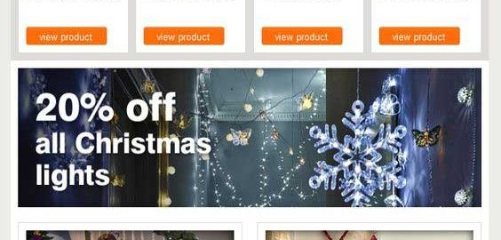
Static Email from B&Q (sent in the year 2013)

Breaking up the static email to analyze the details…
- There are 9 primary horizontal sections, covering all that the marketer wants to display.
- The email is lengthy, forcing the reader to scroll down to see all the sections.
- With too many images used to highlight too many things, the hero image loses its charm among the other images.
- A subscriber views all the sections as he/she scrolls down – whether they are interested or not.
Now, while there is nothing majorly wrong with this static email, let us see how the use of carousels made their recent email more engaging and informative.
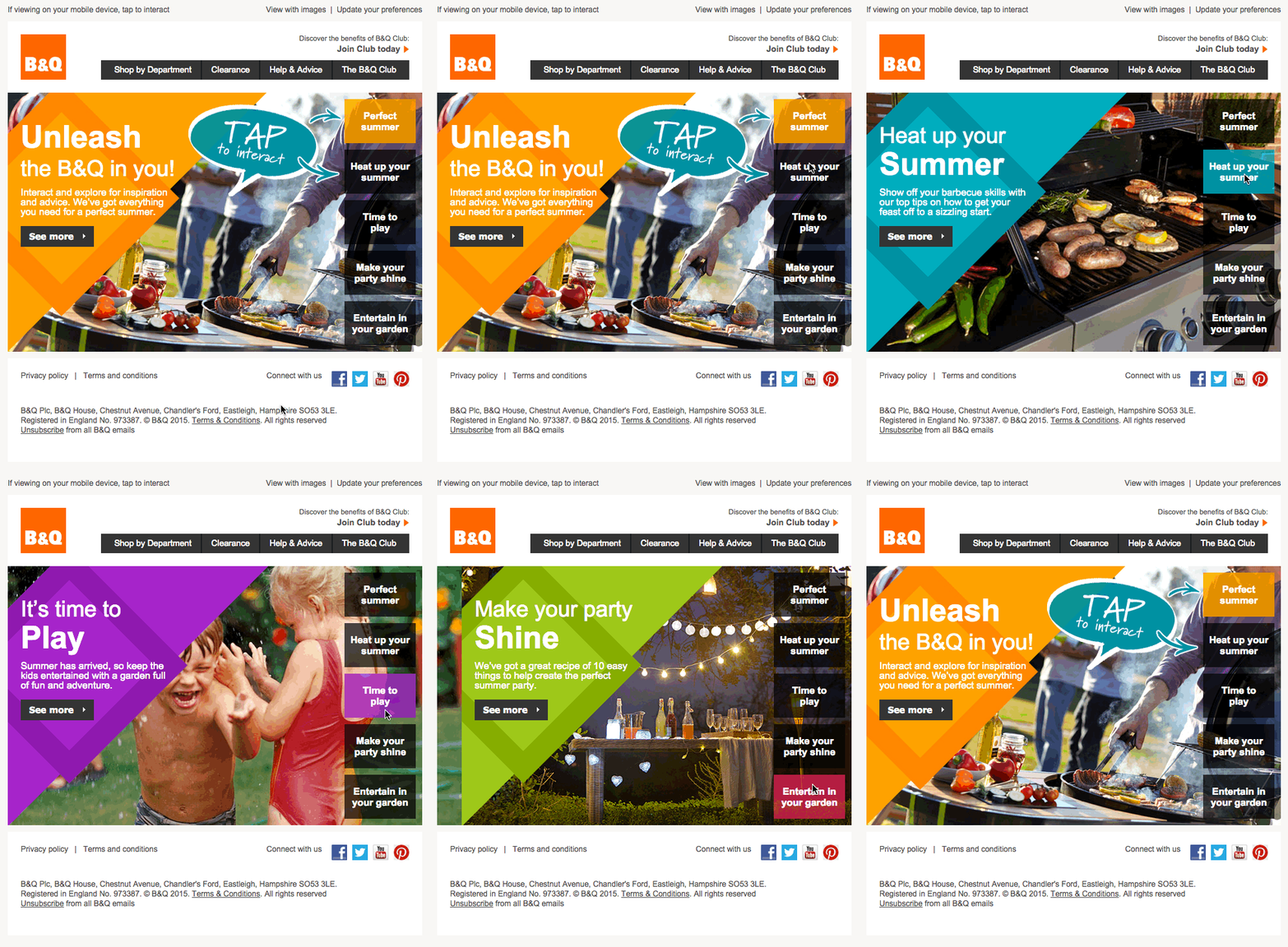
Mailable Microsite from B&Q with carousel navigation (sent in the year 2015)

Breaking up the interactive email to analyze the details…
- The carousel makes the email short, cutting down the effort to scroll.
- In spite of the length, the email succeeds in providing more content, in a stacked up manner.
- Subscriber can click on whatever interests them and get the details; no need to view every section, thus improving user experience.
- All the pictures used are equally attractive, grabbing the attention of the subscriber.
The interactivity in the email makes it more engaging.
- The concise navigation helps in producing quicker actions and conversions especially because more the steps needed to get information or make a purchase, lesser is the engagement.
The shift from static to mailable microsites undoubtedly makes for an awesome experience not just for B&Q but also its subscribers. Their email looks modern, creative and of great value – what with so much content in such a small email. Less is indeed MORE!
In the earlier days, it needed JavaScript to create browsable email content. Unfortunately, security concerns pulled down this idea very soon. But the advent of CSS3 and HTML5 in email now helps to create carousels just like the ones on websites.
What marketers need to be aware of here is email clients’ support. Fortunately, many email clients support CSS, thus presenting email marketers with the opportunity to explore the option of mailable microsites. And for those who don’t support a particular element, a fallback design becomes a must, just to make sure you don’t spoil the user experience.
Have you tried sending carousel in email? If no, now is the right time!
Digital & Social Articles on Business 2 Community(77)


