
Assuming that you have created your company’s brand story using the story brand framework, it is time to use that framework to refine your homepage so you can grow your business. By definition, a homepage is the page typically encountered first on a website that usually contains links to the other pages of the site.
A great digital presence starts with a clear and effective homepage. Prospects may hear about your company through social media, paid ads, or word of mouth, but prospects will often go to your website to learn more. When a prospect lands on the homepage of your website, their hopes need to be confirmed and they need to be convinced that you have a solution to their problem. The days when a website was a clearinghouse for all your company’s information are over. Today, your homepage should be the equivalent of an elevator pitch, not a giant repository for everything about your company. Your homepage is likely to be the first impression a prospect will get about your company. There are five things your homepage should include:
- An offer above the fold
- An obvious call to action
- Images that show what success looks like
- A breakdown with links to your offerings
- Fewer words and more lists and images
An Above the Fold Offer
 Photo by little plant on Unsplash
When a prospect lands on your homepage, the first thing they should see is an image of what success looks like, one line of text designed to encourage and entice the prospect to buy from you, and a call to action, all above the fold. The term above the fold comes from the newspaper industry and refers to the carefully selected teaser articles printed above, where the newspaper is folded in half.
On a homepage, the image, one-liner, and offer above the fold are the things a prospect should see and read before they start to scroll down the page. Think about the messages you share above the fold as being equivalent to the first date. It should create enough intrigue to make them want a second date. When a prospect scrolls down the page, you can share a little more content, suitable for the second or third date. But to get a second date, you have to get past the first one.

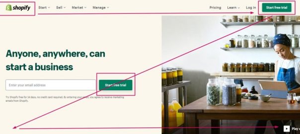
Above the fold, you will need one short sentence or a one-liner that will help the prospect understand what you offer and an image that will show them what success will look like. For example, if you visit the Shopify home page, you will see their simple message that says: “Anyone, Anywhere, can start a business”, a woman developing her own website on a laptop, and a transitional call to action to “Start free trial” at the top right corner.
Make sure the images and text meet one of the following criteria:
- They promised an aspiring identity – Can you help your prospect become competent in something? Will they be a different person after they’ve engaged with your business?
- They promised to solve a problem – Prospects don’t go to your website to read about how your company started, they want to see how you can help them solve a problem.
- They state exactly what you do – For example, “We sell clothes”, or “We do hair”.
An Obvious Call to Action

The whole point of your homepage is to create a place where a call to action makes sense and is enticing. People do not read your page from top to bottom as if it was a newspaper article. Instead, research has shown that viewers scan the page. Therefore there are two main places you will want to place a call to action. The first is on the top right of your homepage and the second is in the center of the screen above the fold. A prospect’s eyes will quickly move in a Z pattern across your homepage, so assuming that the top left is where you have your logo, the next best place for a call to action is in the top right. If your tagline is on the top, the next best place for your call to action is in the middle of the page. For best results, your call to action should jump out from the page and be displayed in a different color and/or font.
Images of Success
Prospects who land on your homepage don’t want to see your building’s facade or spend their mental energy reading about features and benefits. These types of images and messages are best displayed below the fold.
Above the fold should contain an image of a smiling happy person who has had the pleasure of engaging with your company. Images of people smiling and/or looking satisfied speak to your prospect and represent an emotional destination they would like to head towards. If you want to display images of your products, show them in the hands of a smiling customer. Of course, all your images don’t need to include smiling people but they do need to communicate a sense of wellbeing and satisfaction and the easiest way to do that is just to display a happy customer.
Think back to the problem in your story brand framework. How can you show a customer how to defeat their villain, solve their external and internal problem, or demonstrate victory over their philosophical “ought to” or “shouldn’t” dilemma?
Breakdown of Your Products or Services
If your business has multiple revenue sources, your challenge is to find an overall umbrella message and image that unifies them. For example, when I had an invisible fencing business, we offered both a self-install kit as well as installation. The text above the fold might say something to the effect of “The key to a great pet containment system is a customized installation” and the image might show me as the guide pointing out to the customer how he could make sure their dog would never again dig up their prized roses or escape down the driveway. This way, the image, and the text would be equally appropriate for the do-it-yourself and do-it-for-me options.
As the prospect scrolls down the page, they might see one section that talks about the do-it-yourself product and another about your do-it-for-me service. If you are offering multiple products or services, you can always use a series of transitional calls to action for each that will take the prospect to a separate landing page. By definition, a landing page is a separate page on a website accessed by clicking a hyperlink on another web page, typically the website’s homepage.
Very Few Words
Prospects don’t want to spend a lot of time reading content on homepages anymore. Rather, they simply scan them. If you include a paragraph of text above the fold, it’s likely your prospect will not read it. As a customer scrolls down the page, it’s okay to use a few more words but never resort to a dense description. Some of the most effective websites have used ten sentences or less on their entire homepage. It is better to use as few words as possible by employing lists and images to reduce the number of words you use.
How can you use the story brand framework to revise your homepage?
Digital & Social Articles on Business 2 Community
(84)