Landing pages can be majorly effective or ineffective when it comes to capturing information and converting leads, and it all has to do with how they are crafted and what they are trying to accomplish.
Are you developing a landing page? Maybe you’ve launched a few but they just aren’t creating the returns you wanted or you want to boost low conversion rates. You’re not alone. Seventy-five percent of businesses struggle to find ways to optimize their landing pages.
The best way to increase the success rate of a landing page is to take a look at what’s on it. Chances are there are a few ways you can improve your landing page until you’ve got one that converts like a dream.
Here are a few considerations for your next landing page if you’re looking to make some improvements.
Keep Your Messaging Between Ads and Landing Pages the Same
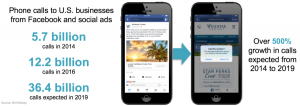
Your ads worked—they got potential leads to click the link and visit your site. So if there is a disconnect between what your ad says and what your visitors see on your website, they will feel betrayed, like they didn’t get what they were promised.
But when your landing page matches your ad, your landing page is completely relevant to the user and you have a higher chance of converting a lead.
Is your “landing page” actually just your homepage or a super-generic landing page that isn’t directly related to your ad? Then you’re not providing a direct answer to your client’s problem and, instead, you’re making them hunt for it on your website. Make sure there’s a direct correlation between your ad and your landing page, and you’ll establish a sense of trust with your new leads.
Limit Your Number of Form Fields
Did you know the average number of form fields on a landing page is 11? How many form fields are on your latest landing page? If your answer is too high, you could be missing out on many more leads who simply don’t want to fill out that many fields on a landing page.
Remember that the potential leads who click on your page may just be getting to know your brand, and they probably aren’t ready to share lots and lots of personal information with you just yet. A landing page form field is a great place to gather just a few pieces of important information.
You wouldn’t ask a brand new friend lots and lots of questions about their personal history or background, would you? It’s the same idea here. Keep it simple, and you’ll end up with more responses. One way to improve your data over time without adding too many form fields is to use progressive profiling in HubSpot. This means if someone comes to the landing page again, or another form on your site, the fields they’ve already filled in disappear, and other fields you’d like data for appear.
When you lower your number of form fields from 11 to 4, statistics show you’ll see a 120 percent increase in your conversion rate. Focus on the quality of information instead of the quantity, and it will pay off.
Use Your Customer’s Voice
Sure, your product may be incredibly technically impressive, but that’s not what your customer cares about. Your landing page should be focused on how your goods or services will make your clients’ lives better.
So how do you find your customer’s voice? You can start by coming up with your organization’s buyer persona. You can collect data from your customers and use it to your advantage, to appeal to your customers and reach them where they are.
And using customer data to create a buyer persona to better market to your audience is incredibly effective. Several Gallup polls have found that when companies collect data and use it to personalize their marketing and their products to customers, they outperform their competitors in sales growth. They also surpass them in gross margin sales by 25 percent.
So why not incorporate your buyer persona on your landing page? You’ll have a better chance of having an impact on your future customers.
Incorporate Video—When the Time Is Right
If you really want to catch the attention of your visitors, a video may be the way to do that. Using a well-placed video can increase your conversions by 86 percent—but only if you do it right.
I’ll admit that people overuse video, and that I think there is a time and place for everything. So when should you attempt a video landing page? The answer isn’t “all the time.” Here are a few opportunities to use video on a landing page where it would enhance user experience and improve your landing page rather than detract from it:
- If you have a complicated product that needs some explanation
- If your business is doing exciting, heroic or jaw-dropping things that potential leads would love to see
- If your business is serving an important function that could be perceived as less than exciting, and you want to broaden the appeal
A few helpful hints about incorporating a video into your landing page strategy: Make sure that the size of the video works on any screen: smartphone, tablet or desktop. Also, you don’t want your video to be too long—90 seconds is a great length to convey what you want to share with page visitors.
Another thought is to consider is when or how your video plays. None of us like visiting a page only to have a video start playing automatically with sound blaring through your speakers. But with a landing page, you do want to ensure visitors watch the video if it’s an important part of your messaging. This is an opportunity to conduct some A/B testing and see whether auto-play is the best option for you or not.
Write a Stellar Call to Action
A call to action (CTA) button that only says something like “Submit” means it’s time to rethink your strategy. I’ve spoken a lot about CTAs, but it’s because their value cannot be undersold.
You should use strong, engaging, evocative words that inspire your new visitor to share information with you. This can be a moment to get creative and show more of your brand’s personality and utilize your carefully crafted brand tone of voice to help your new lead get to know you a little better.
Your CTA is a great opportunity to think about what it is your leads are looking for and how you can help them. They’ll be more likely to click on the link if the copy written on the link matches up with a problem they need to solve or a challenge they might appreciate. This means your CTA also ties in directly with your buyer persona.
Digital & Social Articles on Business 2 Community
(30)


