 Emily Carter
They’re calling it Mobilegeddon. In case you haven’t heard yet, Google recently made this announcement:
“Starting April 21, we will be expanding our use of mobile-friendliness as a ranking signal. This change will affect mobile searches in all languages worldwide and will have a significant impact in our search results.”
Even though this announcement doesn’t provide a whole lot of detail, we can make some educated guesses about a few things:
- What does this mean?
- Why would they warn us about this algorithm change when they don’t normally do that?
- What do I need to do in order to be in Google’s “good graces”?
Let’s get started with what the announcement means. Basically, Google intends to reward mobile-friendly websites with better mobile search engine rankings beginning on April 21. On the flip side, if your website is not mobile-friendly, it could experience a negative impact in mobile rankings. They will receive a smaller piece of the mobile search traffic and have to rely on desktop-based organic traffic.
So why would they give us a date? And why would they warn us of an algorithm update? Google notoriously surprises us with these things, and rarely tells us the exact date such a change will happen. The reason Google has provided a timeline is to encourage anyone who doesn’t already have a mobile-friendly website to get going!
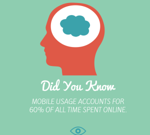
This announcement solidifies the importance of having a mobile-friendly website, but hopefully this has already been on your radar. The amount of people accessing websites from their phones or tablets has skyrocketed in the past couple of years. In fact, mobile usage has overtaken desktop-based digital media. Mobile usage accounts for 60% of time spent online.

So what can you do to make your website mobile-friendly? You have two options.
- Responsive Web Design – If you have a responsive web design, the size of your website’s pages will adjust to the viewer depending on what type of device they are looking at the website on. The great plus to this is that you only have to have one website. It’s highly flexible and you only have to create and maintain one website. Also, it’s Google’s recommended configuration, so that basically is the ultimate seal of approval. Click here to learn more about responsive web design.
- Create a Mobile Site – Mobile sites are a separate website created solely for mobile devices. While this option is typically cheaper to design, they can be a bit of a pain because it’s essentially a duplicate site. This means that if you update one page, you also have to go over to your mobile website and update the page there too. This is time consuming and adds more to your plate. Also, while they might be optimized for today’s devices, there is no accounting for whatever new device that may come out.
Grass Roots Marketing recommends that you consider having a responsive web design when creating or redesigning your website. If you build your website on HubSpot’s COS, your website will automatically have a mobile responsive design (add it to the list of reasons we LOVE HubSpot). For more information on the HubSpot COS, click the button below.
If redesigning your website for mobile is something that you have considered doing in the past, it’s imperative that you add it to the top of your marketing to-do list. Come April 21st, if you haven’t done this yet, you may be taking a hit to your site’s web traffic.
(330)