
It may sound counter-intuitive, but the best way to stand out from the competition and rise above all the online noise is to keep things simple. Less is more when it comes to designing a quality B2B website.
Your website’s homepage is often a prospect’s first impression of your product or service. Keep these three rules in mind when designing your B2B homepage:
Focus on what matters
When your brand’s messaging and navigation are clear, concise, and easy to understand, people will have more confidence in your company. This is because these traits help build trust and demonstrate superior quality.
The average American consumes 34 gigabytes or the equivalent of 100,000 words over 11 hours a day from all media sources. Minimalist design is like a cold glass of water on a hot day—offering users a refreshing break from all the noise. It also offers higher user engagement, better usability, and is more visually pleasing to the eye. Having just the essential things is better than having too many superfluous things. It allows users to focus on what matters—your brand message.
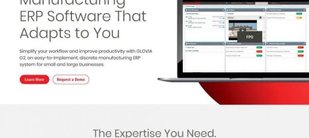
A great example of focusing on what matters comes from our client FUJITSU GLOVIA and their recent website redesign. Which homepage makes you feel more confident and ready to dive-in?


Allow users to dig deeper, but on their terms
Some may argue that minimalist design and messaging on a homepage will not effectively communicate all the many facets of a B2B product or service. B2B marketing is different because it needs to communicate specific details to specific decision-makers and buyers. To those who express this concern, I say fear not. It IS extremely important to communicate all the details of your product or service, but there is a right time and a right place.
Much like a first date— users feel more comfortable when information is rolled out in small bits and pieces at the beginning of the relationship. Visually busy homepages leave us feeling overwhelmed and don’t talk to us, but rather at us. Consumers can smell brand desperation a mile away. There is a fine line between persuasive and desperate.
Make sure to prioritize the essentials. The goal is to make the user excited about your product or service—leading them to dive deeper into your site, and eventually make a purchase. Interactive modules and clearly defined buttons help lead the user to more information and are also great tools for tracking and understanding the needs and wants of your customer.
Speak to people the way they want to be spoken to
In our post-COVID 19 world people are demanding authenticity. Emotional intelligence is taking center stage as a lead indicator of a businesses’ ability to adapt and thrive. Attract and convert high-quality leads by speaking to people clearly and directly through smart design and messaging. Solving, not selling, is mission-critical for companies right now.
Digital & Social Articles on Business 2 Community
(84)