Quality email design plays a major role when it comes to making email marketing work for you.
As a professional, business owner, or marketer, you might know all about the power of email marketing. But just in case you need a reminder, let’s start with some recent email marketing stats.
Email marketing has one of the best returns on investment (ROIs) of any online marketing method. Studies show that for every $ 1 you spend on email, you can get $ 42 in return. That’s because more than four billion people across the globe use email. It’s safe to say that knowing how to design an email is worth your while.
People check their email right when they wake up. Most are conditioned to hop to attention when their smartphones beep to signal incoming notifications. More than a fifth of emails are opened within the first hour of delivery, meaning you can immediately get in front of both loyal customers and qualified prospects — sometimes in the blink of an eye.
Even though 61% of consumers who sign up for promotional emails report enjoying a weekly message — and 38% want even more frequent emails — this digital marketing strategy isn’t always so simple to execute without practice or knowledge.
You need to make sure that every email you send has the best chance to be delivered, opened, and read. Most importantly, a marketing email should motivate its readers to take action — and not just any action, either. The way you present your email will guide your readers to complete the action of your choosing — whether that’s to make a purchase, learn more about your company, or connect with your campaign goals.
One way to ensure you’re presenting your company in the best possible light is by following the tips and best practices professionals use for good email marketing design.
Design, by definition, is the art or skill of laying out text and pictures in a way that’s pleasing to the eye. It should also encourage the viewer to do whatever it is the designer would like them to do.
In this email design guide, you’ll learn:
- The benefits of great email design
- Email design best practices
- The 7 essential elements of an email
- How to integrate email design into a comprehensive marketing strategy
The benefits of great email design
Think about the last email you received from a company. How long did you take to read it? Most people spend an estimated 15 seconds reading an email. If your message isn’t well-designed, it could take less than a minute for it to go straight in the trash bin. On the other hand, a well-designed email could entice a new customer in those same 15 seconds.
Email design best practices combine the knowledge of good graphic design with the technology of digital marketing. It goes well beyond simply making sure that your text is legible and your layout is inviting.
Design can facilitate your ability to build your company’s brand and express it clearly and effectively to your customers. For example, studies show that if you plug video content into your email, you can increase your conversion rate by up to 300%.
If you think you can rely only on social media to connect with customers on a meaningful level, you may want to think again. Email is 40 times more effective for customer acquisition. And conversions (meaning when someone reading your email executes your desired action) will come easier with mobile-responsive messages designed to help you speak directly to your targeted audience.
Investing time and effort in learning how to design emails better will maximize your sales and connections to support your company’s growth.
Email design best practices
People make entire careers out of mastering design. You don’t need to be an expert, but you can improve by always putting the goals of your marketing campaigns in the forefront as you begin to create your emails.
Before you can start working on the best email design for your business, you need to know:
- Who your target audience is
- What the purpose of your email is
- What you want your readers to do
Who is the audience that you’re trying to reach? Answering this question will help you as you write the copy and choose your images. For example, an auto repair shop trying to get customers to come in for an oil change will require a very different kind of email design than that of a hair salon wanting clients to book an appointment with a new stylist.
Once you know who you’re crafting your message for, you’ll need to know exactly what you want them to do. The action should be a measurable objective that you can track on the back end of your email marketing platform. With your campaign’s endgame in mind, you can employ email design techniques that will work to streamline messages for your company’s benefit.
Good email design also helps you avoid having your message arrive in the junk folder before anyone reads it. For example, some spam filters will analyze messages to see if they’re too heavy on images or text. Shoot for about 40% text and 60% images to make it past filters like these. The only way to balance these elements in an email is by following established design best practices.
Below are some general best practices to keep in mind as you learn more and work to enhance your email design skills.
Stay on-brand
Your email design should have the same look and feel as the rest of your marketing materials, including your website and social media platforms. Use email marketing as a means of strengthening your brand, not an opportunity to stray from it.
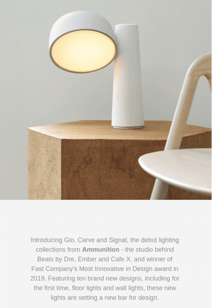
Gantri’s minimalistic leanings are reflected in this simple email design.
While most rules are meant to be broken sometimes, your design should be consistent with your brand identity in the following ways at-minimum:
- Color palette: Stick to using your brand colors consistently, with just a few additional colors that complement your brand. Less is more when it comes to your color palette.
- Font: Try to stick to no more than two complementary font styles. And when it comes to font size, don’t make your type too small. Shoot for somewhere between 14pt and 16pt. You don’t want your email design to force people to get out their reading glasses.
- Tone: Write your emails in the same way you would for any of your other brand channels, like your website or social media, or even over the way you speak to potential customers over the phone.
- Message: Considering your brand identity will keep your message consistent and focused on what’s most important for you — and your readers.
Be mobile-responsive
A majority of people check their email on their smart devices — often before they even get out of bed. Your email design must be mobile-responsive so that your message looks just as good, and functions just as well, on a small screen as it does on a laptop or desktop computer.

The template featured in this Protest Sportswear email works on mobile devices by allowing the reader to scroll through the products, providing a realistic shopping experience.
Since most people are reading emails on their phone’s smaller screen, your emails should be concise. Longer text blocks involve a lot more scrolling on smaller screens. You’ll also want to make sure to choose a font size that is easily readable on a mobile device.
Any images you add will need some extra effort. Some email clients don’t automatically download images. Properly fill out each picture’s “alt text” box so your readers will know what they’re missing. This step will also help with search engine optimization (SEO).
Overall, your emails will look best on smaller screens when you use a simple template featuring a single column. With Constant Contact, you can opt for a multi-column layout, which will show up on a smartphone as a single column. Otherwise, beware: Sometimes multi-column templates will show up on a smartphone so small that a reader will need to zoom in to read. That’s why it’s so important to always use an email marketing provider that prioritizes mobile-responsive emails.
If your email is not mobile-responsive, your design may arrive at your subscribers’ inboxes in a form that’s different from what you originally envisioned. Make sure your hard work pays off.
Use an email template
Often, you can use email templates to make the email design process easier. But you may also want to modify it to fit your needs and tastes.
If this is the case, make sure to incorporate a good amount of white space around each design piece. Think of it like a frame that will draw the reader’s eye to where you want it to go. You can also use colors for contrast in the same manner. Be sure to avoid too many light grays or off-whites, both as font color and as a background choice. It’s too easy to have a gray-heavy design look washed out.
The 7 essential elements of an email
By understanding each design element of your email, you’ll be better equipped to tie it all together functionally and effectively.
Every email has seven elements:
- Header and metadata
- Preheader
- Logo and colors
- Images
- Body
- Call-to-action (CTA) buttons
- Footer
Here are some best practices to consider when you’re maximizing the marketing potential of each of these email sections.
1. Header and metadata
This is the first thing that people see when they receive an email. Email marketing systems usually pre-populate the “From” and “Reply-To” parts with information you provide to your email marketing provider, but you can edit the header information of a message by simply clicking on that area in your draft.
“From” name and email address
To increase deliverability and likelihood for users to receive your emails, use an official email address — ending in your company’s domain name rather than yahoo.com or gmail.com — for both the “From” and the “Reply-To” sections. When your recipients can see exactly who is sending your emails, you lessen the chances of them unsubscribing.
“Reply-To” name and email address
Frequently, company messages come straight from the top executive — but they’re usually too busy to be expected to reply. It’s okay to have a different email address in the “Reply-To” section of your header from the signature at the bottom of the email body. Just make sure it will still be easy for customers to interact with your brand and ask questions through email.
An effective subject line
While your subject line isn’t exactly part of the email design, it’s crucial to the success of your marketing message delivery. It’s the first thing your recipients will see — and boring, irrelevant, or spammy subject line may mean your email won’t even get opened.
Including a subject line is important for more than just enticing the recipient to click open. Emails without subject lines are more likely to end up in the junk folder. Try adding a fun emoji to your subject line, too.
Here are some tips for creating a great subject line:
- Make it brief. Your goal is to not have a subject line truncated by email inboxes.
- Be honest. Use the subject line to announce what’s in the email. Don’t try to be tricky — no “bait and switch.”
- Be clever, but not too much. Check with your team to see if a joke will fly.
- Avoid spam trigger phrases (like “FREE” or “$ $ $ ”) and excessive use of punctuations.
Subject line personalization is also a great tactic. When someone sees their name in a subject line, they know the message was catered just for them — and they’re more likely to click and read.
2. Preheader
Also known as an introduction, a preheader is the text that often accompanies the subject line in a recipient’s inbox. While not all email providers show the preheader automatically, it’s a good idea to still include one, and use this as an opportunity to let your subscribers know exactly what they can expect when they open the email.
Follow the same best practice that journalists use: Start with the most important information. If you are announcing a sale or launching a new product, for example, lead with that detail to encourage people to click and read the rest.
Preheaders are not necessary to send an email, but they can help make your message crystal-clear to your readers. Preheaders can be used to create a feeling of urgency. Focus on the first five to eight words, which almost always show up in a person’s inbox.
If you leave the preheader blank, it will just populate with the first few lines of your email. Depending on their settings, your recipient may see your preheader as well as the first few lines. Consider this while designing your headers.
3. Logo and colors
Email design can be a creative process, but it’s important to stick with some basic best practices and to be consistent if you want to build a strong sense of who you are — your brand. You want your email recipients to get used to your brand identity before you shake things up, so make sure you have a clear set of brand colors and a nice logo to showcase in your email design.
A memorable logo
No matter which template you use, your logo and company name should be front and center when someone opens up your email. For branding purposes, every company needs a logo.
When adding your logo to your email body, be careful that it doesn’t stretch out to fill the entire screen. You may need to decrease your logo’s size so that your email recipients don’t have to scroll down an entire page just to see what’s below it. But, of course, always make sure the logo is large enough to identify or read.
You may wish for your logo to have a transparent background or a shape with your branded color scheme. Take time to edit your logo as you set up a template so that all your emails look even more professional.
Use your brand colors consistently
As mentioned above, you’ll be able to more easily convey a sense of your brand identity if you use a single set of colors consistently. Choose just 2-3 colors that complement your logo to utilize in your email design, rather than starting from scratch and choosing new colors for every email campaign.
4. Images
Images can be an effective tool to include in your emails, but only if it supports your message. Often, customers or potential clients may quickly scroll past text — but they’ll stop for a compelling image. What makes an email image engaging?

This Magic Spoon Cereal email features a compelling image.
High-resolution
First, images should be clear and high-resolution, but not so big that it takes a long time to download. Shoot for around 1 MB in size and not larger than 5 MB. When images are too small, pictures will look pixelated and your email will seem unprofessional. When they are too big, they could take a long time for your readers’ email clients to download or even worse — they could send your email to a SPAM folder.
Original or custom-edited
Stock images can be a great way to quickly create a professional-looking marketing asset like an email campaign. They’re easy and accessible, with a large library of stock images built right into Constant Contact. But that doesn’t mean you should rely entirely on stock images. Using your own, original images shows people who you are and further connects them with the brand identity you are trying to convey.
So try using your own images. If you have the budget, invest in a professional photographer for a unique shoot. You can also work with an illustrator to make branded graphics. If you need to rely on stock photography, look for images that match your brand and support your overall message. Learn how to properly edit images to customize them for your email campaigns.
Showing emotion
Start noticing what type of photos draw your attention the most. Chances are, you connect to images that have the subject looking directly at the camera or showing emotion. Photos are less engaging if you can’t see the person’s face or clearly understand what they’re doing.
Well-lit
Make sure you add photos with good lighting to your marketing emails. Paying attention to this detail can help colors pop in your images. A fun design trick is to use softer shades of the same colors in a photo for the background in some of your content blocks. Clever design can pull the entire email together and make it look more streamlined and professional.
When pictures are too dark, you force the reader to spend time trying to figure out what is going on. Spoiler alert: they won’t. And they might even unsubscribe instead.
5. Body
When someone clicks to open an email, the first thing they see is the body, which is really where you can get creative with your design features. Consider using a drag-and-drop template that works for your industry. It’s also possible to build a customized template from a blank slate, but a template will help you create a cleaner, better-designed email that follows best practices.
Content blocks
To create your templates, you’ll often utilize elements known as content blocks. These help you build and design your email as you’ve envisioned. They can contain:
- Text
- Images
- Buttons
- Dividers
- Spacers
- Social media links
- Videos
- Links to additional content pieces, like your blog
What information do you want to share with your readers? This will determine which content blocks to add to your template. Consider readability as you decide where to add which block.
Remember your goal for your email when laying out your content blocks. Never have too much text in a single block, as that can feel overwhelming for readers. Break up the copy with a soft background color, sub-headings, or bullets. Integrate images that speak directly to your email campaign, so the recipient knows exactly what you want them to do.
It’s also possible to share videos, play with animation, or even include a countdown timer right in an email. Just be careful not to make it too busy. Only use one or two of these interactive design elements per email.
Saved custom templates
If you plan to produce monthly newsletters, you’ll want to create a recognizable design that your customers will appreciate receiving. Luckily, you won’t have to recreate the wheel every month. Once you’ve set up your content blocks, you can save the template for future use.
Keep in mind that you may have different news and updates to share each month. You don’t have to follow your custom template exactly. It’s possible to edit and switch up your email design with different content blocks — or create an entirely new template if you wish for special occasions like a holiday or a once-a-year sale.
Simplicity and space
If you have a lot to share, consider treating your email as more of a digest that previews your content and includes a button to “read more” that links to that content on your website or social media.. This will allow you to give your images extra space and not overwhelm your readers. Remember, minimalism goes a long way with email design.
Another way to simplify is to try using icons as graphic inserts instead of photos. Creating cute drawings for elements of your email can tie the look together more easily than trying to find photos that have the same tone and color scheme.
A clear message
Again, it’s about simplification. It’s a lot harder to write a couple of sentences than a couple of paragraphs, but your emails will look and read better if your text is concise. Most people aren’t going to allocate a lot of time to digest a complex email, even if you have a lot to share. They’ll appreciate a clear and direct message that makes sense.

This Headspace message features a sweet and simple email marketing design that makes you feel relaxed, just like their service.
Good design helps the reader understand what you want to express without too much brainpower. A large section of text takes a lot more focus to read than smaller sections within the email. It’s easier to read a bulleted list or short paragraphs. Sometimes it also helps to include design elements like borders or backgrounds with different colors.
You’ll also want to avoid clichés or insider lingo that may confuse someone. Be careful to not use slang that may have more than one meaning. And while you’re at it, double-check for any typos.
Aligned text
Make sure your readable message is aligned and consistent throughout the email. Perhaps you’d like to align some text along the edge of an image. It’s okay if the choice is consistent, but it’ll look too busy if you have different alignments throughout an email.
Links that work
A benefit of digital marketing is that you can encourage people to visit your website’s contact page, blogs, social media, and other online resources — with just a click of the mouse. But it’s a mistake to not double-check any links you add to an email. Do this every single time. Broken links will not only detract from your design and frustrate your customers, but a broken link can even give the impression that your brand is unreliable.
6. CTA buttons
While technically found in the body of an email, buttons for calls-to-action are so important that they demand a separate section to discuss best practices. Your CTA serves as an arrow for the reader to follow.
The words on the buttons tell them what to do next — like “buy now” or “learn more.” Whatever the text you use, the idea behind it is the main reason you’re sending the email in the first place.
Always include a CTA button with clear and direct text. If your brand is fun and fresh, don’t be afraid to change up the wording on the button to reflect that. Use active language and express the action in as few words as possible.

It’s clear what Hawthorne wants you to do — get yours for $ 60.
It’s essential to limit the number of CTA buttons or links in each email. If you’ve ever eaten at a restaurant with a phone book-sized menu, you know how confused some people get when presented with too many options. CTAs aren’t about giving the reader a bunch of options. Rather, they should be clear and singular — asking the reader to do one specific thing.
Bold and obvious
Your CTA should attract the eye immediately and be conspicuous in color, size, and location. And after clicking your CTA button, tt should take readers exactly where they expect it to take them. If you’re promoting a new product, for example, make sure the link goes directly to that product’s page. Don’t make your readers search for what they want. Use design and direct links to make it easier for them.
No attachments
You may have a lot of information you’d like to include in your email, but adding attachments isn’t the way to do it. In fact, your recipients will be more likely to presume your attachments are spam. That’s why most email marketing services don’t even allow you to add them to your messages.
It’s better to encourage your subscribers to download what you would have attached. Upload whatever you wish to share on a cloud storage service (or better yet — to your website), and link to it somewhere in your message — a CTA would be ideal for this job.
7. Footer
At the very bottom of every email is a section known as a footer. It provides an opportunity to include specific information that’s required by legislation like the CAN-SPAM Act without messing with the overall design.
Mandatory information in the footer includes:
- Your organization’s name and physical address
- An Unsubscribe link
- A way for subscribers to update their profiles
- Your company’s privacy policy
- Details about the service provider
Unsubscribe button
A classic bad move for email design is to hide the unsubscribe button. Don’t make the font of your unsubscribe link super small or the color blend into the background so that you can’t see it. This trick won’t work. People who aren’t interested in your products and services will unsubscribe anyway.
When you frustrate recipients this way, it’s also more likely that they’ll report your emails as spam. Email providers take those reports very seriously. Instead, consider unsubscribes as an act of kindness. More is not necessarily merrier if your email list is filled with people who have already decided not to do business with you.
Of course, if you use an email marketing platform like Constant Contact, you’ll never have to worry about your unsubscribes since the process is already built-in.
How to integrate email design into a comprehensive strategy
Not sure if you’re following design best practices effectively? You’re not alone. Marketing professionals and even graphic designers often try different layouts and messaging. Sometimes the process can feel like a guessing game. The way to know what’s best is through a process known as A/B testing, also known as split testing.
Let’s say you’re not sure which of two different email designs to use to express your message. Perhaps you’re experimenting with the wording of your call-to-action (CTA) button or you can’t decide between subject lines. Make sure your two designs aren’t completely different — otherwise it will be hard to determine what’s working and what’s not.
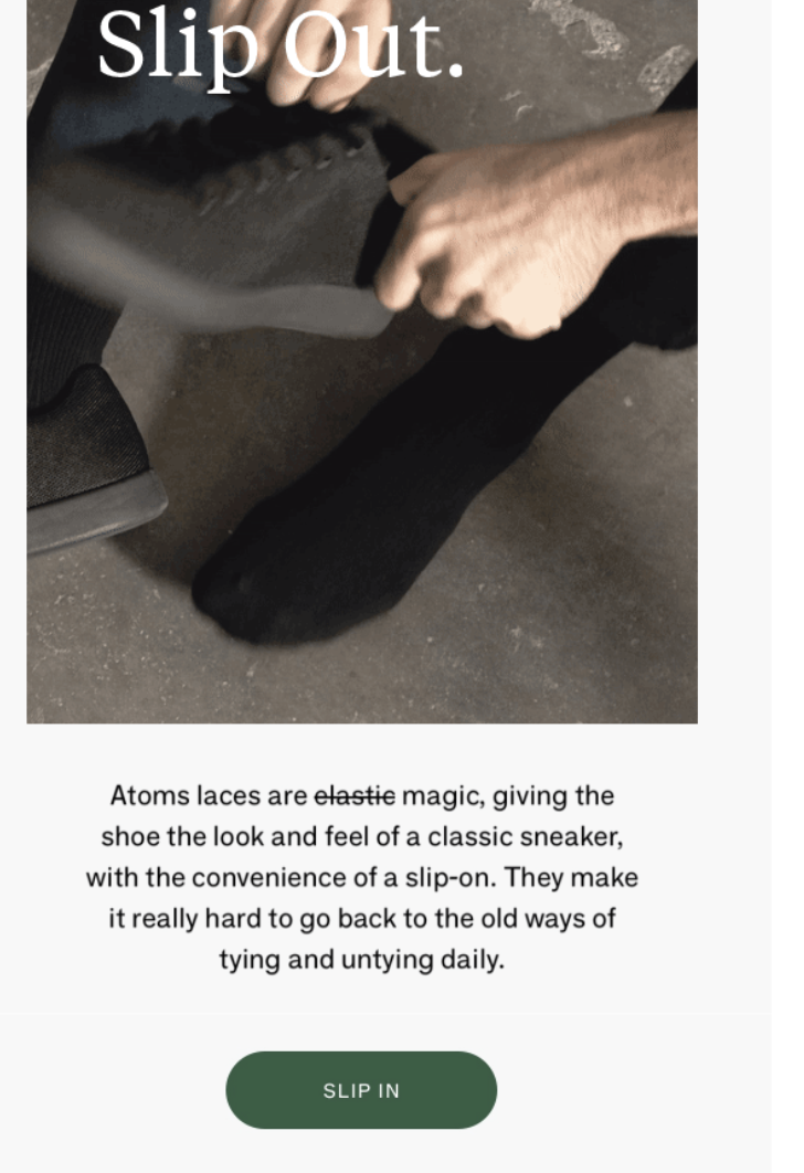
Does the CTA button text in this Atoms email work? You can study CTAs like this using A/B testing methods.
Send one version to half your list and the other to the rest. Then, check your backend email reporting to determine which one is more successful in accordance with your goal — be it open rates, click-through rates, or signups. By analyzing your metrics, you’ll have a clearer understanding of which design works best for your target audience.
Once you have a solid grasp of the basics of email design, you’ll be ready to integrate email marketing into your comprehensive online marketing plan. If it sounds like too much to do, don’t worry. You can use online tools like Constant Contact’s content blocks and email templates to create email campaigns easily.
Remember: Email works best when combined with social media marketing, paid online advertising, content marketing, and managing your overall online reputation.
To learn more about the basics of online marketing and email’s place in it, check out Constant Contact’s The Download. The free marketing guide explains the essential digital marketing tools and strategies that small businesses can use to thrive.
Digital & Social Articles on Business 2 Community
(89)


