
If you run an online business, checkout is the most important part of your selling process, as it’s the step that converts into revenue. What are the best ways to optimize your payment form UX and to design a checkout process to make users complete a purchase?
The credit card payment form design highly affects your website’s or app’s abandonment rate. So, if it’s designed in a way that makes red flags go up in a customer’s mind, you will lose them at the last step of the selling process. And the entire effort you put into attracting that customer will have gone to waste.
Let’s dive deeper into payment form UI and UX practices that will prevent you from designing a clunky credit card checkout that scares customers away.
Credit Card Checkout Form Design Optimization
How a credit card checkout is designed directly impacts conversion and cart abandonment rate. The faster and more convenient it is for users, the better checkout performance.
Table of Contents
- Multi-column forms
- Number of fields
- Form fields arrangement
- Auto-complete
- Required or optional fields
- Radio buttons and dropdowns
- Coupon fields
- Clickable images
- Progress bar
- Checkout speed and performance
- Design with a unique feeling
- Clear call to action
- Price displaying
1. Forget multi-column forms
Based on Cart & Checkout testing run by Baymard Institute, multi-column form layouts are often misinterpreted, making users skip important fields or input data into the wrong ones. This also leads to cart abandonment, as customers can’t proceed to the next step because of the incorrectly filled out form.
The thing is that people don’t notice fields in multiple columns, and they interpret forms with two or more fields in various ways (see the example below). Users are confused when seeing such forms and their eyes start zigzagging.

How users misinterpret multi-column forms. Source: Baymard.com
Based on the CXL Institute study, the information in single-column forms is easier to understand, as users’ eyes go in a more natural direction.
So, a single-column layout eliminates the risk that users will misinterpret your checkout form. There are, however, some exceptions when you can put several fields in the same row without confusing users.
For instance, asking for credit card details in a linear form doesn’t cause users’ confusion and comes with only minimal issues. Based on the Baymard Institute findings, this is mostly when the fields logically belong to the same category.

An example of 3 inputs on a single line that ask for payment card details
What people find helpful when it comes to card payments, is also when the field sequence resembles one that is printed on the physical card.
2. Reduce the number of fields
Another thing that lowers the chance that consumers will misinterpret your payment form is reducing the number of form fields to a bare minimum.
The main problem is that payment forms on most websites have twice as many fields as they need to, which is one of the top reasons for abandonment. According to the Baymard Institute, a checkout flow for non-registered users should have a maximum of 6-8 form fields for a physically shipped product.
For instance, consider whether you have to add the second line to the address input field. While in countries such as the United Kingdom or Spain it’s required, in most of the other European countries it’s unnecessary. Users don’t always know what to type in line 2 and it often causes validation errors. ?To avoid this, add label descriptions or simply collapse the field behind a link, so it will be easier for the customer to guess what goes where.
Another solution is to indicate the field as “optional”, but if you don’t sell globally and your customers don’t use the field, think of merging the two fields or removing/hiding the second line, because every additional input field means lower conversion.
The same goes for the name field. It’s better to create a single “Full Name” field than separate “First Name” and “Last Name” fields.
3. Arrange form fields from easiest to hardest
A good practice is to arrange the easiest form fields first (name or email address) to make people more eager to take action — this way there’s a bigger chance that they will complete the credit card checkout process. So, billing details and other time-consuming questions should go at the end of the checkout form.
4. Provide auto-completed and auto-filled form fields
It’s surprising how many merchants ask for information that they can deduce. Don’t be one of them and give customers an easy and quick payment process by using auto-complete form fields wherever you can.
For instance, you can use geo-targeting and pre-fill the fields with a city name and state. You can also ask for ZIP-code first and then auto-fill fields with address details. See the Baymard Institute’s example.
5. Indicate required or optional fields
Even though many websites use an asterisk to indicate required fields users are familiar with, it’s still not obvious to every customer what this sign is about. So, another solution for marking such fields is placing the placeholder required (outside or inside the field).
Another most common thing is making asterisks red, but it’s not that necessary. However, avoid making them pale gray or in low-contrast colors, especially when your target audience consists of elderly people.
As there are usually more fields required than optional, it’s better to mark optional fields, so it causes less confusion and risk of errors. The entire form is also easier to read and faster to complete, as you limit potential distractions.
6. Use radio buttons instead of dropdown boxes
The CXL study found that people complete forms with radio buttons quicker than ones with multi-select buttons.
Radio buttons are also more practical when there are less than 5 options in the form, as it makes users scan them and select much faster instead of opening a dropdown menu. It also works well when you offer various options (for instance, subscription plan), so users see all of them at a glance and can make a quicker decision.
So, do you even need a dropdown menu? It’s a good practice to use them when there’s a recommended option to choose, so there’s a smaller chance that a user will change the default option. If you display all options, it will take longer for a user to decide, or they will choose something different.

Source: blog.prototypr.io
Dropdowns are also better for a large variety of options.
7. Don’t shine a spotlight on coupon fields
When customers see the coupon code box, they assume there is a special offer and start searching for it. They might even leave your site to find it, and there is a big risk here that they’ll never return, e.g. because they might find better deals on your competitor’s site.

An example of hiding a promo code box
Keep in mind that invalid codes also cause the problem. So, if you rarely offer coupon codes, better hide the box or use a text link, so it doesn’t stick out. Or, instead of displaying it for everyone, you could just show the coupon box to your targeted audience — for instance, when they come to your site via a promotional email or landing page.
8. Use clickable images
As people process visual information faster, there’s a bigger chance that they will check a box than choose an option from a dropdown box. Graphic elements also make the form more engaging and are easier to notice while skimming.

9. Add progress bar on long forms
A progress bar is especially helpful when users need to complete long forms, so they know where they are in the process or how many fields are left to complete a purchase.
Progress indicators increase customers’ motivation to complete the purchase. People feel they have more control over the process if they know when it’ll be completed.
10. Improve checkout speed and performance
Did you know that even a 1-second delay in your page loading speed has a huge impact on your conversion?
One of the Dynatrance studies shows that more than half of online users won’t wait more than 3 seconds for a page to load. It also found that those who averaged a 0-1 second response time on a product page were converting at a rate of 25% compared with a conversion rate of 10% when the page speed took longer than 10 seconds. Another study by Radware shows that a 2-second delay in load time during a transaction results even in an 87% cart abandonment rate.
Avoiding load time delays is especially important on mobile, as people expect quick shopping possibilities on the go, so it’s best to remove all of the things that can harm the page’s loading speed. Here’s what you can do:
Remove extra elements and distractions from the checkout form, such as non-related links, social buttons, graphic elements, etc.
Keep the design clear and uncluttered, remove the footer and header elements from the checkout page.
Keep customers on the same page during the entire checkout process. Don’t redirect them to an external service to pay, as it may severely hurt conversion.
Reduce the number of form fields, ask only for necessary information.
What can also speed up the process is the “remember me” option in the checkout, so customers don’t have to type in their credit card number each time they want to buy something. Think about how convenient it would be for them to pay with just 1 click, with no need to input their credit card information.
11. Design with a unique feeling
A fast checkout form should also come with a beautiful design that matches the website’s layout. It needs to look like it belongs on the site. So, when you’re running a modern, elegant online store, make the checkout look modern and elegant as well.
12. Use a clear call to action
Label the buttons with a clear message to be sure that people understand exactly what will happen when they click on them. This can be a simple “Pay”, “Give me access”, or “I’m ready to pay”. Just don’t try to create button text that is hard to understand like “Go” or “OK”.
13. Display the price
Customers should know the final price (including shipping and/or other extra costs). Hiding the price makes people go back to find the overall cost of their purchase, and you can be sure that some of them won’t return to complete the checkout process.

Mobile Forms and Checkout Optimized to Convert
The checkout page on mobile should be as simple as possible without menu links, a search bar, or social media links that can drive users away. Also, keep text input to the minimum and eliminate extra steps to reduce typing effort. It’s hard to write on a small screen, so remember: the bigger the form, the better.
Table of Contents
- Field focus
- Single-column form
- Multi-step form
- Labels
- Font size
- Touch-target size
- Automation
- Dropdown
- Input mask
- Input optimized for keyboards
- Screen-wide CTA
Shoppers tend to use their tablets and smartphones to compare prices, read reviews, and buy products. Larger smartphone screens make them more likely to choose mobile devices to buy online, as it’s a bit more convenient for people who are constantly on the go.

Creating an intuitive design with a minimal amount of steps in the mobile payment process is a must if you care about your business growth.
To sum up, improve mobile payment UX by reducing the number of fields and condense the entire form to fit on a single page. Create a user-friendly checkout process that improves the customer’s trust and makes them more willing to buy on mobile devices.
14. Consider field focus
To make users move more smoothly through the form, auto-focus the first input field. This saves the additional click and enhances payment form UX. Make it crystal clear for the user where the focus is, for instance, by using a darker border color or by highlighting the box. You can also consider using this method for errors.
15. Provide single-column forms
Mobile users are more motivated to complete a single-column form that requires vertical scrolling, rather than a multi-column form that usually takes longer to fill out. In fact, a study by CXL Institute found that users completed single-column forms an average of 15.4 seconds faster.
16. Eliminate scrolling in multi-step forms
Note, that multi-column forms require more pages to load, which can be burdensome for users with a weaker connection.
However, if you need to implement a multi-step form, replace scrolling with sections that will fit the smartphone window. Such a solution makes it possible to save information after each step, so it reduces potential user frustration.
17. Write clear labels
Thanks to labels, users know exactly what they should type in a particular field, increasing the chances for them to successfully complete the form. Clear and concise messages also make it easy to understand what information is required when they just skim. Also, take note that labels placed above fields are easier to scan.
Also, consider floating labels. As mobile implies having to do more, with less space, floating labels may help to enhance user experience. Floating labels animate upwards when a user starts to type in the information. Overall, the solution makes the form look shorter and users get a clear view of what field they’re on.
18. Adjust font size for mobile
Mobile users love large text on the screen to clearly see everything without having to zoom in, as such the standard font size for body text is 16px. According to the Nielsen Norman Group report, the bigger the font size, the better. Glanceable strings of text perform better and the study recommends using all uppercase letters in forms to guarantee faster reading.
19. Provide touch-target size
The rule of thumb is to create a design for touch — mobile elements must be large enough to seamlessly click with one hand.
Another study by Nielsen Norman Group found that interactive elements must be at least 1 cm × 1 cm, however, finger-sized is not always practical (average fingertips are 1.6– 2 cm wide). Touch targets that are too small make users take longer to tap, which negatively affects conversion.
20. Automate wherever possible
If used properly, automation positively affects credit card checkout on mobile. Examples of such automation features could be auto-capitalize (especially the name and address fields), auto-complete, auto-fill, or auto-detection (for location). Everything that helps minimize users’ effort is welcome.
21. Limit dropdowns
Mobile forms with dropdowns take longer to complete and make it harder to choose items from the list on small screens. Not to mention that this requires extra taps, making users more likely to abandon the checkout process.
Instead of a dropdown, you can consider steppers (+/- controls), segments (or radio buttons), or date pickers (if your form requires choosing a date).
22. Use input masks
Field masks help users correctly format the input text, for instance, a phone number or ZIP code. Unlike placeholders, the proper format is displayed automatically, as the user types in the information, so it’s more responsive. This way, users don’t have to bother adding dashes, slashes, or any other elements, as masks are designed to ignore invalid inputs.

Source: smashingmagazine.com
23. Optimize input for keyboards
Typing on mobile is usually slower than on desktops where it is carried out via keyboards, and thumbs aren’t as precise as a computer mouse. That’s the major reason to only ask for essential information and provide auto-fill wherever possible to allow users to pay conveniently.
Also, you should optimize input for touch keyboards in order to avoid validation errors. This could be, for example, disabling auto-correction (e.g. to minimize mistakes with filling out the address) or not using validation for fields such as name, phone, or credit card number.
Moreover, it’s important to use the right keyboard to match the input type — e.g. display a dial-pad when asking for a credit card number and a text-pad for a name or address field to reduce typos.
24. Add a screen-wide CTA button in a contrasting color
Keep in mind that users use both their right and left hand to operate smartphones, so make it equally easy to tap the button from both sides of the screen.
Use eye-catching colors to draw customers’ attention and navigate them to take the desired action; and remember to keep the CTA button above the fold.
Form Validation and Errors
Alert users of any errors to enhance the process of form inputs. Make the messages short and clear, so users will be less likely to abandon the checkout process.
Table of Contents
25. Use microcopy to address errors
Baymard Institute found that 92% of e-commerce websites wrongly use field labels. Bearing in mind that people are more likely to abandon the checkout process when there’s a lack of clear messages, it’s hard to understand why merchants don’t pay much attention to this issue.
percent of e-commerce websites wrongly use field labels
Short descriptions next to each field tell users exactly what they need to put in the field and/or where they can find the required information. For instance, you can add a short prompt next to the labels and extra descriptions, such as “Card number without dashes or spaces”.

Communicate errors clearly and avoid messages, such as “Some fields are incorrect”. Your customers need to easily understand how to fill in the form.
Need more? There are solutions like Skeuocard which allow you to show the users a card template in the checkout process, so they know where to type all of the required information.

26. Use inline form validation
Mobile devices can be tricky in terms of how the form is displayed. Users usually see only a part of the entire checkout, so this is why you should use inline validation. Real-time validation with descriptive text highly improves the payment experience, which positively impacts revenue.
Picture a situation when you need to scroll up or down to see the error message. Frustrating, right? This is one of the fastest ways to lose customers.
27. Communicate errors the right way
Overall, users don’t like error messages, so you should communicate them in clear and simple terms. Also, avoid using a negative tone (e.g. words like failed, wrong etc.).

An example of positive messages about invalid input. Source: Apple.com checkout
Your message should contain direct and short information to make users understand the reason why they can’t complete the purchase. But, don’t use technical jargon and don’t lose the message by over-communicating.
28. Use input masks??
Input masks help to control what should be typed into a field and can automatically notify users of an error, if the input doesn’t match your requirements. They also allow you to add several types of information into a single input field, which can be helpful on mobile.
You can see how this works in Luke Wroblewski’s video below:
Security and Trust Badges
One of the biggest concerns of online shoppers is payment security, especially on relatively unknown sites. They simply don’t want to share their personal information and card details, as they’re afraid of fraud.
Customers need to know that the merchant they buy from is reputable and that their personal information will be protected. Using the words Secure Checkout will help put them at ease.
29. Display trust badges??
The Baymard study shows that one of the reasons for cart abandonment during checkout is that users didn’t trust the site with their credit card information. Their team also asked people which site seals they trust the most — here are the top 3 they listed:
Trust seals, such as Google Trusted Store
SSL seals, issued by SSL certificate vendors
Made up symbols like padlock icons or Secure Checkout badges.

Source: Baymard.com
So, what should you do?
Firstly, your website should have a high-encryption security certification. Secondly, think about outsourcing your payment process to a trusted payment provider with PCI Compliance in place.

Display a trust mark and security logos during the checkout process in order to gain your customer’s trust and increase sales. You can also improve credibility by putting testimonials and reviews on your website.
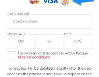
30. Add recognizable logos
It’s also good to display familiar logos for accepted payment methods, so your customers don’t need to consider whether their cards are accepted or not. ??You can also show the relevant logo when the customer starts to type in their card number — Visa always starts with a 4, Mastercard 5, AMEX with a 34 or 37, etc.


Save your users’ time and show the card type automatically instead of making them pick their card type from a dropdown.
Tools for Measuring and Optimizing Checkout Performance
You successfully implemented your credit card checkout with the best user experience practices in mind, so it’s time to track the performance. A reliable payment platform will provide you with a 24/7 activity tracking panel;but you can go even further and measure customer behavior as well as analyze heat maps and other indicators.
Here are some tools that will give you a broader view of data analysis.
Google Tag Manager
If you’re wondering whether your payment form UI is designed the right way, you can track credit card checkout engagement with a tool provided by Google. Go to Simo Ahava’s blog for the details.
Formisimo
Formisimo lets you add a tracking snippet to the page where your form is implemented, so you can measure how users interact with your credit card checkout. You can use the tool to generate insights focused on users, fields, and metrics.
Zuko
Zuko comes from the Formisimo team and plays the role of a more advanced counterpart. The tool gives you more visualizations and features, such as custom segmentation or behavioral alerting, allowing you to track more types of forms and elements.
Takeaways
As you can see, a well-optimized checkout may help you generate more sales. Overall, the easier a checkout process is, the more likely customers are to buy from you and to return to your site.
Find the balance between speed, functionality, and efficiency. Make your checkout process as easy and fast as possible, with responsive design and minimized effort required to complete a payment form.
Digital & Social Articles on Business 2 Community
(120)