Ecommerce site navigation is very essential to the success of any site. If your customers cannot find what they are looking for, there is no way they will be able to buy it.
Whether a site is accessed on desktop or on a mobile device, if a customer fails to find a product solely because of a loosely executed navigation system or product categories, they can prematurely conclude that your site does not carry the items they need.
Aside from the immediate loss of a potential sale, what is worse is they will likely not come back because of the assumption that you do not sell the types of products they are looking for.
And with visitor-to-sale conversion rate for ecommerce hovering at around 2-3%, you need to address as much friction as possible, especially with your ecommerce navigation, or else, you will be leaving a great deal of money on the table.
Ecommerce site navigation can sort out any product findability problems you may have. In this article, we listed down 7 ways you can improve your site navigation for better customer experience and a substantial lift in your conversions.
Make parent categories clickable
In one of the research studies conducted by Baymard Institute on navigation usability, they found out that when parent categories are just plain labels and headers, it breaks customers’ expectations of being able to explore products first and urges them instead into the narrow subcategories than they desire.
When it comes to the headers or labels of your parent categories in your web navigation, make sure that it is clickable so customers can see the general category page before going into the specific subcategory pages inside it.

To give your customers the cue that your parent categories are clickable, accompany the header or the label with a clickable line or a pointer hand instead of a plain text-selector.
It is safe to assume that not everyone who arrives at your site already knows what they want and need, so making your parent categories part of the product hierarchy is a good way on assisting them find out what that would be.
Letting them browse through broad scopes of products first before going straight to the narrow subcategories provides them with inspiration on what to shop for.

Additionally, allowing customers to click on parent category pages allows them to refine their options according to the filters they may want to use. With Pixmania again as the example, allowing customers to explore the parent category page of mobile phones allows them to sort out their many options according to departments, brands, and price ranges.
Double list subcategories whenever applicable
To avoid the issue of a customer not being able to find a subcategory where it is very much expected to be, it is best to always consider putting a subcategory in multiple parent categories whenever it is logical.
When it only appears in one parent category, it can leave customers confused, frustrated or they might assume that your store does not carry the particular item they are looking for, leading to unwanted site abandonment and zero future visits.
For instance, when ‘Kindle Fire’ is looked up on Amazon, it appears under the parent categories ‘Electronics’ and more aptly under the ‘Kindle Store’.

To make subcategories appear under different parent categories where it logically applies, there are two ways to go about it.
Put a subcategory in one place in the site’s taxonomy and simply link to that destination in the other parent categories. This way, customers will be able to land at the subcategory regardless of where they accessed it from.
However, this may cause unwanted confusion if a customer clicked on a subcategory from menu 1, but landed on menu 2, as evidenced by the breadcrumbs.
Consider duplicating parent categories such that it becomes a unique entry in your site’s hierarchy. Although this assures customers that they will see the proper breadcrumb paths, this can be technically challenging to execute.
Products need to be tagged consistently across multiple subcategories and the onsite search should be able to suggest all subcategories that particular product is a member of, and not just one.
Tip: Just as you need to double list applicable subcategories whenever it is logical, it is equally important to hide categories that have zero contents. Otherwise, you will leave your customers frustrated by letting them navigate categories with no product results for them to choose from.
Hide empty categories at the backend of your ecommerce site, or if you think you won’t be using these in the future, remove them altogether from your site architecture.
Have a specific category just for new products
Especially for customers who have grown a special affinity towards your brand and know your products well, having a “New Arrivals” or a “What’s New” category as part of the website navigation bar will let them know what’s new in your store without them having to search through previously browsed products.

Topshop goes beyond letting customers shop according to what’s new in store in general, but what’s new under dresses, shoes, bags & accessories, and brands. This makes product browsing and site navigation even smoother and easier for their customers.
Additionally, the ‘New In’ category is the first thing you will see in the website navigation bar, immediately informing returning customers of what’s the latest in store.
A ‘new products’ category is especially helpful for brands selling seasonal merchandise, such as apparel and grocery items. It is also a category helpful for gift buyers who want to purchase something new and interesting.
When a product is fairly recent in release, there is a chance that the recipient does not own the product yet, making it a great purchase for the person shopping for it. This is a popular feature in online toy stores.

If you do not want to have a ‘What’s New’ category on your site, you can treat it as a filter instead similar to the above illustration on the right. Customers can simply apply the filter to refine their choices.
Aside from a ‘New Arrivals’ or a ‘What’s New’ category, consider having a category also for clearance items, sales, discounts, and specials. This way, your visitors will only need to click on a single category for the best prices in store for them instead of going through your product lists one by one in hopes of finding a good deal.
Make the search bar prominent
Part of effective site navigation is having a prominent onsite search for your customers to use. Onsite search is an essential component of any ecommerce site with 30% of customers relying on it to look up products, expecting the same ease of finding results quickly and accurately via search engines.
There are three guidelines you need to follow to make your search bar is prominent on your site.
Emphasize its presence on the page. Position it at the center of the header next to the logo and label it accordingly either with a call to action (e.g. ‘Search’) or a magnifying glass symbol indicating that it is a search box. Also, regularly test on its best size to adhere to your customers’ search behavior.

Additionally, do not integrate the search bar as part of the navigation nor surround it with different page elements. All these may compromise your search bar’s impact and prominence.
Allow customers to do narrow searching even before they start looking for products on your site. This helps provide some form of context to their search, especially if they arrive at your site not yet fully decided or have not thought about yet what they want to look for.
Taking the Barnes & Noble site again for example, customers can click on ‘All’ that shows all available genres in a scrollable list. Customers can immediately start shopping for books under the genre that interests them, such as teens, kids, and hobbies and collectibles.

The use of categories to help narrow down search falls under faceted search, which only 40% of ecommerce sites have.
Ease the search with auto complete. Auto complete in onsite search guides customers make their search queries, saves them time, and ensure that a search result will be returned. This is also particularly helpful for customers who may be unsure of the spelling of the product name they have in mind.
But more than the convenience, auto complete is a reliable conversion booster. For Printerland, integrating their search bar with auto complete helped them gain a per visitor value 4x greater than their previous sales.

And aside from the best matching suggestions, its auto complete feature also shows relevant product photos and its corresponding prices, guiding shoppers further to the option that best fits their needs and wants.
Bonus tip: Implementing advanced product filters and breadcrumbs also assures your customers a pleasant navigation of your site. Allow them to sort through search results with different helpful filters and enable easy checking, unchecking or removing of filter options without clearing their initial search entirely with smart breadcrumbs.
Follow conventions on navigation design
Although it would be great to have a totally unique website navigation design, it is best to stick to ones that majority of customers have already come to accept and understand as the norm in ecommerce. This prevents or reduces any mistrust that may arise from implementing your site navigation differently.
In ecommerce, there are two navigation design conventions – site navigation at the top of the page (for left-to-right reading languages) and site navigation on the side of the page.
Site navigation at the top of the page is a long navigation menu situated usually under the site’s logo and the search bar. The example below from Pottery Barn is a conventional take on this navigation design type.

Some sites consider having a sticky navigation, especially since 22% of users finding it quicker and easier to navigate.
Sticky navigation, also called fixed navigation, is locking the navigation bar into place so that it does not disappear when the customer scrolls down the page, cutting the need to scroll back to the top of the page when it is needed.
Site navigation on the side of the page is another navigation design convention. In desktops, side navigation bars are often placed on the left.

Navigation design on mobile devices also follows this convention and designers call this a hamburger menu because of the three lines that function as its symbol.
Despite it being common place, there have been debates about the usability of hamburger menus with the first being its discoverability.

This study showed that among the three layouts, the menu symbol with a border was quickest to spot in a mobile view of a site and had better visitor conversions and improvement in conversion rates than the original, borderless menu symbol and the menu symbol with ‘Menu’ as the label.
Aside from discoverability, another issue lies in its efficiency. In its default state, the contents of the side navigation bar remains hidden, which is done so primarily to save screen size.
And although people are aware about its value and function, it opens significant usability friction because people have to open the menu first and only then will they be able to see and reach their options for navigation.

While there is no ‘one size fits all’ solution for hamburger menus, the best way to come up with the best website navigation design for mobile is to do regular A/B tests.
Use easy-to-understand navigation labels
An essential step in good ecommerce navigation is labelling. This allows you to present your otherwise complex product information in an intuitive and fashionable manner for your customers.
Parent categories have very generic labels, often single words that describe the broad range of products organized under it. When labelling your parent categories, make sure that your customers will be able to scan through them and understand immediately what those labels mean for them within the context of your store and their possible wants and needs.

For instance, REI, an outdoor adventures store, labels their parent categories according to the outdoor activities their customers may want to participate in, such as camping & hiking, climbing, cycling, paddling, and so on.
Click on any activity (parent category) and you will see different subcategories describing the condition or the person who might be using that particular product. Subcategories, such as ‘Women’s Yoga Clothing’ and ‘Men’s Yoga Clothing’ are presented when the parent category ‘Yoga’ is clicked on.
Consider using visual cues also for better navigation on your site. Take Sunglass Hut as an example. Showing how the different frame shapes look like serves as a very useful navigation aid for their customers.

Look at your site data and improve based on it
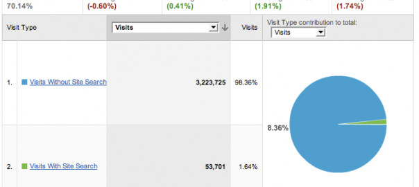
To know whether your site navigation is helping your customers or not is to reference your data on Google Analytics. Use it to check conversions on customers who used your site navigation and more importantly your onsite search to shop for your products.
Google Analytics Site Search and Content Drilldown is a valuable source of information in knowing what your customers are actually searching for in your site and what categories are the most popular. It gives you insider access into the minds of your customers; know what they look for in your site and what might be missing.

According to John Ekman of Conversionista, conversion rates for visits with site search are usually twice as high as visits without site search.
Check your site’s Google Analytics to see if this applies for your site. To get that overview report, go to Behavior – Behavior Flow – Site Search – Overview.
With Google Analytics Site Search data, it will give you an idea on the categories you can add on your site to yield more relevant search results for your customers. After all, it is also important to categorize your products within the context of your customers’ ability of finding products relevant to their wants and needs.
And aside from adding new categories on your site, your site search data can also help guide the order of your categories on your site arranged by relevance or popularity.
You can also look for queries that returned unmatched results, so you know what more you can add to your site. Also, look for the words commonly used by your visitors while using your site search to improve conversion rates even further.
Conclusion
Ecommerce site navigation can have overwhelming consequences than just site abandonment when it is implemented poorly.
As a recap, here are the main points:
- Make parent categories clickable
- Double list subcategories whenever applicable
- Have a category for new products and important announcements
- Make the onsite search prominent
- Follow navigation design conventions for desktop and mobile
- Use easy-to-understand navigation labels
- Reference data on Google Analytics for improvement
Additionally, do not forget to optimize your ecommerce navigation on mobile since a significant percentage of ecommerce traffic comes from mobile. And lastly, keep testing and improving based on your unique data and the industry’s best practices.
Designing perfect site navigation for your customers is not an easy task, but keeping in mind these 7 optimization tips can definitely help you quickly improve your site navigation for better customer experience and conversion rates.
Digital & Social Articles on Business 2 Community(83)