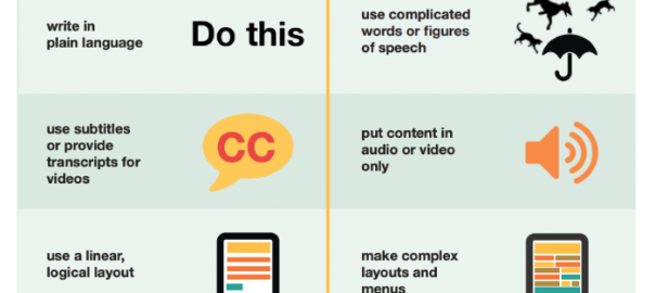
Some key strategies to help you offer a more inclusive website design experience for people with dyslexia, vision, hearing and motor impairments.
Google describes accessibility best when it says “everyone should be able to access and enjoy the web”. It also says “we’re committed to making that a reality,” which should tell you enough about the importance of accessibility from an SEO perspective. Earlier this year, we outlined accessibility as one of the most important design trends for 2020, referencing new regulations that all websites need to meet by 23 September 2020.
However, the priority with this design principle is always making the web more usable for people with a diverse range of capabilities; vision, hearing, motor, neurological and more. So, in this article, we’re looking at five key steps you can take to offer a more inclusive website design for all users.
#1: Follow text and layout guidelines for dyslexic users
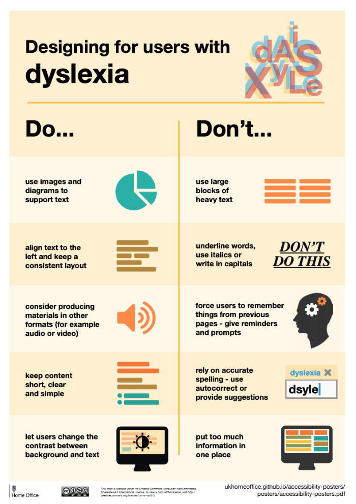
According to the Dyslexia Association of Ireland (DAI), up to 10% of web users may have dyslexia. Separate studies have shown this figure can be significantly higher among audiences outside of Europe (the global average may be as high as 15-20%).
Dyslexia can affect the way the brain interprets visual and audio information but it’s not directly related to the functionality of the eyes and ears in the same way vision and hearing impairments are.
Designing for users with dyslexia puts a strong emphasis on making text as readable as possible. You can find a list of best practices on the British Dyslexia Association’s website – they’re all good design principles in general:
- Ensure text is large enough
- Use strong contrast
- Use responsive font size units so users can make text larger
- Use sans serif fonts
- Use bold font styles to emphasis text (easier to distinguish than italic or underlined text)
- Keep sentences and paragraphs relatively short
- Keep language relatively simple
- Use plenty of white space
- Use font styles, size and writings to make text distinguishable
- Use bullet points
While some of the best practices provide specific percentages for font sizes, letter spacing and other proportions, it’s hard to find a recommendation made by the British Dyslexia Association that isn’t of benefit to all users. Clear, easy-to-consume content is a basic principle of UX design and we all find ourself in situations where content is more difficult to consume – a noisy bus, for example.
#2: Ramp up the contrast for colour blind and visually impaired users
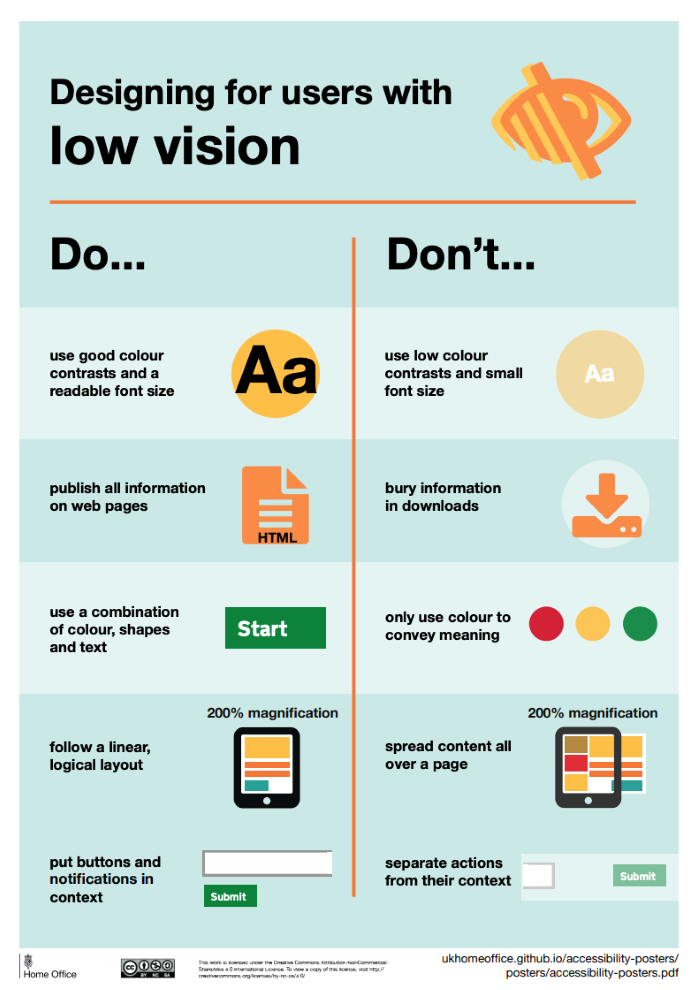
According to Colour Blind Awareness, 4.5% of the British population is colour blind and this figure rises to 8% for the male population. In most cases, people who are colour blind can see things clearly but are unable to see certain colours in the same way other people do.
“Most colour blind people are able to see things as clearly as other people but they are unable to fully ‘see’ red, green or blue light. There are different types of colour blindness and there are extremely rare cases where people are unable to see any colour at all.” – Colour Blind Awareness
Meanwhile, the NHS says there are almost two million people in the UK living with sight loss – roughly 360,000 of whom are registered blind or partially sighted. In other words, the majority of people with vision impairment can see to some extent.
One of the most important design principles for people with low vision and colour blindness is contrast.
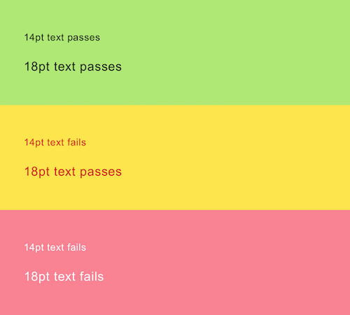
Another key tip is to avoid relying on colour alone for contextual meaning, like red and green text or background colours for form validation. In this case, you should add symbols to reinforce the meaning and always consider the contrast of text coloured backgrounds.
Likewise, make sure you include labels in any instance where users are expected to select a colour, such as buying clothes online, customising a dashboard or creating their own character for a game.
Detailed guidance on accessibility requirements for people with low vision is available at W3C.
#3: Optimise your code for screen readers
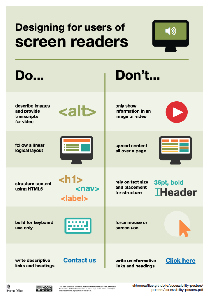
Blind and seriously visually impaired users often rely on screen readers to navigate the web and engage with content. These devices convert text into synthesised speech and provide context about the elements on a page.
Here are some steps you can take to optimise for screen readers:
- Alt-text: Provide descriptive alt-text for every image on your website.
- Use ARIA attributes: Describe the “role” of page elements by using ARIA attributes.
- HTML language: Define the language of your page by using the HTML lang attribute in each page.
- Use Semantic Elements: Semantic Elements in HTML provide basic contextual information for screen readers (and search engines).
- Links: Keep the text in links relatively short but large enough to aim for and click.
- Structure: Follow page structure best practices (plenty of h2 and h3 tags), as this is the most suitable format for screen readers and their users.
If you want to understand what it’s like to rely on a screen reader, take a look at this excellent Smashing Magazine article by Chris Ashton.
#4: Reduce clicks for people with motor impairments
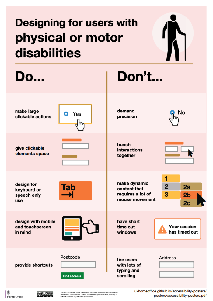
We often hear about optimising websites for people with vision impairments but motor disabilities and impairments don’t always get the same kind of attention. A motor disability is any condition that impedes sensation, movement or coordination. These may be the result of conditions like cerebral palsy and multiple sclerosis or trauma injuries, such as limb loss or spinal injuries.
Accessibility for motor impairments is a vast and complex topic, partly due to the wide range of conditions involved but also the extent to which they can limit web usage. This article from Telerik and this Harvard University page are good starting points to get a better understanding of the diverse challenges people with motor conditions can face and the usability aspects worth thinking about.
One of the most important considerations for users with motor impairments is reducing the number of clicks required to complete actions. Each click is physically demanding for people with motor conditions and reducing the workload can drastically improve the experience. Using a mouse can also be tricky so take steps to ensure your site is navigatable by keyboard. Follow WAI-ARIA guidelines to make all elements on your web pages accessible via keyboards and keyboard emulators.
Many users with motor conditions rely on assistive technologies, such as neck wands or mouth sticks. These can be especially demanding to use for prolonged periods of time, making every click even more physically demanding. So keep this in mind.
Also, add a search field to your website as this will allow people using voice recognition as an assistive tool to navigate your site faster.
#5: Provide captions and transcriptions for video
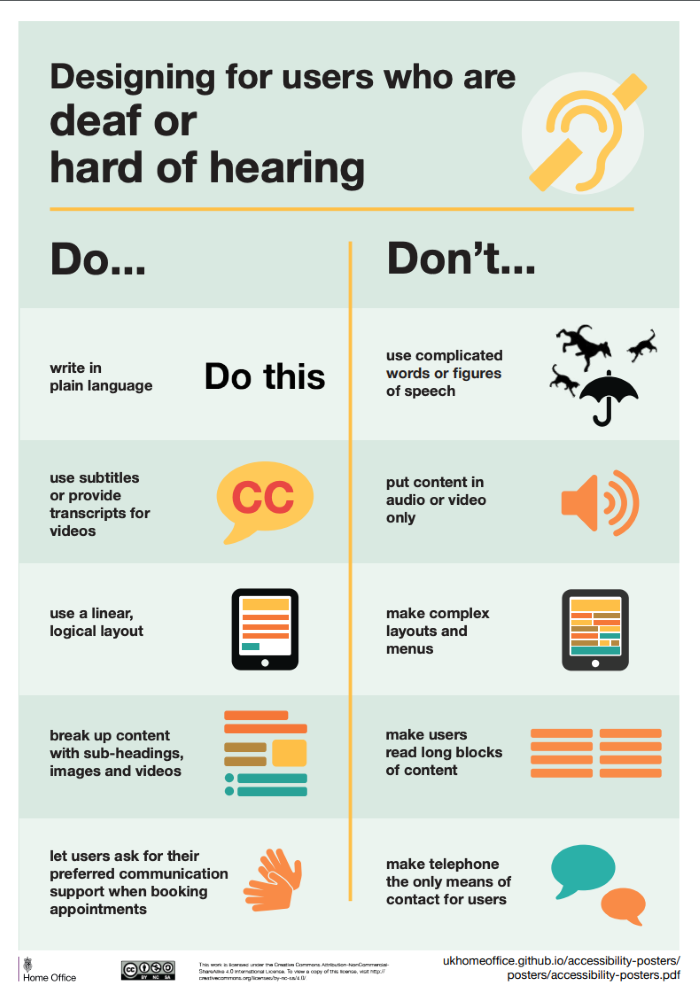
With the web generally being a visual form of media, people with hearing impairments don’t always get the consideration they deserve. However, it’s important to understand that the internet is becoming increasingly audiovisual with 92% of marketers saying video is an important part of their strategy in 2020.
As a minimum requirement, videos should come with captions that provide a text substitute for spoken dialogue. Unlike subtitles, captions also replicate important, contextual sounds that the viewer benefits from understanding – like a phone ringing or the sound of a horn beeping.
Also, you should create text transcripts of your videos so people with hearing impairments can read the text version in addition to or instead of the video content itself. This is also a good SEO tactic as it allows search engines to “read” the content of your videos. It also benefits other users who prefer text content or might want to take notes, quote your video in their own content or simply remind themselves of the key points.
All of the points we’ve looked at today are good practices that benefit a wide range of people and this is what a more inclusive web should look like.
Digital & Social Articles on Business 2 Community
(56)
