Website split testing (or A/B testing) is an essential conversion optimization activity, as it can attract more leads and boost subscriber rates for you. Most of us don’t bother because it requires a little setup and extra work. But if you invest the time now, you’ll enjoy significant benefits from it because you’ll be making decisions for your site based on data rather than guesswork.
You’ll avoid trying someone else’s success tactics because they may not work for you. A/B testing helps you experiment with different tactics that’ll work for your website, not someone else’s. You’ll discover precisely what works best for you and what doesn’t, so you can make changes that are appropriate for your site.
Here are five A/B tests you can run on your opt-in forms to increase your lead generation and subscriber growth.
A/B Test #1: Try Different Colors with Your CTA Button
There’s a lot of talk online about what color your website should use, including design items like buttons and hyperlinks. Psychology, emotion, culture, and more inform how people respond to colors online, so how can you test this for better conversions?
At a basic level, your CTA button color should be eye-catching and high-contrast. That helps people see it, and their eyes are drawn to it more easily. For an opt-in form, you might want to choose one that’s a different contrasting color than the rest of your site. E.g. if you tend to use blue buttons on your site, try a yellow one, or if you use orange buttons, try a blue one. Then see which does better for your opt-in form.
Hubspot did a test and found that green buttons converted more than the red ones on their site.

A/B Test #2: Vary the Copy on Your CTA Button
Another thing people like to test is the copy on your button. That is, the actual words that encourage people to click it.
For an opt-in form, most sites use a variation on the “subscribe now” idea, but what if you tested out something completely different?
EczemaCompany.com did this on their mobile pop-up test. The control opt-in form sent visitors a 10% off coupon in exchange for their email address (“Get My Coupon.”)

The test form offered visitors a choice to opt-in or not (“Yes, I Want 10% OFF!” or “No Thanks.”)

The psychological effect of the two-step opt-in ensured it performed better, converting nearly double the rate of the control pop-up (13.76% to 6.35%.)
She then tested something similar on her desktop website and increased conversions 158% against the control. She wouldn’t have known that if she hadn’t tested them on both her mobile and desktop sites.
A/B Test #3: Make Your CTA Button Bigger
Surprisingly, sometimes a change to the size of the CTA button can make a big difference. BuildASign.com changed the size of their CTA buttons several times, making them bigger each time, and noticed significant changes to their conversion rates.
Cloudways tested two opt-ins with different options, including CTA button sizes. The control form’s CTA button was smaller than the input field and wasn’t a prominent color. It only converted 0.21%.

The test form used bigger CTA buttons and encouraged visitors to click the Yes option with a prominent color that stood out on the darker background. It converted nearly 4% within a few weeks, a 1700% increase over the control.

Be careful with this test, however, as there is such a thing as a button that’s too big. Make sure it’s big enough to indicate its importance, but not big enough that it distracts from your message.
A/B Test #4: Offer Content Upgrades
Content upgrades are an excellent way to increase signups, but they can take a while to create. It’s worth testing with your visitors to see if it would increase your conversions since they can significantly impact them.
Kindlepreneur added an exit-intent overlay on one of their longer blog posts to try to increase signups. Within minutes of setting up, the upgrade recovered 9.9% of abandoning visitors.

They added a content upgrade link inline on the post itself to see if it would work any better and found it was even more successful. It converted over 64% of readers!

A/B Test #5: Test a Pop-Up Form
Most people test where to place an inline opt-in form on their site: at the end of posts, in the sidebar, or before posts. That’s well and good, but you can also test whether people respond better to a pop-up form too.
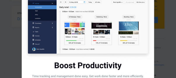
Hubstaff did an A/B test with a pop-up form and converted nearly 22% of visitors. The first pop-up used a short video to explain how they could help visitors and converted just over 7% of visitors:

They continued testing by making substantial changes to the layout, images, and copy, and eventually converted nearly 22% of visitors with this pop-up:

Doing A/B testing (or split testing, as it’s sometimes known) requires a little setup, but it can pay off massively for your website. Use it to test out the smallest change on your opt-in form or a big one. You’ll never know how it can improve your conversion rates until you try.
Digital & Social Articles on Business 2 Community
(70)