 It takes the average person 0.5 seconds to form an opinion of your entire company brand based on your website. Additionally, 88 percent of consumers are less likely to return to a company’s website if they have a bad experience on their initial visit.
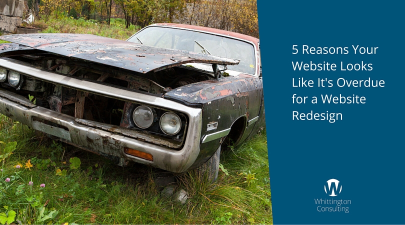
How’s your company website?
Website redesign can be a major investment for companies, which is why it’s critical to ensure you’re able to eventually see a return on your dollars spent.
If you’re unsure whether your company website is due for an upgrade, here are some positive signs your site needs some improvement in the form of a website redesign:
1. It’s Not Mobile Friendly
40 percent of online shoppers and researchers will leave a website if their first choice isn’t mobile-optimized. Few brands can afford to lose 40 percent of their potential prospects simply because they’re not offering a web experience that’s friendly to smartphones and tablets. And yet they do. Nearly 80 percent of people today use their smartphones to make purchases and product decisions — for personal reasons and for business research.
A mobile-optimized website isn’t an optional benefit – it’s a requirement of having a website that’s built for the modern reader. It’s a requirement for virtually all brands.
2. Your Website Uses Flash
Website animations and videos can be a powerful way to engage your prospects and customers, as there are over 50 billion views of videos online each month. However, Flash is an outdated way to deliver animation and navigation, and users of your website may be more likely to leave your site than download a new version of the program. HTML5 can be a more user-friendly alternative.
Pro tip: Flash is officially defunct, yet thousands of websites still use it. If yours does, it can erode your company brand because it can make your website unusable.
3. Your Homepage is Busy
First impressions made online are 94 percent related to visuals. Opting for a website homepage that’s cram-packed full of written content, links and information is an outdated website design method. Choosing a clean design and simple, intuitive navigation will be far more visually appealing and usable to your prospects.
Pro tip: Too many links on the homepage of your website is the kiss of death. It’s not difficult to determine exactly what your customers want to see first. Pare down the content on the homepage to only what your customers need.
4. You Lack Social Proof
88 percent of people trust online reviews just as much as personal recommendations from friends and family. Adding testimonials from your current clients and other forms of social proof, such as logos, trust marks and other signs can improve your site’s ability to win the trust of your prospects.
5. It’s Not Conversion-Optimized
If your site isn’t optimized to convert visitors into sales leads, you may struggle to win customers and see marketing or sales benefit from your website. Adding calls-to-action, landing pages and high-quality content offers to your website can significantly increase your company’s ability to turn a casual website visitor into a potential sales opportunity.
Pro tip: Every website has conversion opportunities (even ours!). Most websites turn less than a half a percent of visitors into a contact. Doubling your conversion rate means twice as many contacts from your website.
Digital & Social Articles on Business 2 Community(128)