It is high time you start giving attention to your contact page, if you want your site to be user friendly. No website can be completely user friendly, unless it can provide a smooth flow design template that users find easy to comprehend and navigate. Your website is your online shop and your contact form is the customer service desk. This is where your customers know that they can seek solution from your online team for any issue related to a product, service or any query.
The contact page of a website, is the first means of communication to start conversing with your customers. Unfortunately, many business organizations seem to often overlook this vital customer relationship management page, especially when it comes to designing an engaging page.
Designing a simple contact page is pretty easy. You just need to insert certain fields and then leave the rest of the work, for your user to complete . However, that itself is an approach where your purpose lacks elegance. Your task does not end with a contact page, rather your job starts from here now.
Sometimes, a customer may finally be willing to contact you for your service but leaves discouraged, after finding the contact page confusing and troublesome. A good contact page needs to guide a customer to the correct place, while at the same time showcase a visual demonstration as to what your e-shop is capable of.
‘Charity begins at home’ – Every page of your website must be an elaborate display of what your organization is capable of. Your site is the most important work portfolio that visitors can refer to, in order to understand what you can do. And, the contact page is no exception.
Let’s Start Designing A Good Contact Page
Contact page is a two way communication between the customer and the service provider. When a visitor decides to contact you, he/she might be interested in your service and would like to talk about it. It is your job to take the cue from there, which is only possible with a good contact page design. Read below to learn, what makes a good contact page design:
- Your Contact Page Needs To Work
Many websites have contact pages that do not work properly. They are either broken or show error when someone clicks on the ‘Contact Now’ button. Now that can not only lead to a customer loss but would also leave a bad impression on the visitor’s mind.
- Your Contact Page Needs To Be Visually Engaging
A horrible looking contact page could turn off a visitor’s interest. You need to hold on to your bait till the last minute, and therefore a visually engaging contact page is a must.
- Your Contact Page Needs To Speak Out Seductively
That is true. Sometimes, even a simple design could work out well if the copy that accompanies, is engaging enough to grab the attention of a visitor. Select the right words to craft a copy good enough to beguile a reader to submit his/her email id or phone number.
- Your Contact Page Should Make Your Customer Relationship Stable
Getting leads is a good job and you want to build a stable customer relationship in the long run. This is what your contact page should be able to work on and establish some personal touch from your side. Statements like “We are looking forward to hear from you” or “Stop by for a cup of tea” can give out a strong personal message.
Here’s bringing to you the top 5 among several website names that showcase how you can get creative, when developing an engaging contact page design template.
Time to get some inspiration from the ones who have cracked the show!
#1- Pixel Wrapped – Simple And Yet Visually Engaging
![]()
Pixel Wrapped keeps their contact page visually simple and yet eye grabbing. A first glance at the page and you would find nothing extraordinary about the design. But the real fun starts when you start typing down your details in the contact field. The keys present on the typewriter are animated, thus reflecting the keystrokes into the entry form, every time you type a letter. The paper release lever of the typewriter is where the final ‘Submit’ button is added with a special effect. All in all, the entire design not only makes typing down into the fields of the contact form interesting, but also turns up to produce an engaging conversation. Try it out for yourself.
#2- B3NET Inc – Let Customers Describe Their Project Details

The design layout here is quite simple. There is a lot of usage of white space here to keep viewers away from getting distracted. Here, you can see usage of a number of fields to make it easier for a client to specify in detail about their project requirements. A three lined description about who they are and what services they are specialized to provide, keeps the reader informed till the last minute about whom they are contacting, before they finally click on the submit button. B3NET Inc. also displays a map along with their address and other contact information to visually show their exact office location.
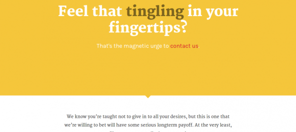
#3- Kick Point – A Good Copy Can Keep It Engaging Throughout

Your copy should be seductive enough to beguile you. Remember? This is what you need to learn from Kick Point. Apart from the use of a color shade that speaks of going bold and fun, the copy is what adds a cherry on top of the cake. Indeed the copy seduces us to draw towards the ‘magnetic urge’ and tap on the contact link.
#4- Little Lines – Little Care Can Build Warm & Cozy Relationship

Indeed! Adding a little bit of personal touch can build up a warm and cozy relationship. Everybody likes to feel special and a personal message can make visitors feel that your organization can take the extra mile to take special care of your project. The contact form of Little Lines, is a perfect demonstration of how simple and one line messages can produce a caring charm on a client’s psychology.
#5- KIN – Adding An Informal Touch Could Be Fun & Intimidating

You need not always be strict and professional to sit down for business. Time to step out of your business shoes and choose your flip flops instead. Because going informal is cool! Sometimes, clients too enjoy it because it seems that they get to know you a little bit better. Kin uses a powerful image and a text that enables a client to feel that they are already getting to know the real people working behind the website. This leaves an impression that your team members are indeed approachable for any help they need.
As simple a contact page might seem to look, a good page design can motivate your buyer to take the extra step and make the click. Many a time, a dull and boring contact page can take a fraction of a second to change a visitor’s mind. Let’s hope these 5 examples were enough to inspire you into creating a unique contact page template.
(294)