Are you experiencing lower than anticipated conversion rates? Are your landing pages performing poorly? Are sales down on your website?

This isn’t WebMd, but we’ve diagnosed you with a bad case of “Crap-Ass CTA.” Don’t be upset, it happens to the best of us, and the best news is: we can cure you!
Your call to action buttons are arguably the most important part of your website, so you need to get this remedy down ASAP. A great CTA button can direct users, get them to take a desired action, improve conversion rates, and ultimately help your website achieve its defined objectives.
On the other hand, generic, poorly placed, and boring CTA buttons will do very little to get your users’ attention or get them to click (see crap-ass CTA above). If you’re using ‘click here,’ ‘buy now,’ ‘add to cart,’ ‘purchase now,’ and ‘order now’ as CTAs, it may be time to revisit your engagement and call to action strategy on your website.
Like we said in 10 Ways to Increase User Interaction on Your Website, “Having strong but relevant calls to action on your website will help you grab the attention of your website visitors. This will help increase user interaction while achieving business goals like: email subscriptions, sales, sign-ups, and so much more.
If you need your visitors to take action immediately, and to convert, then using CTAs will allow you to achieve that. However, you can’t just slap a CTA on a button and call it a day. You need to think strategically and creatively to ensure your CTA is achieving its objective.”
In an attempt to enhance engagement and get landing pages to perform better, many try to reinvent the wheel and stray from the CTA button formula that has been so successful in the past.
Crazyegg explains this situation:

4 Core Call to Action Considerations
If users are not clicking, there is an issue. While a first step would be to check your user data and social data to identify how your calls to action are performing and which landing pages need the most attention, there are 4 core considerations for every call to action button:
1) Text: Is your call to action clear? Does it create a sense of urgency? Is it short and to the point? Does it communicate value?
2) Placement: Is your call to action above the fold? Is it in a logical place where users would most likely take action?
3) Size: Is your button easy to find? Is it too big that is has become a distraction? Is it easily identifiable as a CTA button? Is it sized appropriately for mobile?
4) Color: Does your button visually stand out from the rest of the page? Is there enough white space surrounding it? Have you tested which colors provide you with the most clicks?
Adjusting these four elements can have a significant impact on landing page results, clicks, and conversions.
7 Effective Ways to Improve CTA Button Performance
1) Assess and test
Before you do anything, get the word “asses” out of your head! Second, it’s important to take a look at the current data you have about your CTA buttons and conversion performance. Take a look at website analytics, landing page performance, traffic sources, and other accessible data. What’s working? What isn’t working? Answering these simple questions will help you target which components of your CTA buttons require some further testing and tweaking.
Social data and user data can be used to learn more about your website visitors, create user profiles, and improve understanding of your visitors’ online behaviors to help improve click through rates.
2) Choose the perfect location
Location, location, location. Where you place your call to action on your landing page can impact its performance. You may need to play around with placement a bit—try a CTA above the fold, below the fold, and where you think it should naturally appear on the page.
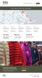
Landing page best practices traditionally state that your CTA button should be placed above the fold; however, placement higher or lower on a page is dependent on the complexity of the offer. Contentverve ran some testing on placement and found there is a correlation between complexity and optimal placement.
They found that the “CTA placed way below the fold at the bottom of a very long landing page significantly outperformed a variant with the CTA at the top of the page above the fold. The increase was 304%.”

They argue, “If the product/offer is complex, and the prospect has to digest a lot of information in order to make an informed decision, positioning the CTA lower on the page generally works best. Vice versa, if the product/offer is very simple, and the prospect hardly has to do any thinking in order to make an informed decision, positioning the CTA above the fold generally works best.”

3) Make text action-oriented
A little motivation, and an action word here and there, can help boost click rates. Use short and action-oriented words to create a sense of urgency and get your users to act. “The vast majority of your online viewers are skimmers and scanners. The simpler the words you use to present your ask, the more it’s going to resonate with your audience,” says Wishpond.
The more action-oriented your CTA verbs are, the more immediate reactions you’ll provoke. H&M and oDesk provide a good example of using action words:

H&M use the action word “shop” and “now” to create a sense of urgency.

oDesk uses the action word “post” and the benefit “free” to persuade users to click.
Making the text more specific and relevant can also help increase conversion rates. Contentverve found that changing a fitness company’s CTA button text from “Get your membership” to “Find your gym and get membership” increased click through rates to the payment page by more than 200%!

4) Get the color right
The color of your button matters more than most realize. “Generally speaking, green and orange buttons are reported to perform best. Ultimately, though, it will depend on your site design, as contrasting colors work best to make striking buttons that stand out. You wouldn’t want a green CTA button on a green background,” says Megan Marrs on WordStream.
Overall, think of your button as a visual cue signaling users where to click. Regardless of the color you choose, it needs to stand out from the rest of the page. For example, Social Media Examiner has become well known for using orange:

So, which color is best?
SAP found that the color orange boosted their conversion rate by over 32.5%. Performable found that the color red boosted their conversion rate by 21%.

But the truth is that the color you choose is not as important as the contrast you create.
“Different colors have different meanings. For instance, red can sometimes create a sense of urgency. The main goal with your CTAs is to make sure they stand out. You can accomplish it by creating a strong contrast between the color of your button and your website design,” says Neil Patel.
5) Make it relevant
Your button needs to be relevant and use text that clearly describes why a user should click the button. For example, if you want a user to view food options, rather than using “Click here” or “See more” use more relevant language such as “Show me delicious food options” or “Quick and healthy meal options”
Unbounce provides a great example comparing generic and relevant buttons for an e-book:

6) Make it stand out
Your call to action button needs to stand out. If it gets buried within the text or lost in the background with other images and design elements, it will be difficult for users to see:

The white text and lack of whitespace surrounding this CTA makes it difficult for users to identify immediately.
Facebook makes it clear where to look:

This example makes it immediately apparent where users are supposed to look:

Patel offers three tips for creating more white space around your CTA button:
- Reduce the number of elements within your web design
- Reduce the number of bright colors in your design
- Don’t place too many things around your CTA’s
7) Bigger is not necessarily better

Size matters. Yes, you want your CTA button to stand out, but you don’t want it to be so big and overbearing that it takes away from the rest of your page. “You want to make your CTA button big enough to stand out, but not so big it distracts from the benefit content on your page. You also don’t want to be totally in your face with your asks. You could look desperate and provoke your customer to take the action of leaving your page!” says Wishpond.

The large button looks out of place and too dominant for the page.
What we’re trying to say is…
There is no perfect combination of elements. What works for me might not work for your landing pages, but following CTA button and landing page best practices is vital to get your call to action right. If you get your call to action right, you will see your conversion rates go up. Test, tinker, review, and repeat until you find a formula that works for you.
(300)