These days, it feels like we’ve seen it all. We survived not forwarding those endless chain emails, the world “ending” in 2012 and all six seasons of Jersey Shore, so it’s hard to be scared of anything. This Halloween, it’s time to get spooked by something even worse than the Boogeyman, Loch Ness Monster and the Jersey Devil combined. This is not for the faint of heart…this is what happens when email design goes wrong.
A Nightmare on Design Street
It happens to all of us. We open an innocent looking email, stare at it in horror, and run screaming into the night. Okay, maybe it’s not that dramatic, but opening a poorly designed email is definitely not a fun experience. With different font sizes, a range of a hundred colors and tons of buttons saying “click here,” you’re sure to get sent straight to the trash. Keep your designs clean and user-friendly to increase your reader’s engagement.

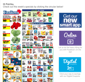
In this grocery store ad, there’s simply too much happening for the reader to benefit from the email. Instead, highlight a few key items in an easy-to-read format to entice your reader to click through to read more.
Invasion of the Unresponsive Email
You might want to think twice about sending that Halloween email campaign if you haven’t tested it on a mobile screen. If an email looks jumbled when your reader opens it, you just might scare them into deleting it. Mobile devices, tablets and wearables have taken over as the leading platforms for reading emails, so make sure you’re not just designing for the desktop.
Yikes! How do I make sure my email is responsive?
Using a responsive email editor, like Mailjet’s Passport, to create your emails is the easiest way to make sure your reader can view your content on any device. The template will automatically adapt to the screen size of the device on which the email is opened. Responsiveness can also be a pain for developers, so at Mailjet we’ve set out to make their work easier with MJML, our open source email coding framework, which generates high-quality responsive HTML that renders beautifully in the most popular email clients.

While this email may be fine for a user on a laptop or larger-screened tablet, it would be very frustrating to choose one of the categories on a mobile device. Make sure your email adapts to a variety of screen sizes to make sure that your user can always engage with it.
The Silence of the Images
Of course, email design responsiveness also means that your content adapts to your user’s bandwidth. For example, large photos may not load over a subscriber’s cellular connection. If the majority of your email is images, your subscribers might experience the horror of a big blank email when they open it. Add alt text to make sure your reader understands what your email is about, even if the images don’t download.

The email on the left has no alt text within the images, so when it’s opened without a strong cell phone signal, the user has no idea what the images are. The email on the right provides readers with a description of the image so that they can know what the message is about.
The Evil Text
We get it. You want your readers to have all the information they need, simply from opening your email. While it’s important that your emails provide value to your reader, adding too much text makes it difficult to keep them engaged. When your subscribers open a text heavy email on their mobile devices, chances are they’ll lose interest quickly if they have to scroll several times just to reach the call-to-action. Instead, give your readers a snippet of the information, then direct them to a landing page to read more.

Receiving an email like this can make the reader feel overwhelmed with information, even if they are interested in the topic. Instead, try breaking up text with images and redirecting your reader to learn more on your website.
The Blair Witch Palette
For those of us who are fashion conscious, we know which color combos to avoid. The same applies to email templates – you don’t want to have too broad a range of tones or clashing, distracting colors in the design. For example, if you place light text on a light background, your subscribers may have trouble reading your email. Also, using too many colors can frustrate your subscribers and cause them to move on to the next email. The colors used in your email design will also affect your reader’s view of your brand, so choose your palette wisely.
Of course, you’ll want to make sure you keep your email colors consistent with your overall brand. If your brand identity consists of mostly dark tones, a neon email may confuse your recipients and cause them not to recognize you. Your emails represent your brand as much as your website or print materials, so be sure to put your best foot forward!

The wide range of colors in this email make it difficult for the reader to know where to focus. The bright red background is distracting from the main content of the email, which can cause the reader to lose interest quickly. Instead, try to stick to a limited number of colors and use different tones to direct the reader’s eye.
We hope we haven’t scared you too much with our spooky email examples. Your subscribers want to receive email treats, not tricks in their inboxes, so make them happy with your Halloween email campaigns!
Digital & Social Articles on Business 2 Community(94)