 Navneet Kaushal
The news became official recently! Google announced its new mobile-friendly algorithm that will be launched on April 21st. Google intends to reward mobile-friendly websites with better mobile search engine rankings. But to every coin there is a flip side too. If your website is not mobile friendly, it could experience a negative impact in mobile rankings, thus leading to low organic traffic.
Here’s what Google said via the Webmaster Central blog:
“Starting April 21, we will be expanding our use of mobile-friendliness as a ranking signal. This change will affect mobile searches in all languages worldwide and will have a significant impact in our search results. Consequently, users will find it easier to get relevant, high quality search results that are optimized for their devices.”
Here are some of the facts and figures you need to know!
- There are currently 6 billion people who have access to mobile phones on a global level
- 1.08 Billion of these are using smartphones
- Mobile usage accounts for 60% of time spent online
- 80% people use mobile for searching
- 50% of local searches are carried out on mobile devices
- Out of 175 Million users on Twitter, half are active through Twitter Mobile
- 57% of users say they will not recommend a business with a poorly designed mobile site
- A second delay in page response can result in 7% reduction in conversions
- 90% of consumers move between devices to complete a task
How will a website qualify as a mobile-friendly site? What will a site need to be considered mobile friendly?
- Google needs to know your website can be easily read on mobile devices. This means your website must be either a responsive design (something Google states is their recommended design format for websites) or otherwise able to display a mobile-only version of the page.
- Google needs to be able to see “everything”. This means Googlebot (Google’s web crawler) needs to be given access to read not only the HTML, but also CSS, JavaScript, etc. used on your website.
- Your website needs to avoid common mistakes that stoop the level of mobile user experience down. Among these mistakes are slow-loading mobile pages and making Flash videos or the bulk of a page’s content.
Is it really that important?
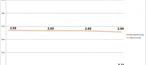
Yes. It pretty much is. The average rank for mobile friendly URLs is 33% better than that of the non mobile friendly URLs, as suggested by the report by seoClarity. This seems to be a bad news for all the websites that are not mobile-friendly.

Even for those who think that they won’t be affected because they do not generate mobile revenue, they will be. You will end up losing a huge chunk of the traffic resulting in loss, if your website is not compliant with Google’s mobile SEO requirements.
Mobile traffic is increasing at a rapid rate as people accessing websites from mobile or tabs has skyrocketed in the recent past. Somewhere between 2013-14, the number of mobile users rose to 1700 million, and has been rising since then, reaching almost around 2000 million, on a global level.

Source- comScore
Also according to Google, mobile search has gone up 5x in the past two years.

Source:- The Mobile Playbook
So, in order to not lose the organic search rankings or to exit from deriving benefits from the “skyrocketed” figures, what you ought to do?
Save your website, before Google clobbers it down!
For quite a time now, Google has been reminding to go mobile friendly! In fact, in November 2014, they officially added “mobile-friendly” labels in mobile search results:

The first and the foremost action in this course should be to check whether or not your site is truly mobile friendly or not from Google’s view point. For that you may start with the mobile-friendly test.
It is also recommended to have a look at the mobile usability report, which would provide with a comprehensive list of mobile usability issues on your site. This could contain issues like use of Flash, content in improper size or elements too close and packed together.
After analyzing both the things, if you find your website to be “mobile-unfriendly”, it’s time to pull your socks up and devise a game plan. There are two things you can do!
- Adjust your existing site- Try for responsive web design. As Google’s recommended configuration, trying out this step is not going to bring forth another platter of problems. If you have responsive web design, the website’s pages will adjust themselves depending on the device being used, giving comfort and flexibility to the user.
- Create a separate mobile site- You can also opt for creating a separate website for mobile which is in compliance with Google’s mobile SEO requirements. Try and go for simpler, minimalist web designs, large fonts, playable videos, buttons and much more to make is simpler and better for users. Place the important information above, written in a simpler language that is easy to follow.
It is necessary for Google to understand your mobile set up!
- Responsive Web Design- If your web design is responsive, the same HTML is served on the same URL irrespective of the users’ device. It renders the display differently based on the screen size of the user. You may use meta name=”viewport” tag to communicate to the browser as to how adjust the content.
- Dynamic Serving- This is basically a set up where the server responds with different HTML on the same URL depending on the user agent requesting the page. You may use the Vary HTTP header to show your changes, depending on the user agent. It is essential that the user-agent strings should be detected correctly.
- Separate URL’s – Each desktop URL has an equally different URL serving the mobile-optimized content.
Why using responsive design is beneficial?
- It makes it easier for users to share and link to your content with a single URL.
- It helps in reducing loading time as it requires no redirection for users to have a device-optimized view.
- It almost eliminates the possibility of the duplicate content that affects the sites on mobile.
- Requires less engineering time to maintain multiple pages for the same content.
- It saves resources when Googlebot crawls your site. It makes crawling efficient and helps Google indirectly to index more of your site’s content.
- It helps Google’s algorithms accurately that assign indexing properties to the page rather than requiring signal existence of corresponding mobile or desktop pages.
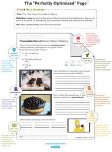
Here are some of the Mobile SEO recommendations that might come in handy for you!
- Don’t block Javascript, CSS and Image Files- You may try and test your robots.txt in Google Webmaster Tools
- Avoid Unplayable content-Try and use video-embedding that is playable on all devices. You may also add the transcript of the video available as it gives more content. This will make your site even more accessible to people. More traffic, don’t you think?
- Faulty Redirects and Cross Links- Set up your site accordingly so that it helps to redirect smartphone users to the equivalent URL on your smartphone site.
- Use Mobile centric 404s- It is one of the common issues that some sites open up on desktop’s but show an error page to mobile users.
- Negate slow loading pages- The attention span of a reader is just like a kid’s sleep. It can come and go in seconds. Slow pages make people irritated.
- Say a big NO NO to pop ups- It gets frustrating for mobile users to deal with pop ups. This might lead to high bounce rate.
- Goodbye Flash- The plugin for flash may or may not be available on user’s mobile, so avoid using flash formats for animations.
It is not that the mobile world means everything in today’s time. It is just that the new way has surpassed the traditional format to such an extent that the might of mobile search cannot be ignored. The facts and figures are clearly laid out in front of you. It is time to devise an action plan before Google hammers your site. So buck up, before the clock ticks down and the time is out.
(396)