— December 21, 2017

You work hard to drive people to your ecommerce website, but once they get there, up to 99% of them leave before giving you a dime.
It hurts.
Now there are a number of ecommerce marketing strategies you can implement to start taking better advantage of the traffic your website gets.
This article, though, will focus on your product page itself – the place where a prospective customer says “yes, I want to buy your thing,” and puts it in their shopping cart. Whether they buy it or not is an entirely different article, but let’s take things a step at a time.
This article will break down the 8 essential elements of a successful product page by using a real-world example from Greats shoes. I’ve analyzed a few product pages in my time and theirs is a great example of a clean, modern, optimized ecommerce page.
I’ll also recommend a few tests that they (and you) can try in order to optimize your product pages further.
Let’s get rolling!
This is what the complete ecommerce product page looks like on Greats shoes’ website:

And here are the 8 individual elements which make this ecommerce product page an optimized one. So long as your page has each of these (done well) you’re on the right track…
#1: A Large, High-Res Product Image

First and foremost, your visitors need to 1) Know that they’re on the right page, looking at the product they selected from your product directory and 2) Be able to see the look they’re going for. A large, high-res product image should be the first thing they see when they arrive on your product page.
#2: A “Stars” Rating that Builds Trust

Showing at the top of the page that your product is well-reviewed by objective, unbiased buyers of that product is a great way to start the “buying conversation” off on the right foot. This, alongside the product image above, is the one-two punch of “My product is awesome and beautiful, and even people who don’t work here love it.”
#3: Value Add #1

Greats shoes offers free shipping on all orders. This is what we call a “value add” – an additional deliverable beyond the quality of the product for the price: another reason buying is a no-brainer.
Featuring this free shipping at the top of the product page is a great way to frame the visitor’s experience. Their assessment of how likely they are to buy is predicated on the idea that the price as they see if won’t be increased when they get to the checkout page.
The primary reasons that people abandon a shopping cart are required account creation (see below), complex checkout processes, and unexpected delivery costs. Be sure you address all these pain points either on your product page or within your checkout process.
#4: Value Add #2

If your ecommerce business has a special policy which your competitors don’t (free shipping, free returns, try-it-out policy, etc) feature that value add front and center.
The fact of the matter is that most ecommerce businesses aren’t selling totally unique products. The shoes on this product page don’t look all that different from 100 other shoes. What stands out, though, is these value-adds: the reviews, the trust-building stars, and this “Free returns and exchanges” messaging.
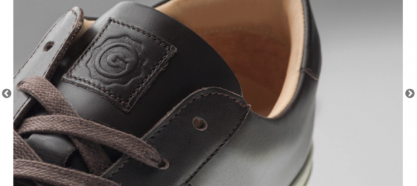
#5: A Large, Zoomed-in Product Image Carousel

Buying clothes or shoes online is hard. By definition, your prospective customers aren’t able to touch, feel or see every angle of what is ultimately a thing they’re looking to wear. This makes it tough for them to feel totally confident that they’ll like the look when their package comes.
That’s why the large, zoomed-in product image carousel is so important. It shows the stitching, the interior of the shoe, the laces, the eyelets, the branding, and (in the other images within the carousel) everything else a prospective customer could possibly want to see.
#6: Reviews from Customers

This is the big one. The fact of the matter is that, when it comes to your own products, you’re biased.
So trust is a little thin on the ground.
This is why customer reviews are so incredibly valuable – they offer personalized, objective opinions which feel genuine and more “real” than anything you can do. They feature people like your prospective customer, rather than someone who is, as far as they’re concerned, just looking to get a buck.
#7: A Social Media Engagement Prompt

If social media is important to your business, include a section to prompt prospective customers to engage there. If it isn’t, don’t.
I only recommend a social media engagement prompt section on your product pages if you’re finding that social media is yielding a super positive return on your investment. Otherwise, you’re just distracting your product page visitors from your bottom-line goal (a purchase).
Greats shoes isn’t actually sending anybody to Instagram with this section. Clicking on one of the images simply opens a modal window which resembles Instagram. The modal itself has a product carousel and “buy now” option which sends visitors to a different product page. See below for my full thoughts on this.
#8: An Email List Opt-in

A crucial component of a successful ecommerce marketing strategy is list-building. Without it, you have no opportunity to promote your products to people who haven’t buy, or prompt another purchase from existing customers. They simply buy and disappear, nameless.
Now, there are several strategies for ecommerce list-building (including my favorite, a discount code for first-time buyers who opt-in). You can also prompt opt-in during the checkout process, or even make it required. My recommendation is to keep in mind the importance of email list-building, and prompt it as frequently as possible.
As good as this ecommerce product page is, there can always be improvements. Here are the elements I’d recommend that Greats shoes test:

#1: Call-to-Action Button Contrast
The current “Add to Cart” CTA button is not as eye-catching as it could be. I’d recommend that Greats invert the current color scheme and make the button blue.
You’d be surprised by how impactful a simple design change can be – especially when it’s a design change implemented on a bottom-of-funnel element like “Add to Cart.”
#2: Elimination of Non-Vital Elements
I recommend that this ecommerce product page removes the “Discover the Royale Family” section entirely and retains only the “You Might Also Like” section. This section accomplishes the same visitor need (the possibility of seeing something they like more).
Another option, and one I’d definitely test down the line, would be to remove these external links entirely – thereby focusing visitor attention on the product they’ve chosen, and requiring them to go “back” to view related products.
#3: Fewer Product Reviews
Alongside the clear option to move between multiple pages of customer reviews, 3 on-page reviews is enough to communicate that these are great shoes. The additional two do nothing to provide value, and simply elongate the page.
Test I Might Test: Social Engagement Prompt
As mentioned above, I’d definitely be open to removing the social engagement prompt section. For me (personally), I’d seriously question whether these external links would be helping or hurting my product page’s conversion rate.
I’m a bit of a product page purist: I think that your product page should focus almost entirely on the product at hand. For me, the fewer “related products” or external links, the better.
My recommendation is this: when optimizing a product page, start simple and test the addition of each element. If it doesn’t help, remove it.
Final Thoughts
Hopefully this article, and the analyzed product page example, have given you something to chew on for your own ecommerce product pages.
Do you agree or disagree with any of my recommendations? Is there anything else you’d test on this product page? Get the conversation started below!
Digital & Social Articles on Business 2 Community
(67)