No one hates change like app users, and the latest changes that Google has made to the colors in its Google Maps app are ruffling users’ feathers all over the web. Google Maps users on Reddit have called the new colors “godawful” and expressed how they “hate” the changes. Even Google Maps alum Elizabeth Laraki, who helped design the service in 2007, chimed in on X to say that she believes the new design “feels colder, less accurate and less human.”
But hear me out: I actually like the new colors. I think they are a sign that Google is finally aware that its beloved mapping app, which changed the navigation world almost 20 years ago, has become an eyesore.
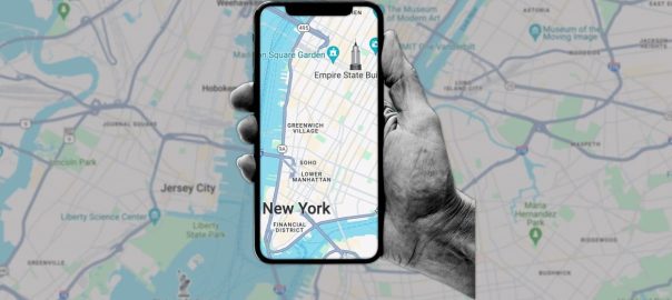
The uproar began a few weeks ago when Google started rolling out its new color schemes for Google Maps to its iOS and Android apps. The updated palette turns major roads from yellow to dark gray, minor roads from yellow or white to light gray, bodies of water from blue to turquoise, and grassy and forested areas such as parks from a muted green to a brighter pastel green.
I first noticed the color changes back in September when the company began rolling them out to desktop users as a test. Yes, the first 10 minutes of seeing the new colors on the desktop was a little jarring, but I quickly fell in love with them. Then I couldn’t wait for the rollout to hit the company’s smartphone apps.
Sure, maybe I took to the new color scheme because I’m used to using Apple Maps as well; the new colors in Google Maps make the app look—a lot—like Apple Maps. And that’s a good thing because Apple Maps has always been easier to read, largely thanks to its color scheme.
When it comes to highways and streets on Google Maps, the new Apple Maps-inspired grays make more sense than the yellow of old. Not only is asphalt usually dark gray, but none of us lives in the land of Oz. And when you zoom in on a road, its name appears in white text with a black outline. Against the gray backdrop of the road, street names are much easier to read.
As for the turquoise waters and areas of pastel greenery, yes, the brighter colors threw me at first. However, I quickly came to understand Google’s likely reasoning for making the colors brighter. The new gray roads are more visible against these hues, making them much easier to follow.

And while Laraki’s post has received a lot of attention in the tech press, it’s important to note that she does admit that the new colors make “major roads, traffic, and trails stand out more now.” That’s always a good thing in a mapping app.
Still, I agree with the main point she made too: Google Maps should have changed up its UI and simplified the interface. Only after that should it have worried about changing colors. Over the summer, I wrote (twice) about how Google Maps has become an eyesore. One of the main reasons is that the user interface is cluttered with elements that obscure the main map—11 of them, as Laraki points out.
But I think the changes to the app’s colors are a sign that Google knows its Maps UI has spiraled out of control.
Before the redesign of Apple Maps several years ago, Google really didn’t have to worry about this UI sprawl, because what else were people going to use? But now that Apple Maps is gaining users—not just for its improved navigation abilities but also for its simple, beautiful user interface—Google Maps has increasingly serious competition for the first time in its existence.
Its color changes are an acknowledgment of that. Here’s hoping they’re just the start of more Google Maps changes to come.
(15)