 Sue Cockburn
Are you looking for a leg-up when it comes to your website ranking with search engines? A good place to start is ensuring your website is mobile optimized.

Is your website mobile-friendly? (Image Source: Google)
While not everyone searches for web content using a mobile device, more and more Internet users are doing so everyday.
In 2013, Google commissioned the “Our Mobile Planet” research on smartphone usage worldwide. The research, conducted by Ipsos MediaCT, found that:
- 66% (Canada) and 67% (US) of users access the Internet every day on their smartphone.
- 77% (US & Canada) reported having used their smartphone to research a product or service.
- 55% (Canada) and 61% (US) search on their smartphones everyday.
According to Google, “in the USA, 94% of people with smartphones search for local information on their phones. Interestingly, 77% of mobile searches occur at home or at work, places where desktop computers are likely to be present.”
In recognition of the increasing number of mobile device users worldwide, Google is making changes to its algorithm that will give a search engine edge to websites that they deem mobile-friendly, websites optimized for viewing on mobile devices.
Google Algorithm Change Begins April 21st
The change to Google’s algorithm will begin on April 21st. Starting then Google says, “(we) will be expanding our use of mobile-friendliness as a ranking signal. This change will affect mobile searches in all languages worldwide and will have a significant impact in our search results. Consequently, users will find it easier to get relevant, high quality search results that are optimized for their devices.”
What Does This Mean For Websites That Are Not Mobile-Friendly?
According to a Forbes article on this topic, by Jayson DeMers, up to now, “The ranking boost you get from having your site optimized for mobile has been significant, yet not overwhelming. Millions of sites have fared just fine despite not being optimized for a mobile user experience, and yours may very well be one of them. Unfortunately, this respite will not last much longer.”
DeMers goes on to point out that “this latest algorithm rollout is set to have a bigger impact than either Panda or Penguin, and considering Panda and Penguin are the biggest algorithm updates we’ve ever seen from Google, this new mobile update could completely change how we look at search.”
How Do You Know If Your Website Is Mobile-Friendly?
Google describes non-user friendly sites in this way, “Have you ever tapped on a Google Search result on your mobile phone, only to find yourself looking at a page where the text was too small, the links were tiny, and you had to scroll sideways to see all the content? This usually happens when the website has not been optimized to be viewed on a mobile phone. This can be a frustrating experience for our mobile searchers.”

Google Mobile-Friendly Test Site (Image Source: Google)
To see if Google considers your website mobile-friendly take the Google Mobile-Friendly Test.
It’s as simple as entering in your website address, clicking the ‘Analyze’ button and waiting as Google analyzes your website for mobile-friendliness. The process is fast!
The Top 3 Things To Know When Building A Mobile-Friendly Website
Google says the top 3 things you should know when building a mobile-friendly website are:
- Design your website so it is easy for customers to complete their most common tasks.
- Measure the effectiveness of your website by how easily mobile customers can complete common tasks.
- Select a mobile template, theme or design that is consistent for all devices.
In other words . . .
- The text size is easy to read (not too small – no need to pinch and zoom)
- The links are spaced or sized appropriately (not tiny) and are easy to click on when using a handheld or mobile device.
- The content of the site can be viewed by scrolling down the page (no need to scroll sideways).
Google Recommends Using Responsive Web Design
To accomplish the aforementioned, Google recommends using responsive web design over other design patterns.
Responsive web design allows businesses to have one mobile-friendly website that provides a good experience for all visitors, whether they are viewing your website on a desktop or almost any mobile device.
Responsive web design, essentially, takes your desktop website and adjusts how the information is displayed when viewed on a mobile device. So that, whether viewed on a desktop or a mobile device, the experience is good. The website is easily readable and usable on a desktop or a mobile device, without having to pinch and zoom or scroll sideways.
Rather than having one website designed just for desktop users and another one or more websites designed specifically for mobile devices, responsive web design works for both. Responsive design also means you are only making changes to and managing one website, rather than two or more.
Remember This When Transitioning to Mobile-Friendly Design

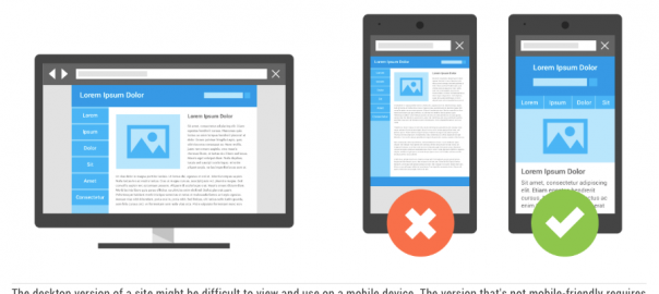
Responsive Web Design: Desktop to Mobile-Friendly (Image Source: Google)
Google provides the following advice when moving to a mobile-friendly site: “On a very basic implementation level, transitioning an existing desktop site to mobile entails using existing sections of content from the desktop site and organizing them in a mobile-friendly design pattern.”
If your website is not already mobile-friendly and you are transitioning to a responsive web design, how the various sections are laid out will impact how your site looks on mobile devices.
Thus, the design process needs to incorporate not simply designing a responsive website that looks good on a desktop. It also needs to consider how the site elements will respond/adjust when viewed on mobile devices. This isn’t a complicated process with responsive web design, but it is one that needs to be kept in mind when designing a mobile-friendly site.
(294)


