
Not long ago, emails resembling printed newsletters were prevalent. They had two or three columns, a number of articles, a table of contents, a “published” date and a lot of content that was best read on a desktop device.
We’ve come a long way since then.
First Impressions
You’ve managed, with your compelling subject line, to convince an email recipient to open your email.
But did they read your email? Or did they “bounce?”
What your open rate (and click rate) doesn’t tell you is if they actually read your email after opening. That’s where email open time comes in.
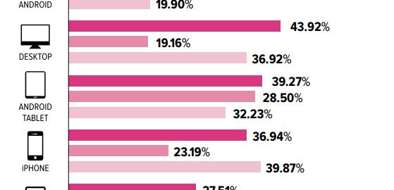
According to emailmonday, a large percent of readers on various devices spend less than 15 seconds reading an email. This could indicate they quickly clicked a link but it could also mean they quickly closed or even deleted the email.

Credit: emailmonday
Your email needs to engage the reader quickly and to encourage the reader to scroll and to click regardless of the email type.
Layout Design
Though statistics vary for different industries, on average, 66% of emails are now opened on mobile devices (Constant Contact) and 54% are opened on mobile first (Cynthia Price), making it very likely your readers are viewing your email on a smartphone rather than desktop device.
However, it is still important to design your emails for all devices, using responsive layouts to increase the likelihood your email will be read and clicked rather than abandoned.
- If you use a multicolumn format, make sure it reformats to a single column when viewed on a mobile device, making it easy to read on a narrow screen.
- Design your email to be no more than 650 pixels wide to ensure that when viewed in a browser-based email application such as Yahoo or Gmail, the entire width is visible.
- Use a simple layout that is clean and uncluttered with visual cues to indicate headlines and calls to action as well as to create information hierarchy.
- Use spacing and dividing lines to split content sections
- Keep paragraphs short for easy scannability and readability.
- Use your company’s colors and fonts. However, make sure your email works with a system font as well.
- Watch your use of background images. Some email clients such as Outlook, will not display them.
- Include a pre-header or preview text if your email uses a header image or logo which would take up a large portion of a mobile screen.
- Try to keep your header less than 150 pixels high so that your main content is more likely to display on smaller devices.
- Break up large chunks of text with images and consider linking to longer content hosted on your website. Remember to include “alt text” on your email images just as you would on a website to help identify images that might not be downloaded or displayed.
- Balance your images and text. An email that is overly image-heavy can be flagged as spam.
Our internet savvy audience has matured rapidly and mobile technology continues to evolve. As such, it’s long past time to drop emails that look like old, printed newsletters, and to instead focus on mobile-friendly emails that are easy to read regardless of device. Rather than using email as a way to deliver every detail of every story in a given time period, consider the specific purpose of each email and use it as a gateway to information located elsewhere on your website where users can convert.
- email design
- email readability
- email engagement
(73)
