
Your site looks great. You’re driving traffic and you’re getting sales. But a 2% conversion rate isn’t enough. Sure, that is industry benchmark, but you know there are techniques and strategies out there to boost that number and drive more revenue.
What’s the secret?
Calls to action –– or CTAs.
What are Calls-to-Action?
CTAs are the buttons throughout a site that tell your customers what to do, where to click and what to buy.
Having a clear call-to-action on every page allows you to steer the customer toward the most appropriate spot in your conversion funnel. The recommended action can be direct — buy this product, or simply an innocuous newsletter subscription sign-up button.
By placing the right CTAs on the right pages, you can keep customers engaged without compromising the relationship you’ve built with them.
The actions you recommend should simply align with their interest; someone on a product pages is interesting in buying, while someone on a content page is interested about learning more. The CTA simply aids them in advancing their goal.
Every online business uses CTAs, from the household name brands and platforms you interact with daily (i.e. Facebook and Google) to startups you’ve never heard of. For instance, on Facebook, most of the ads you see have a CTA to download more or read more.
There is no exact science on how to make a CTA more effective. It is important that you test language, colors and placement.
But even though there’s no “right” way to craft your calls-to-action, there are a few best practices. Let’s review.
CTA Language and Copy
The only hard and fast rule for CTA copy is to keep it short and sweet. In the example below, Lems Shoes uses only “Shop Now” to drive customers to product pages from the homepage.

Psychology plays a large role here, too. You’ll see that many CTAs across the web utilize a timeframe factor, like “Show Now,” versus just “Shop” or “Shop Here.” This is because people respond to urgency and scarcity. Putting a timeframe on something compels people to follow through on it in that instance.
Learn More On How to Use Psychology to 2x Sales
CTA buttons aren’t the only area on your site where psychology comes into play. Learn more about the 7 psychological triggers best selling sites use to sell more.
Call-To-Action Button Color
One of the biggest changes we made was to the ‘Add To Basket’ button. Simply changing it from black to a blue color has reduced abandoned carts by up to 50%.
Jeremy Hagon, Marketing Manager, Andreas Carter Sports

The button color that most converts for your brand will differ from other sites. You will need to A/B test various button colors in order to see which ones convert the most.
By and large, though, choosing a color that stands out will draw the eye and best convert. This means your button color may often a secondary brand color. See above how Andreas Carter Sports shifts from the brand’s typical green to a blue for the CTA. This change alone increased conversions 50%.
Button Placement
“Above the fold” may be an old newspaper term, but it is still alive and well in the digital marketing space. In general, you want to have your CTA land above the fold –– meaning a customer won’t have to scroll through the page to find the button.
You also want to be sure to only offer a few options –– especially as someone gets closer to the checkout point of the conversion funnel.
On your homepage, for instance, you will merchandise your products to pull people in. Once they land on a product page, however, you want to convert them. Here, you’ll want clear CTAs above the fold –– and only those that will increase engagement with your brand or signal desire to move further down the funnel.
In the Saint Heron example below, the team uses only two CTAs: “Add to Bag” and “Add to Wishlist.”

Now, beyond basic best practices for CTAs, there are a wide variety of CTAs you can and should use across your site. Each of them have different purposes.
Think for a moment of the conversion funnel: at each stage you ask for various information, leading to brand discovery and engagement, a sale and then customer lifetime value.

Here are the must-have CTAs on your website.
1) Social Follow and Social Share CTAs
Building an online community is one of the first steps to take as an online business. Communities are the foundations of modern culture –– and humans are drawn to them, especially ones in which they can see themselves.
Building an engaged community is exactly how Spearmint LOVE went from blog to multi-million dollar business in less than three years. They now have 107,000 followers on Instagram alone.

While there are certainly tactics outside of your own website that help to grow an engaged community, be sure you are using your website to increase your follower count. This is an easy setup and no-brainer way to grow your audience.
Your ecommerce platform should make it incredibly easy to add social media buttons and icons. In the BigCommerce backend example below, you can even rearrange icons by dragging, dropping and reordering the forms.

Here is how Spearmint LOVE has their social icons setup on their homepage.

While on your homepage you’ll want to make it easy for customers to find your social communities, on product pages it is important customers be able to share the items they found out with their own networks.
Again, your ecommerce platform should allow you to easily set this up.

2) Subscribe CTAs
On average, only about 2% of the traffic that comes to your site will result in a sale. So, how do you capture the rest of that interested, but not-ready-to-buy audience?
By asking for an email address.
Once you have an email address, you no longer have to pay to pull a customer back. That person is now part of your list, and your list is an own-able asset. You can market to that list and build a conversion funnel to A/B test and optimize.
There are multiple ways to get someone to subscribe. Here are a couple.
Simple Homepage Callout
This offers a easy way for browsers on your homepage who like what they see to sign up and then continue with their web browsing elsewhere.

You can even sweeten the deal by offering a percentage discount. This particular subscription code is also part of the footer –– which means it will be present no matter where the customer is on your site.

Coupon Code
Coupon codes are a great way to entice potential future buyers to join your list. Plus, it sends a great signal to your email service that when you send an email, a customer opens it (because there is a coupon in it!).
Use this opportunity to build engagement with your email list, training customers top open your emails every time you send one.
You can use coupon codes in a regular subscription call out on the homepage (like in the examples above) or product page, or use a pop-up like Natori has done. Pop-ups like these more emails than static homepage ones.

In the Tracy Reese example below, they are using both a pop-up and a call-out on the top of the site to drive email signups. CTAs like this do not have to be one or the other.

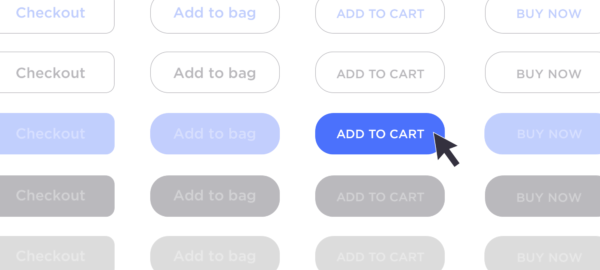
3) The Buy Button + Add to Cart Button
The Buy Button is probably the most important CTA on your entire site. You want it to stand out. You want it to work exceptionally well. The Add to Cart Button is the second most important CTA on your site. Users must click this before they can even reach the buy button.
If a user hits add to cart but doesn’t hit the buy button, you now have yourself an abandoned cart. Your goal is to 1) get users to click the add to cart button and 2) minimize the friction between add to cart and buy so you can increase conversions.
Let’s take a look at how simple Native Union makes this part of the funnel.

Native Union has 2 add to cart or buy buttons so customers don’t miss how to get an item into their basket.

Once you add to cart, you are dropped into this simple and clean checkout interface.

Finally, the entire checkout process lives on a single page so users can fly through and make it to “completed purchase” as quickly and conveniently as possible.
4) Review CTAs
Social proof is a key psychological reinforcement factor when consumers are buying from an online brand — particularly for the first time. You want your best customers to leave reviews on your site to encourage additional purchases from customers less familiar with your business.
You can do this in a couple of way.
- Add a “Leave a review” CTA on all product pages, and make it extremely visible
- Send emails to customers after they have received an item, asking them for a review
In an ideal world, you do both of these.
StoreYourBoard, a Innovation Award Winner, does this extremely well. Let’s take a look.

Every single product page on the StoreYourBoard site has clear CTAs to review products or ask questions about products.

After a customer receives an item, StoreYourBoard sends them an email to go back and review the product. From the email, they are directed to their own personalized Customer Review center. Every customer has a customized view based on past purchases and reviews. Plus, giving a review is super simple –– they use CTAs drive action.
How Not to Use CTAs
While CTAs are the mechanism by which you push customers through your conversion funnel at whichever stage they are at, there is a such thing as overdoing it.
Here are a few tips on what *not* to do when it comes to CTAs.
- Don’t go crazy: You don’t want your page to be so covered in CTAs they might as well be wallpaper for all the attention they get.
- Don’t be irrelevant: Make sure your CTAs make sense and that they are always relevant and useful.
- Don’t let the CTA overshadow the content on the page: Think of CTAs as a quick wave “hello” instead of shouting “over here!” in a megaphone.
- Don’t let the CTA blend in so much that the eye naturally ignores it.
- Don’t just add CTAs and never test them: A/B test every single CTA you have again and again. Small changes can seriously increase conversion rate
Tools to A/B Test
Want more insights like this?
We’re on a mission to provide businesses like yours marketing and sales tips, tricks and industry leading knowledge to build the next house-hold name brand. Don’t miss a post. Sign up for our weekly newsletter.
- Email*

(106)