What is the value of a website that looks amazing but at the end of the day it does not attract, convince, convert and delight the end user? The answer is probably nothing!
The internet is getting crowded and websites are no more a company display profile; they are actually the sales agent that helps businesses reach out to more targeted audiences and get leads and customers. You can easily find case studies of different brands where they change the color of the website and as a result their conversion rate goes sky rocketing!
Today, design is not limited to beauty, look and feel but it is more directed towards conversions so a designer should not only know how to beautify a website, but they also need to have an idea of how the potential customer will feel when they visit the website.

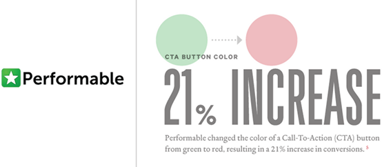
Here is an example of a brand that saw a 21% increase in conversions just by changing the color of a CTA button on their website.
My audience here is mostly designers and the point I want to make here is that you should design your website in such a way that the company CROs and digital marketers should say ‘WOW!’
No matter if you are going for a basic web design, ecommerce CMS, WordPress or even a site builder, here are a few things you should know about search engine optimization (SEO) as a designer.
1. Consider different design templates
Choosing a design template is the number one place to start. When brainstorming for design ideas, always look at different competitors, research the niche and see what kind of designs are working and what kind of designs people prefer not to use. This is not only a great idea for designers but this is also the perfect approach from the conversion point of view.
Remember, you cannot copy and paste the design of another website as it is not a website design it’s probably the image of the company so it has to show the full potential.

Moz.com recently changed their brand name and image (which includes website), take a look and see how their website template, colors, changed as per their brand image.
2. Selection of Colors
A common misconception by SEOs as well as by designers is that colors only have to do with design and designers. The impact of colors on conversion is a very important topic in CRO and I believe every CRO focused marketer should care about it.
As a designer the idea is not to ‘believe in your gut feelings’ when selecting a color for your website design, instead try to go through studies and see how different colors impact human psychology and then go from there. For instance, if you are creating a website for a restaurant, the use of sharp red will make perfect sense, whereas for a restaurant business the same color could be a disaster.

This is a significant example where RIPT changed their CTA button and which witnessed a 6.3% increase in sales.
There are actually tons of resources that can help you with choosing a color scheme of your website design but I want you to take a different approach and read this article about the impact on color on human psychology.
Quick Note: Always make sure the colors you are choosing for the website are not contradicting the brand’s core policies.
3. What Trend to Follow
2014 has been an amazing year for digital design as we see a lot of trends booming and even more brands investing their money to stay up to date and providing a good experience to people who visit their website.
99 designs listed the top 10 trends of website in 2014 and I would highly recommend reading this as this not only give you new ideas but also allows you to think over what trend is important for what type of audience and how each type of design will impact conversions.
If you are designing a website for a design house, you probably have to go with all the latest trends as a design house’s targeted audience is pretty much updated with all the latest trends and they would love to see how you incorporate your expertise within the new trends.
I want to include Pushhere.com as an example here. Take a look and see how they change the trend over the years.

4. Placement of CTA
Search for ‘Call to Action’ (CTA) on any marketing centric blog and you will find out the importance of it when comes to conversions. CTA is a place from where a visitor will convert into a lead and possibly a customer for the business.
There are tons of things involved in a small CTA button that includes font, size, color, shape and probably more, but from a design point of view the most important is the placement of the CTA button on the website.
Where to place the CTA button on a landing page? Above the fold, below the fold, bottom of the page or any other place? The best way to find the answer is by testing different versions of the page, commonly called A/B testing.
There are multiple tools that can help you with A/B testing like Optimizely and Unbounce; just make multiple versions of the page with placing CTA on different places and test accordingly.

This is the split test result of Apples to Oranges. You can find the full story here.
Quick Note: Do not choose your CTA positions randomly or by looking at your competitors!
5. Following Web Design Usability Principle
What determines the success or failure of a website? It’s not really a good looking website but the utility and usability of the website that makes the difference and can make or break the user experience. No matter how ‘pretty’ looking your design is, if the visitor cannot access different parts and functionalities of the website, then probably he or she will bounce off.

Huffington Post is a perfect example of usability and design as it attracts user’s attention and at the same time allows users to reach their destinations within few clicks.
Web design usability is an important concept but unfortunately there are not many quality resources available on the Web that addresses the issue.
Quick Note: Cosmetics are important, but if it is difficult for users to use, it’s nothing but garbage!
Designing is expanding from an art to science! You not only have to consider aesthetics, but you also have to see how functional they are; after all… even the mirror has a purpose!
(262)